The following dotplots show the average high temperatures (in degrees Fahrenheit) for a sample of tourist cities
Question:
The following dotplots show the average high temperatures
(in degrees Fahrenheit) for a sample of tourist cities from around the world. Both the January and July average high temperatures are shown.
What is one statement that can be made with certainty from an analysis of the graphical display?
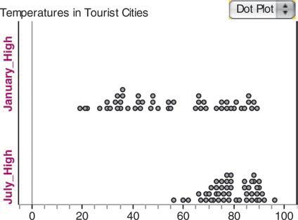
(a) Every city has a larger average high temperature in July than in January.
(b) The distribution of temperatures in July is skewed right, while the distribution of temperatures in January is skewed left.
(c) The median average high temperature for January is higher than the median average high temperature for July.
(d) There appear to be outliers in the average high temperatures for January and July.
(e) There is more variability in average high temperatures in January than in July.
Step by Step Answer: