

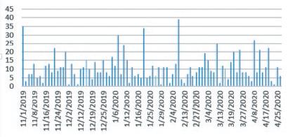
The following two charts represent the exact same datathe quantity of beer sold on each day in
Question:
The following two charts represent the exact same data—the quantity of beer sold on each day in the Sláinte Sales Subset dataset. Which chart is more appropriate for working with dates, the column chart or the line chart? Which do you prefer? Why?
a.
b. 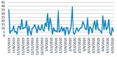
Fantastic news! We've Found the answer you've been seeking!
Step by Step Answer:

Related Book For 

ISE Data Analytics For Accounting
ISBN: 9781265094454
3rd Edition
Authors: Ryan A. Teeter, Vernon Richardson, Katie L. Terrell
Question Posted:
