Draw a scatter diagram of the price of oil and the quantity of oil produced. Describe the
Question:
Draw a scatter diagram of the price of oil and the quantity of oil produced. Describe the relationship.
The spreadsheet provides data on oil and gasoline:
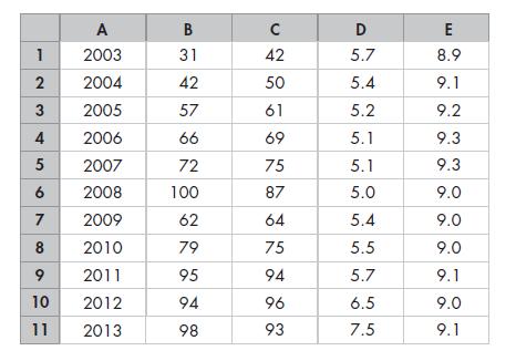
Column A is the year, column B is the price of oil (dollars per barrel), column C is the price of gasoline (cents per litre), column D is oil production, and column E is the quantity of gasoline refined (both in millions of barrels per day).

Transcribed Image Text:
1 2 3 4 5 6 7 8 9 10 11 A 2003 2004 2005 2006 2007 2008 2009 2010 2011 2012 2013 B 31 42 57 66 72 100 62 79 95 94 98 C 42 50 61 69 75 87 64 75 94 96 93 D 5.7 5.4 5.2 5.1 5.1 5.0 5.4 5.5 5.7 6.5 7.5 E 8.9 9.1 9.2 9.3 9.3 9.0 9.0 9.0 9.1 9.0 9.1
Step by Step Answer:

This question has not been answered yet.
You can Ask your question!
Related Book For 

Microeconomics Canada In The Global Environment
ISBN: 9780321931184
9th Edition
Authors: Robin Bade, Michael Parkin
Question Posted:
Students also viewed these Business questions
-
Draw a scatter diagram of the price of oil and the quantity of crude oil produced. Describe the relationship. The spreadsheet provides data on oil and gasoline: Column A is the year, column B is the...
-
Draw a scatter diagram of the price of gasoline and the quantity of gasoline refined. Describe the relationship. The spreadsheet provides data on oil and gasoline: Column A is the year, column B is...
-
Draw a scatter diagram of the price of gasoline and the quantity of gasoline refined. Describe the relationship. The spreadsheet provides data on oil and gasoline: Column A is the year, column B is...
-
Given the following points: 2,4,10,12,3,20,30,11,25. Assume k = 3, and that we randomly pick the initial means 1=2, 2=4 and 3=6. Show the clusters obtained using K-means algorithm after one...
-
How are mission statements, goals, objectives, and plans related?
-
How do you start using Google Analytics at a website?
-
(2) If you worked for the organization concerned, which organizational audiences might require an account of the change to be constructed?
-
Jason Rogers works full-time for UPS and runs a lawn-mowing service part-time after work during the warm months of April through October. Jason has three men working with him, each of whom is paid $6...
-
Problem One: On January 1, 2022, Company borrowed $250,000 for 5 years at 6% interest. The loan requires 5 annual payments of $59,349.10 (round computations to the nearest PENNY). 1. Complete the...
-
Complete the level production plan, using the following information. The only costs you need to consider here are layoff, hiring, and inventory costs. If you complete the plan correctly, your hiring,...
-
Which of the following statements is positive, which is normative, and which can be tested? a. Canada should cut its imports. b. China is Canadas largest trading partner. c. The federal government...
-
What happens in the graph in Problem 10 if the temperature rises to 30C? The table gives the price of a balloon ride, the temperature, and the number of rides a day. Price (dollars per ride) 5 10 15...
-
In 2015, Greece's debt had reached 323 billion eurothe highest in modern history. With debt amounting to 177 percent of its GDP, Greece's rating was downgraded. Not only Greece but other highly...
-
Using the ideas of kinetic particle theory when you come home from school and open the door you can smell food being cooked
-
The following information relates to Salamat Corporation for the last year.Salamat uses direct labor hours as an overhead base. Estimated direct labor hours 360,000 hours Estimated manufacturing...
-
Code in matlab the translational motion via numeric integration of the orbit (two-body orbit sufficient). Use the orbital characteristics of the Centaur V upper stage from the Atlas V launch on...
-
Lolita Company has the following information available for June 2020: Beginning Work in Process Inventory (25% as to conversion) 20,000 units Started 130,000 units Ending Work in Process Inventory...
-
Question 3 (15 marks) Sporty Ltd. produces scooters and skateboards. At the beginning of the year, the following volume of activities were budgeted for the year: Production volume/units Direct labour...
-
Time dilation is sometimes described by saying that moving clocks run slow. In what sense is this true? In what sense does the statement violate the spirit of relativity?
-
Troy is a qualified radiologist who operates a successful radiology practice from purpose- built rooms attached to his house. Troy works in the practice three days a week, and the other two days he...
-
Which of the entries in the list are capital goods? Explain your choice. List An interstate highway An airplane A school teacher A stealth bomber A garbage truck A pack of bubble gum President...
-
Which of the entries in the list are capital goods? Explain your choice. List An interstate highway An airplane A school teacher A stealth bomber A garbage truck A pack of bubble gum President...
-
If Tom and Abby specialize and trade 15 balls for 1 racket, what are the gains from trade? Figure 3.3 (on below) shows Toms production possibilities and Figure 3.4 (on the next page) shows Abbys...
-
Dr. Claudia Gomez, a plastic surgeon, had just returned from a conference in which she learned of a new surgical procedure for removing wrinkles around eyes, reducing the time to perform the normal...
-
QUESTION 2 ( 2 0 Marks ) 2 . 1 REQUIRED Study the information provided below and prepare the Income Statement for the year ended 3 1 December 2 0 2 3 using the marginal costing method. INFORMATION...
-
DROP DOWN OPTIONS: FIRST SECOND THIRD FOURTH 5. Cost of new common stock A firm needs to take flotation costs into account when it is raising capital fromY True or False: The following statement...

Study smarter with the SolutionInn App


