

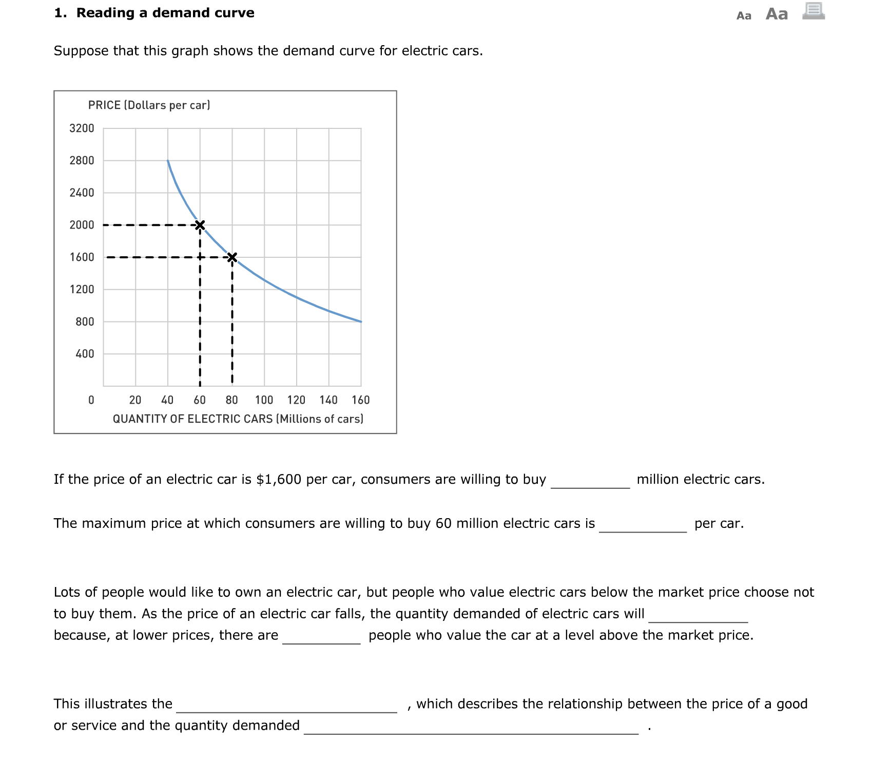
Question: 1. Reading a demand curve Aa Aa E Suppose that this graph shows the demand curve for electric cars. PRICE [Dollars per car] 3200 2800
![graph shows the demand curve for electric cars. PRICE [Dollars per car]](https://dsd5zvtm8ll6.cloudfront.net/si.experts.images/questions/2024/09/66f6a18ad6102_24266f6a18ab19c0.jpg)
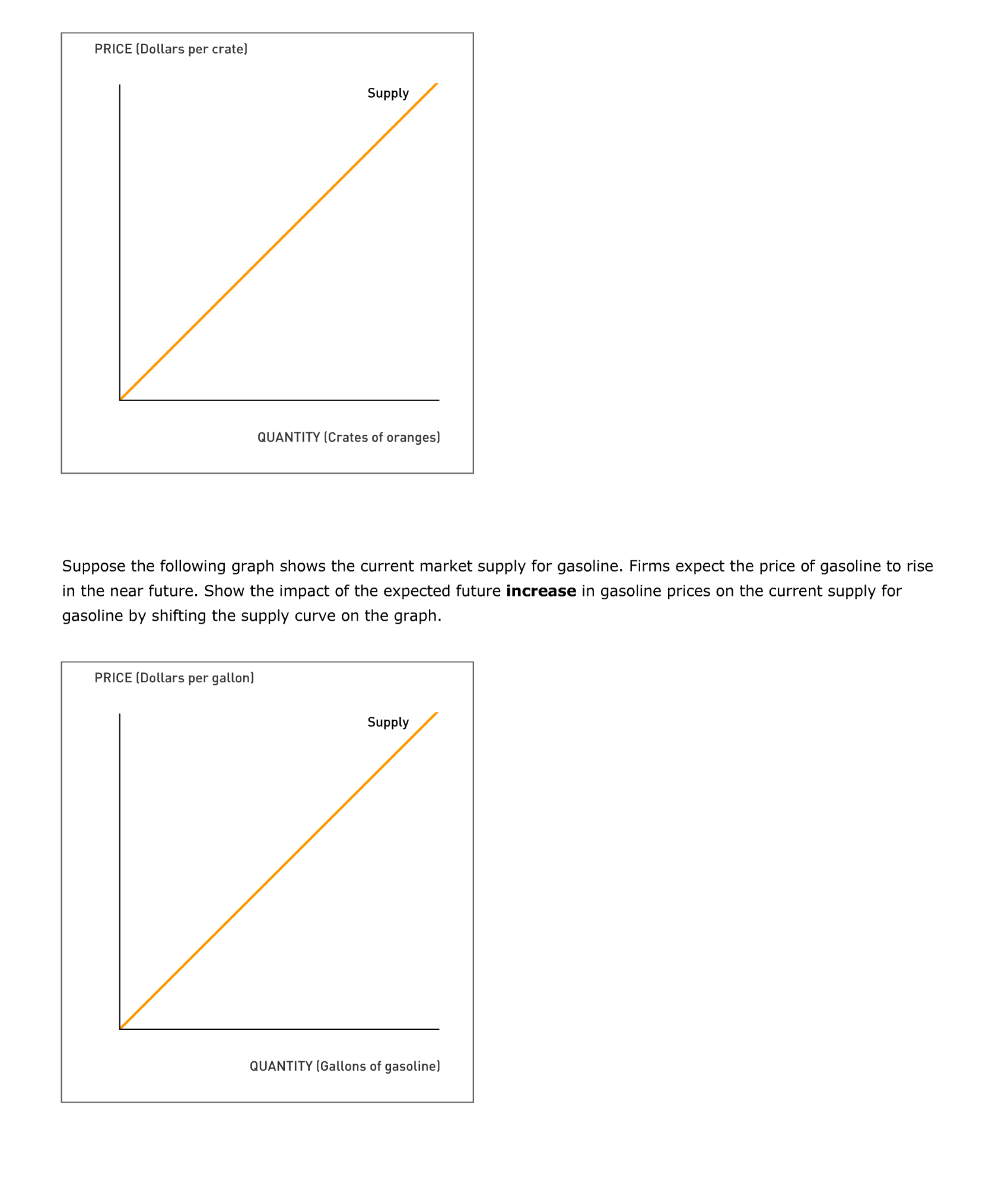
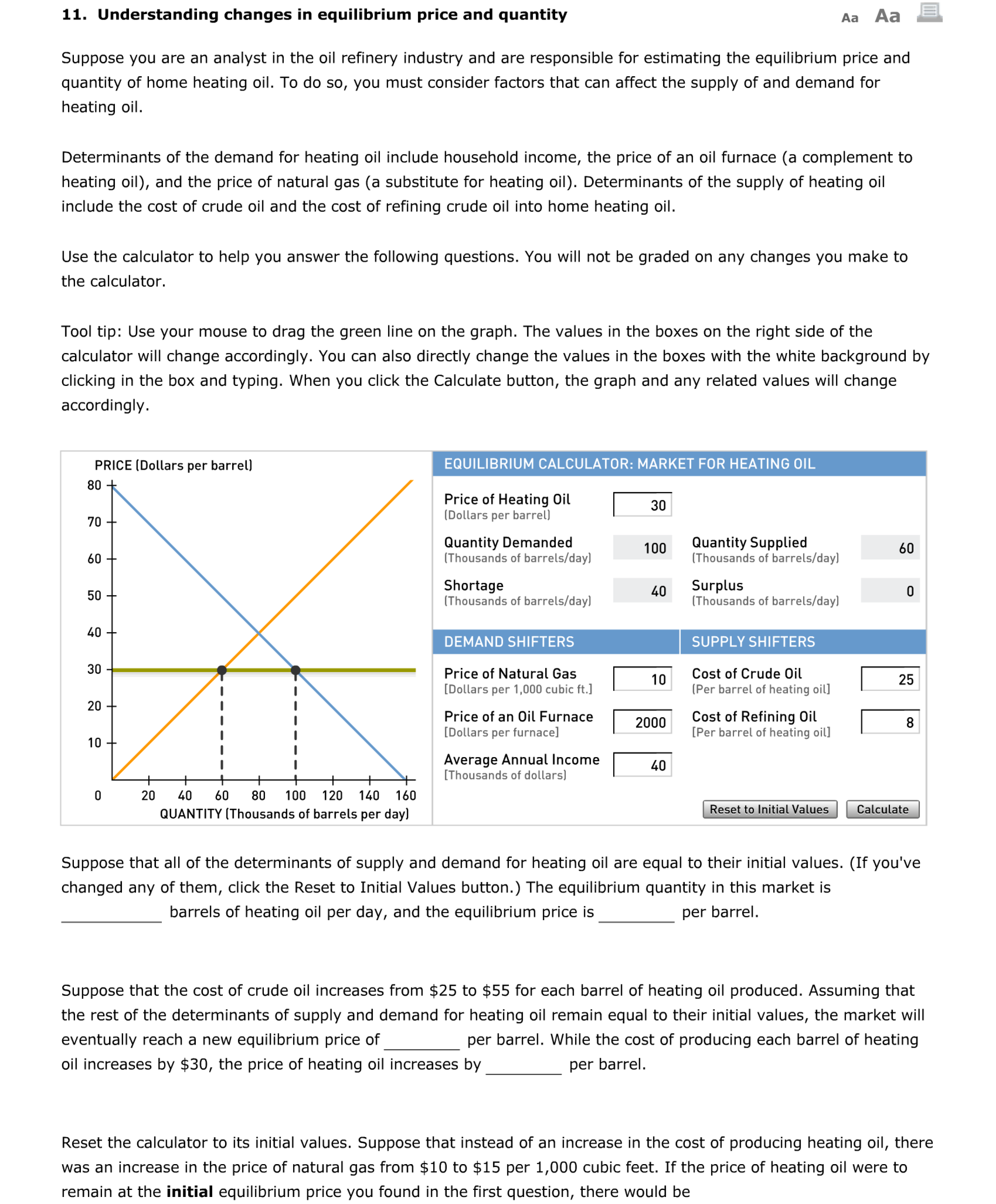

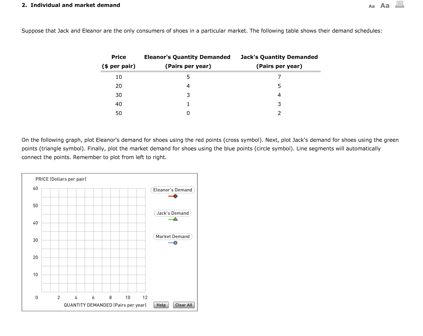
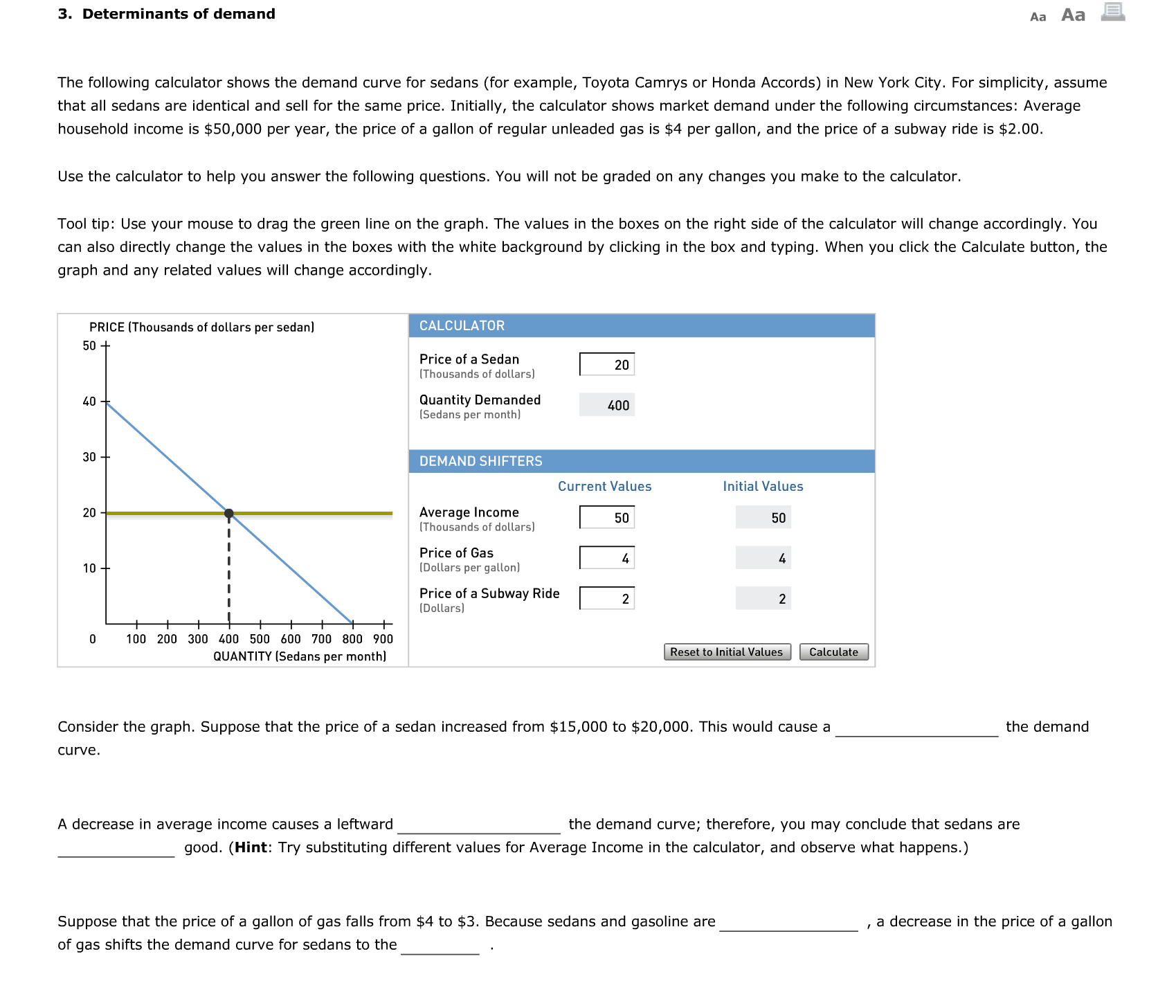
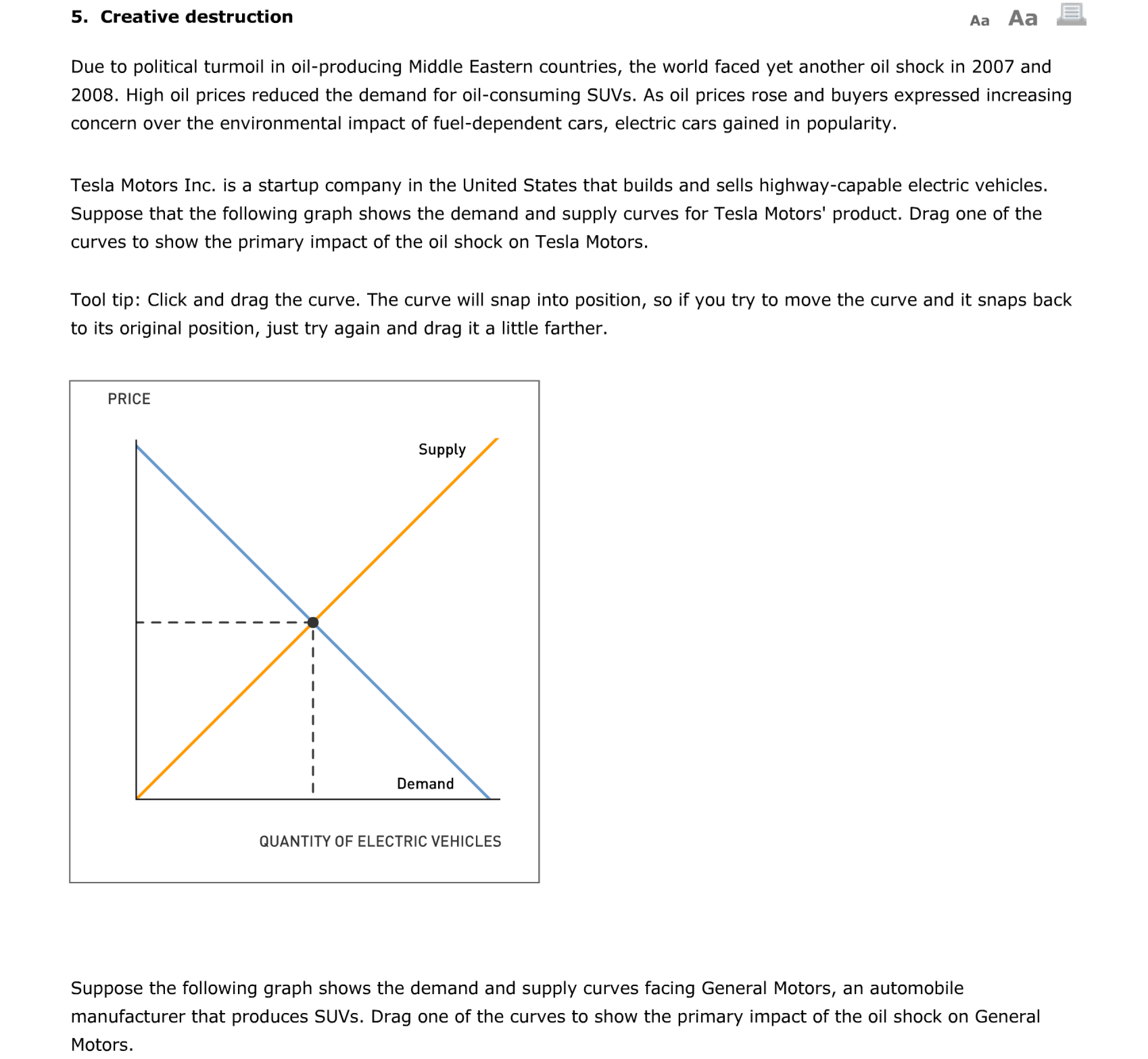
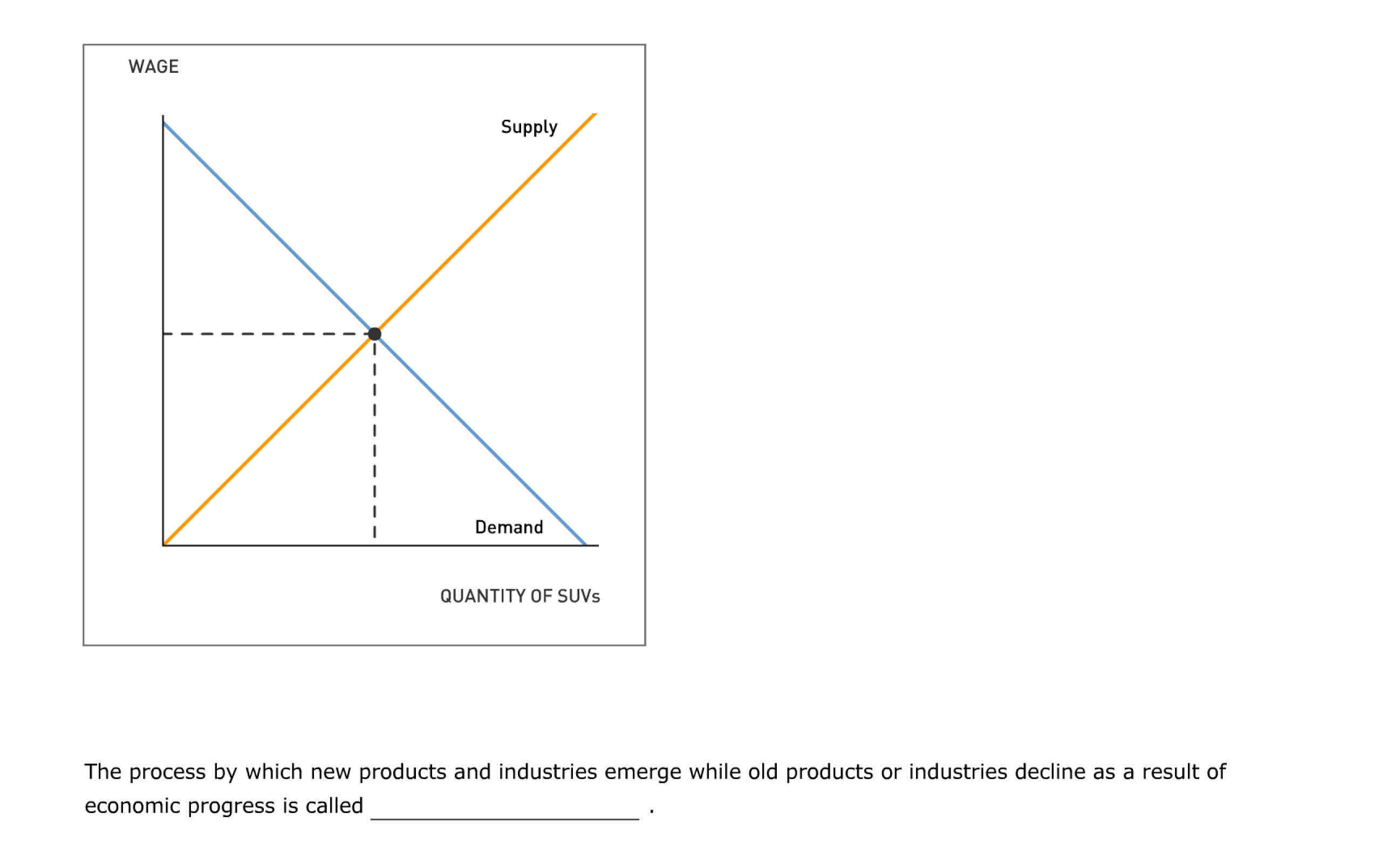
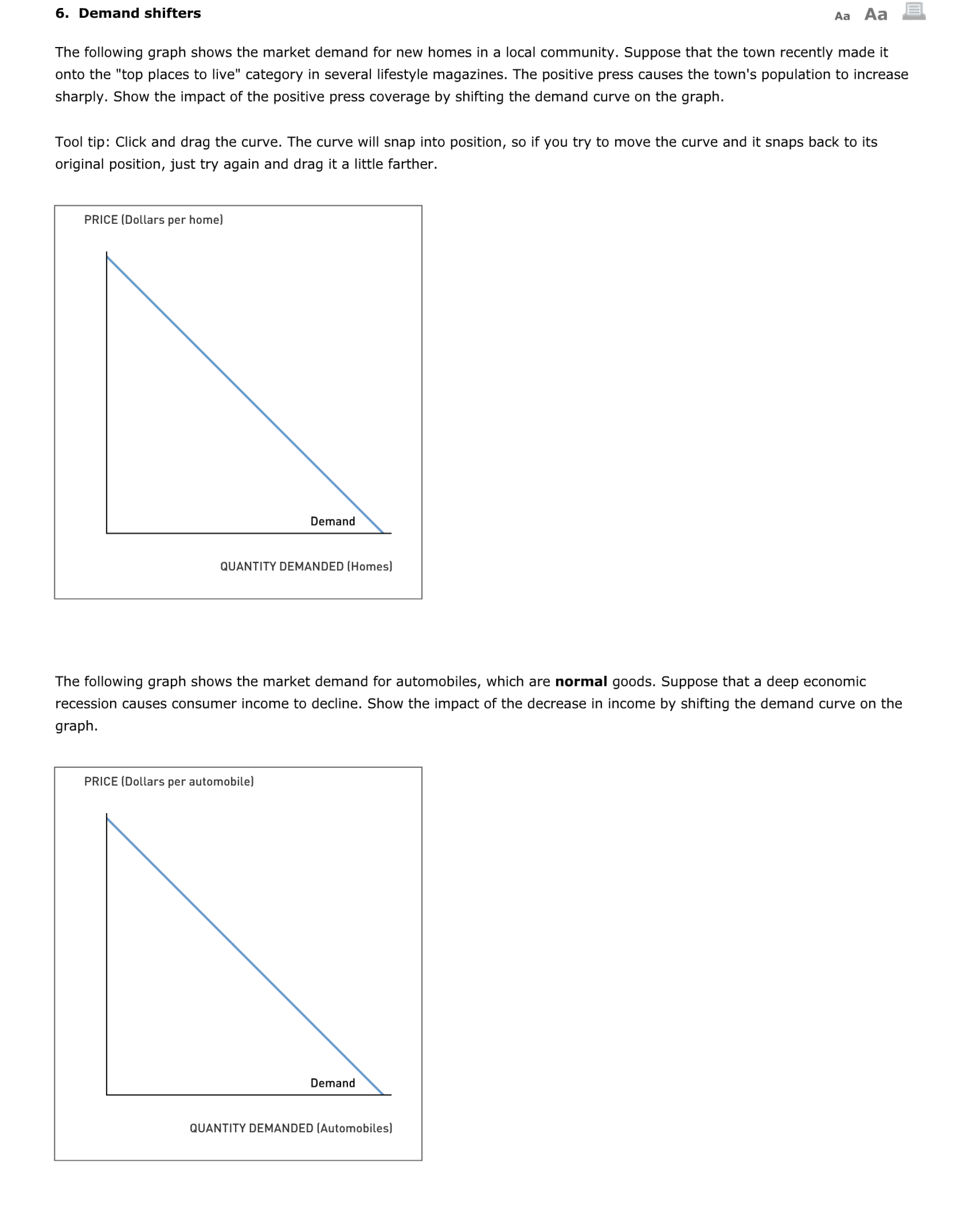
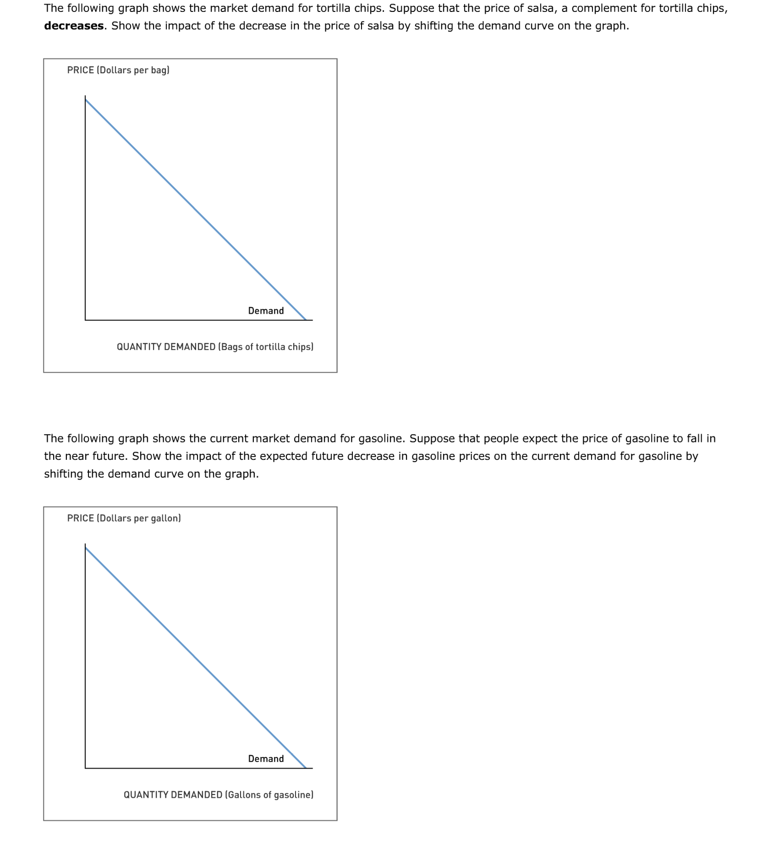
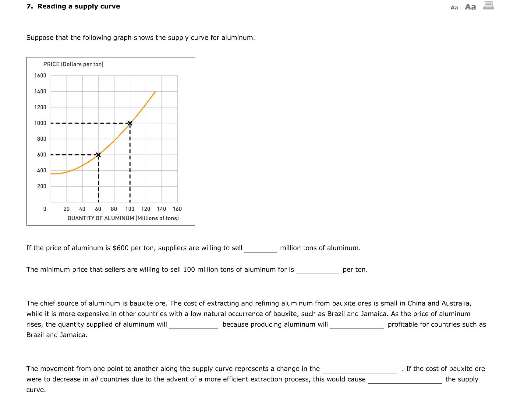
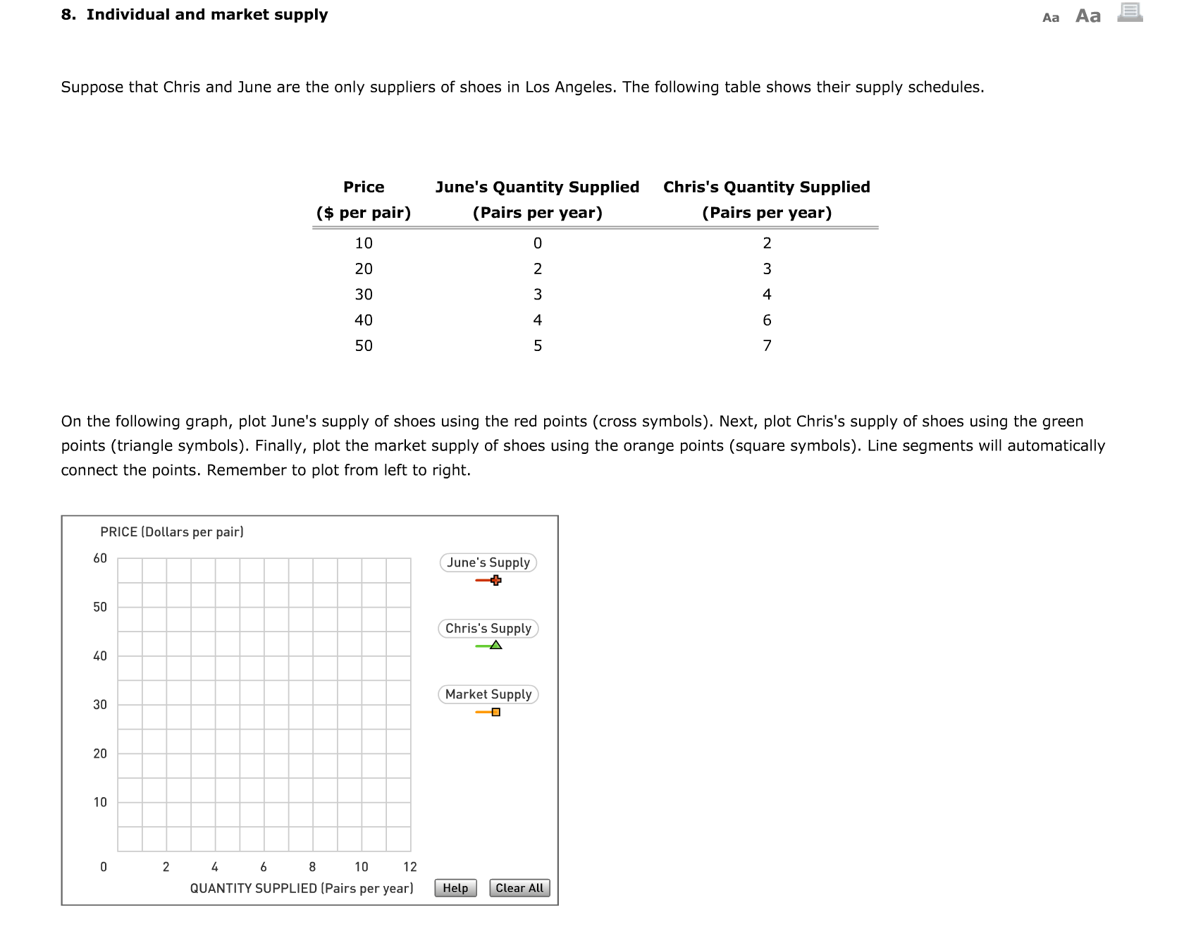
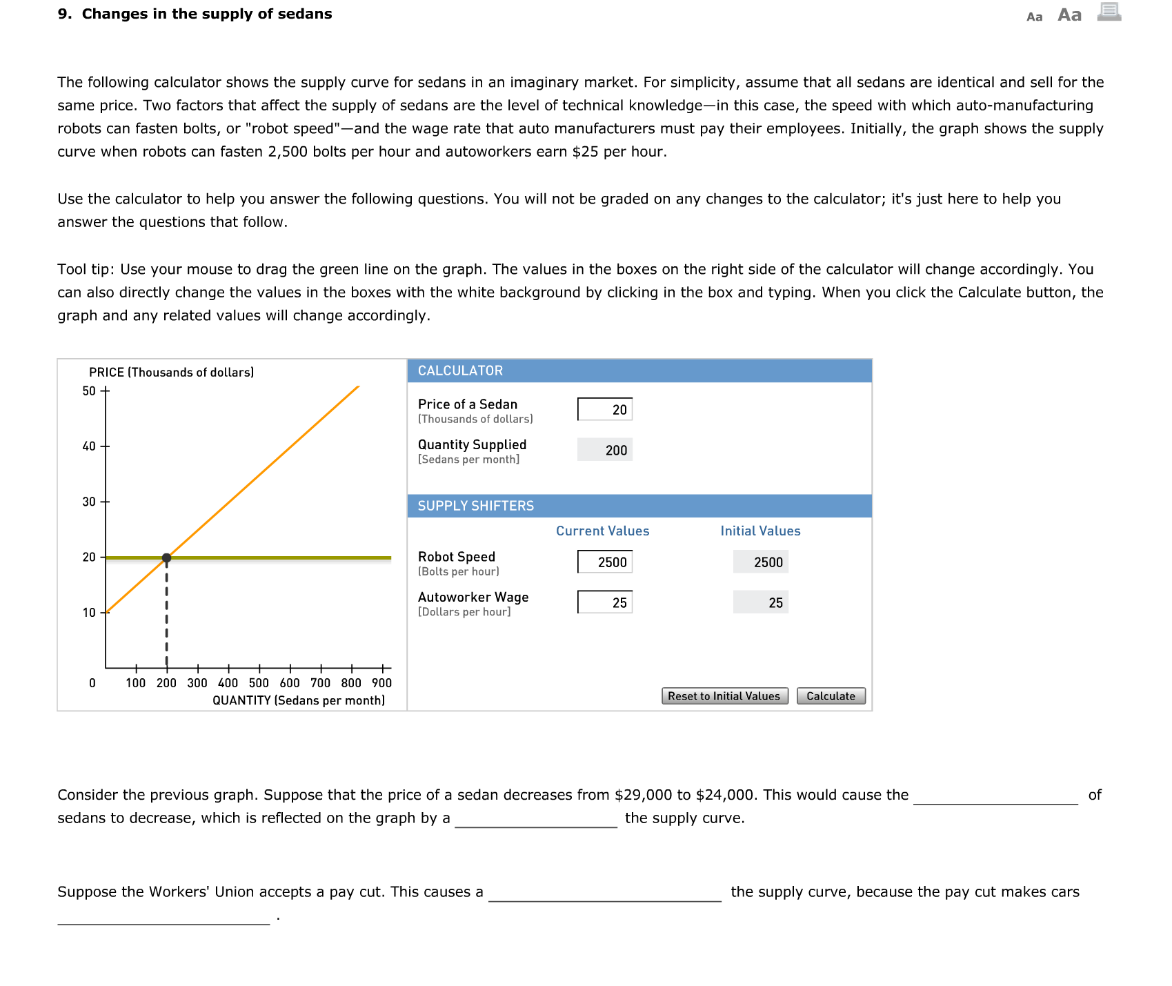
1. Reading a demand curve Aa Aa E Suppose that this graph shows the demand curve for electric cars. PRICE [Dollars per car] 3200 2800 2400 2000 - 1600 1200 800 400 0 20 40 60 80 100 120 140 160 QUANTITY OF ELECTRIC CARS (Millions of cars) If the price of an electric car is $1,600 per car, consumers are willing to buy million electric cars. The maximum price at which consumers are willing to buy 60 million electric cars is per car. Lots of people would like to own an electric car, but people who value electric cars below the market price choose not to buy them. As the price of an electric car falls, the quantity demanded of electric cars will because, at lower prices, there are people who value the car at a level above the market price. This illustrates the , which describes the relationship between the price of a good or service and the quantity demandedAa ABE 10. Supply shifters Suppose the following graph shows the market supply for oranges. A severe drought destroys much of the crop of oranges. Show the impact of the severe drought by shifting the supply curve on the graph. Tool tip: Click and drag the curve. The curve will snap into position, so if you try to move the curve and it snaps back to its original position, just try again and drag it a little farther. PRICE [Dollars per crate] QUANTITY [Crates of oranges] Suppose the following graph shows the market supply for oranges. An influx of migrant workers leads to a decrease in the wages of orange pickers. Show the impact of the decrease in farm-hand wages by shifting the supply curve on the graph. Tool tip: Click and drag the curve. The curve will snap into position, so if you try to move the curve and it snaps back to its original position, just try again and drag it a little farther. PRICE [Dollars per crate] QUANTITY [Crates of oranges] Suppose the following graph shows the current market supply for gasoline. Firms expect the price of gasoline to rise in the near future. Show the impact of the expected future increase in gasoline prices on the current supply for gasoline by shifting the supply curve on the graph. PRICE [Dollars per gallon] QUANTITY [Gallons of gasoline] 11. Understanding changes in equilibrium price and quantity A3 A3 a Suppose you are an analyst in the oil refinery industry and are responsible for estimating the equilibrium price and quantity of home heating oil. To do so, you must consider factors that can affect the supply of and demand for heating oil. Determinants of the demand for heating oil include household income, the price of an oil furnace (a complement to heating oil), and the price of natural gas (a substitute for heating oil). Determinants of the supply of heating oil include the cost of crude oil and the cost of rening crude oil into home heating oil. Use the calculator to help you answer the following questions. You will not be graded on any changes you make to the calculator. Tool tip: Use your mouse to drag the green line on the graph. The values in the boxes on the right side of the calculator will change accordingly. You can also directly change the values in the boxes with the white background by clicking in the box and typing. When you click the Calculate button, the graph and any related values will change accordingly. PRICE [Dollars per barrel] EQUILIBRIUM CALCULATOR: MARKET FOR HEATING OIL 80 Price of Heating Oil I 70 [Dollars per barrel] 30 Quantity Demanded 100 Quantity Supplied 60 6!] [Thousands of barrels/day] [Thousands of barrels/day] Shortage 40 Surplus 0 50 [Thousands of barrels/day] [Thousands of barrels/day] '0 ' DEMAND SHIFTERS SUPPLY SHIFTERS 3\" Price of Natural Gas I Cost of Crude Oil [Dollars per 1,000 cubic ft.] 10 [Per barrel of heating oil] 25 20 Price of an Oil Furnace I Cost of Refining Oil 10 [Dollars per furnace] 2000 [Per barrel of heating oil] 8 l Average Annual Income I [Thousands of dollars] '0 0 20 40 6D 80 100 120 140 160 QUANTITY [Thousands of barrels per day] Suppose that all of the determinants of supply and demand for heating oil are equal to their initial values. (If you've changed any of them, click the Reset to Initial Values button.) The equilibrium quantity in this market is barrels of heating oil per day, and the equilibrium price is per barrel. Suppose that the cost of crude oil increases from $25 to $55 for each barrel of heating oil produced. Assuming that the rest of the determinants of supply and demand for heating oil remain equal to their initial values, the market will eventually reach a new equilibrium price of per barrel. While the cost of producing each barrel of heating oil increases by $30, the price of heating oil increases by per barrel. Reset the calculator to its initial values. Suppose that instead of an increase in the cost of producing heating oil, there was an increase in the price of natural gas from $10 to $15 per 1,000 cubic feet. If the price of heating oil were to remain at the initial equilibrium price you found in the rst question, there would be of barrels of heating oil per day, which would exert pressure on prices. 2. Individual and market demand Aa Aa E. Suppose that Jack and Eleanor are the only consumers of shoes in a particular market. The following table shows their demand schedules: Price Eleanor's Quantity Demanded Jack's Quantity Demanded ($ per pair) (Pairs per year) (Pairs per year) 10 5 7 20 4 5 30 3 4 4O 1 3 50 0 2 On the following graph, plot Eleanor's demand for shoes using the red points (cross symbol). Next, plot Jack's demand for shoes using the green points (triangle symbol). Finally, plot the market demand for shoes using the blue points (circle symbol). Line segments will automatically connect the points. Remember to plot from left to right. PRICE [Dollars per pairl 60 Eleanor's Demand III Jack's Demand A Market Demand 0 4 6 8 10 12 QUANTITY DEMANDEDlPairs peryearl @ 3. Determinants of demand Aa Aa E. The following calculator shows the demand curve for sedans (for example, Toyota Camrys or Honda Accords) in New York City. For simplicity, assume that all sedans are identical and sell for the same price. Initially, the calculator shows market demand under the following circumstances: Average household income is $50,000 per year, the price of a gallon of regular unleaded gas is $4 per gallon, and the price of a subway ride is $2.00. Use the calculator to help you answer the following questions. You will not be graded on any changes you make to the calculator. Tool tip: Use your mouse to drag the green line on the graph. The values in the boxes on the right side of the calculator will change accordingly. You can also directly change the values in the boxes with the white background by clicking in the box and typing. When you click the Calculate button, the graph and any related values will change accordingly. PRICE [Thousands of dollars per sedan] CALCULATOR 50 J- Price of a Sedan [Thousands of dollars] 20 Quantity Demanded ADD [Sedans per month] DEMAND SHIFTERS Current Values lnitialValues Average Income [Thousands of dollars] 5|] Price of Gas [Dollars per gallon] Price of a Subway Ride 1H [Dollars] 2 a 100 200 300 500 500 600 700 Bun 900 QUANTITY (Sedans per month] W W Consider the graph. Suppose that the price of a sedan increased from $15,000 to $20,000. This would cause a the demand curve. A decrease in average income causes a leftward the demand curve; therefore, you may conclude that sedans are good. (Hint: Try substituting different values for Average Income in the calculator, and observe what happens.) Suppose that the price of a gallon of gas falls from $4 to $3. Because sedans and gasoline are , a decrease in the price of a gallon of gas shifts the demand curve for sedans to the 4. Consumer sovereignty Aa Aa E According to the principle of consumer sovereignty, shifts in consumer preferences shifts in the types of goods that are produced. 5. Creative destruction Aa Aa El. Due to political turmoil in oil-producing Middle Eastern countries, the world faced yet another oil shock in 2007 and 2008. High oil prices reduced the demand for oil-consuming SUVs. As oil prices rose and buyers expressed increasing concern over the environmental impact of fuel-dependent cars, electric cars gained in popularity. Tesla Motors Inc. is a startup company in the United States that builds and sells highway-capable electric vehicles. Suppose that the following graph shows the demand and supply curves for Tesla Motors' product. Drag one of the curves to show the primary impact of the oil shock on Tesla Motors. Tool tip: Click and drag the curve. The curve will snap into position, so if you try to move the curve and it snaps back to its original position, just try again and drag it a little farther. QUANTITY OF ELECTRIC VEHICLES Suppose the following graph shows the demand and supply curves facing General Motors, an automobile manufacturer that produces SUVs. Drag one of the curves to show the primary impact of the oil shock on General Motors. QUANTITY OF SUVs The process by which new products and industries emerge while old products or industries decline as a result of economic progress is called 6. Demand shifters Aa Aa El The following graph shows the market demand for new homes in a local community. Suppose that the town recently made it onto the \"top places to live" category in several lifestyle magazines. The positive press causes the town's population to increase sharply. Show the impact of the positive press coverage by shifting the demand curve on the graph. Tool tip: Click and drag the curve. The curve will snap into position, so if you try to move the curve and it snaps back to its original position, just try again and drag it a little farther. PRICE [Dollars per home] Demand QUANTITY DEMANDED [Homesl The following graph shows the market demand for automobiles, which are normal goods. Suppose that a deep economic recession causes consumer income to decline. Show the impact of the decrease in income by shifting the demand curve on the graph. PRICE [Dollars per automobile] Demand QUANTITY DEMANDED [Automobiles] The following graph shows the market demand for tortilla chips. Suppose that the price of salsa, a complement for tortilla chips, decreases. Show the impact of the decrease in the price of salsa by shifting the demand curve on the graph. PRICE [Dollars per bag] Demand QUANTITY DEMANDED [Bags of tortilla chips] The following graph shows the current market demand for gasoline. Suppose that people expect the price of gasoline to fall in the near future. Show the impact of the expected future decrease in gasoline prices on the current demand for gasoline by shifting the demand curve on the graph. PRICE [Dollars per gallon] Demand QUANTITY DEMANDED [Gallons of gasoline] 7. Reading a supply curve Aa Aa E Suppose that the following graph shows the supply curve for aluminum. PRICE [Dollars per ton) 1600 1400 1200 1000 - 800 600 - 400 200 0 20 40 60 80 100 120 140 160 QUANTITY OF ALUMINUM (Millions of tons) If the price of aluminum is $600 per ton, suppliers are willing to sell million tons of aluminum. The minimum price that sellers are willing to sell 100 million tons of aluminum for is per ton. The chief source of aluminum is bauxite ore. The cost of extracting and refining aluminum from bauxite ores is small in China and Australia, while it is more expensive in other countries with a low natural occurrence of bauxite, such as Brazil and Jamaica. As the price of aluminum rises, the quantity supplied of aluminum will because producing aluminum will profitable for countries such as Brazil and Jamaica. The movement from one point to another along the supply curve represents a change in the If the cost of bauxite ore were to decrease in all countries due to the advent of a more efficient extraction process, this would cause the supply curve.8. Individual and market supply Aa Aa E Suppose that Chris and June are the only suppliers of shoes in Los Angeles. The following table shows their supply schedules. Price June's Quantity Supplied Chris's Quantity Supplied ($ per pair) (Pairs per year) (Pairs per year) 10 0 2 20 2 3 3O 3 4 4O 4 6 50 5 7 0n the following graph, plot June's supply of shoes using the red points (cross symbols). Next, plot Chris's supply of shoes using the green points (triangle symbols). Finally, plot the market supply of shoes using the orange points (square symbols). Line segments will automatically connect the points. Remember to plot from left to right. PRICE [Dollars per pair] 60 June's Supply i 50 Chris's Supply .A 40 Market Supply 30 _. 20 10 l] 2 A 6 8 10 12 QUANTITY SUPPLIED [Pairs peryearl @ 9. Changes in the supply of sedans Aa Aa E The following calculator shows the supply curve for sedans in an imaginary market. For simplicity, assume that all sedans are identical and sell for the same price. Two factors that affect the supply of sedans are the level of technical knowledgein this case, the speed with which auto-manufacturing robots can fasten bolts, or "robot speed"and the wage rate that auto manufacturers must pay their employees. Initially, the graph shows the supply curve when robois can fasten 2,500 bolts per hour and autoworkers earn $25 per hour. Use the calculator to help you answer the following questions. You will not be graded on any changes to the calculator; it's just here to help you answer the questions that follow. Tool tip: Use your mouse to drag the green line on the graph. The values in the boxes on the right side of the calculator will change accordingly. You can also directly change the values in the boxes with the white background by clicking in the box and typing. When you click the Calculate button, the graph and any related values will change accordingly. PRICE [Thousands of dollars] CALCULATOR 50 4- Price of a Sedan [Thousands of dollars] 20 0 Quantity Supplied 200 [Sedans per month] 3\" SUPPLY SHIFTERS Current Values InitialValues 20 Robot Speed | [Bolts per hour] 2500 2500 I Autoworker Wage 'llJ : [Dollars per hour] 25 25 I I IlIIIIIII o 100 200 300 00 500 sou 700 800 900 QUANTITY (Sedans per month] W @ Consider the previous graph. Suppose that the price of a sedan decreases from $29,000 to $24,000. This would cause the of sedans to decrease, which is reflected on the graph by a the supply curve. Suppose the Workers' Union accepts a pay cut. This causes a the supply curve, because the pay cut makes cars
Step by Step Solution
There are 3 Steps involved in it

Get step-by-step solutions from verified subject matter experts