Answered step by step
Verified Expert Solution
Question
1 Approved Answer
1. Using the invoice data in the Reducing Delinquent AR Exhibit 1 spreadsheet accompanying this case, create a Pareto diagram with the following groupings:

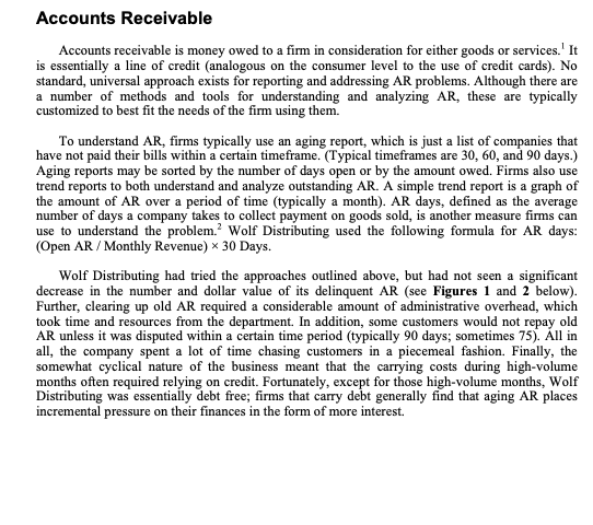
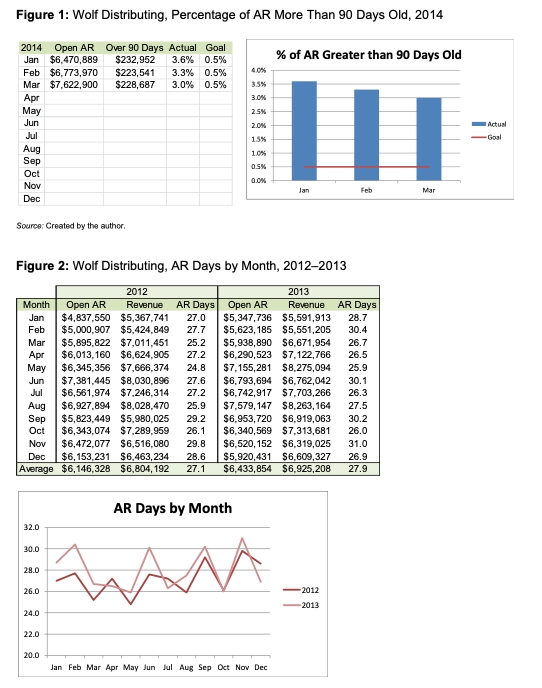
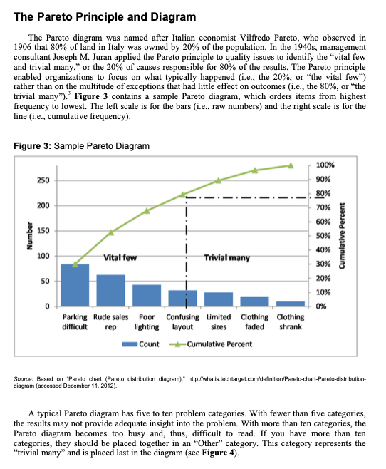
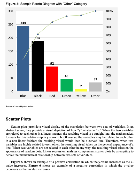
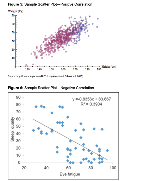
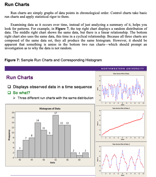
1. Using the invoice data in the Reducing Delinquent AR Exhibit 1 spreadsheet accompanying this case, create a Pareto diagram with the following groupings: a. Group the data by collector. Does this data help provide you with any insight into the problem? If so, what are some potential (corrective) actions? b. Group the data by sales representative. Does this data help provide you with any insight into the problem? If so, what are some potential (corrective) actions? c. Group the data by chain name. Does this data help provide you with any insight into the problem? If so, what are some potential (corrective) actions? Accounts Receivable Accounts receivable is money owed to a firm in consideration for either goods or services.' It is essentially a line of credit (analogous on the consumer level to the use of credit cards). No standard, universal approach exists for reporting and addressing AR problems. Although there are a number of methods and tools for understanding and analyzing AR, these are typically customized to best fit the needs of the firm using them. To understand AR, firms typically use an aging report, which is just a list of companies that have not paid their bills within a certain timeframe. (Typical timeframes are 30, 60, and 90 days.) Aging reports may be sorted by the number of days open or by the amount owed. Firms also use trend reports to both understand and analyze outstanding AR. A simple trend report is a graph of the amount of AR over a period of time (typically a month). AR days, defined as the average number of days a company takes to collect payment on goods sold, is another measure firms can use to understand the problem. Wolf Distributing used the following formula for AR days: (Open AR / Monthly Revenue) 30 Days. Wolf Distributing had tried the approaches outlined above, but had not seen a significant decrease in the number and dollar value of its delinquent AR (see Figures 1 and 2 below). Further, clearing up old AR required a considerable amount of administrative overhead, which took time and resources from the department. In addition, some customers would not repay old AR unless it was disputed within a certain time period (typically 90 days; sometimes 75). All in all, the company spent a lot of time chasing customers in a piecemeal fashion. Finally, the somewhat cyclical nature of the business meant that the carrying costs during high-volume months often required relying on credit. Fortunately, except for those high-volume months, Wolf Distributing was essentially debt free; firms that carry debt generally find that aging AR places incremental pressure on their finances in the form of more interest. Figure 1: Wolf Distributing, Percentage of AR More Than 90 Days Old, 2014 2014 Open AR Over 90 Days Actual Goal Jan $6,470,889 $232,952 3.6% 0.5% % of AR Greater than 90 Days Old Feb $6,773,970 Mar $7,622,900 $223,541 $228,687 3.3% 0.5% 3.0% 0.5% 4.0% 3.5% 3.0% Apr May 2.5% Jun 2.0% 1.5% Aug Sep Oct Nov Dec 1.0% 0.5% 0.0% Jan Feb Mar Source: Created by the author. Figure 2: Wolf Distributing, AR Days by Month, 2012-2013 AR Days 28.7 30.4 Revenue $5,347,736 $5,591,913 $5,623,185 $5,551,205 $5,938,890 $6,671,954 $6,290,523 $7,122,766 26.5 Apr May Jun Jul Aug Sep 2012 Month Open AR Revenue Jan $4,837,550 $5,367,741 Feb $5,000,907 $5,424,849 27.7 Mar $5,895,822 $7,011,451 25.2 $6,013,160 $6,624,905 27.2 $6,345,356 $7,666,374 24.8 $7,381,445 $8,030,896 27.6 $6,561,974 $7,246,314 27.2 $6,927,894 $8,028,470 25.9 $5,823,449 $5,980,025 29.2 $6,343,074 $7,289,959 26.1 2013 AR Days Open AR 27.0 Oct Nov $6,472,077 $6,516,080 29.8 Dec $6,153,231 $6,463,234 28.6 Average $6,146,328 $6,804,192 27.1 32.0 30.0 26.7 $7,155,281 $8,275,094 25.9 $6,793,694 $6,762,042 30.1 $6,742,917 $7,703,266 26.3 $7,579,147 $8,263,164 27.5 $6,953,720 $6,919,063 30.2 $6,340,569 $7,313,681 26.0 $6,520,152 $6,319,025 31.0 $5,920,431 $6,609,327 26.9 $6,433,854 $6,925,208 27.9 AR Days by Month ELAMA 28.0 26.0 -2012 -2013 24.0 22.0 20.0 Jan Feb Mar Apr May Jun Jul Aug Sep Oct Nov Dec Actual -Goal Number The Pareto Principle and Diagram The Pareto diagram was named after Italian economist Vilfredo Pareto, who observed in 1906 that 80% of land in Italy was owned by 20% of the population. In the 1940s, management consultant Joseph M. Juran applied the Pareto principle to quality issues to identify the "vital few and trivial many," or the 20% of causes responsible for 80% of the results. The Pareto principle enabled organizations to focus on what typically happened (i.e., the 20%, or "the vital few") rather than on the multitude of exceptions that had little effect on outcomes (i.e., the 80%, or "the trivial many"). Figure 3 contains a sample Pareto diagram, which orders items from highest frequency to lowest. The left scale is for the bars (i.e., raw numbers) and the right scale is for the line (i.e., cumulative frequency). Figure 3: Sample Pareto Diagram 100% 90% 250 80% 200 70% 60% 150 50% 40% 100 Vital few Trivial many 30% 50 50 20% 10% 0 0% Parking Rude sales Poor Confusing Limited Clothing Clothing difficult lighting layout sizes faded shrank rep Count Cumulative Percent Source: Based on "Pareto chart (Pareto distribution diagram)," http://whatis.techtarget.com/definition/Pareto-chart-Pareto-distribution- diagram (accessed December 11, 2012). A typical Pareto diagram has five to ten problem categories. With fewer than five categories, the results may not provide adequate insight into the problem. With more than ten categories, the Pareto diagram becomes too busy and, thus, difficult to read. If you have more than ten categories, they should be placed together in an "Other" category. This category represents the "trivial many" and is placed last in the diagram (see Figure 4). Cumulative Percent Figure 4: Sample Pareto Diagram with "Other" Category 300 244 250 100% 90% 80% 70% 200 187 60% 150 50% 40% 100 42 92 30% 45 20% 50 33 10% 7 0 0% Blue Black Red Green Yellow Other Source: Created by the author. Scatter Plots Scatter plots provide a visual display of the correlation between two sets of variables. In an abstract sense, they provide a visual depiction of how "y" relates to "x." When the two variables are related to each other in a linear manner, the resulting visual is a straight line; the mathematical formula for this relationship is y = mx + b. Of course, the variables may be related to each other in a non-linear fashion; the resulting visual would then be a curved line. Therefore, when two variables are highly related to each other, the resulting visual takes on the general appearance of a line. When two variables are not related to each other in any way, the resulting visual takes on the appearance of random dots. Linear regression analyses complement scatter plots by attempting to derive the mathematical relationship between two sets of variables. Figure 5 shows an example of a positive correlation in which the y-value increases as the x- value increases. Figure 6 shows an example of a negative correlation in which the y-value decreases as the x-value increases. Figure 5: Sample Scatter Plot-Positive Correlation Weight (Kg) 90 80 70 60 50 40 130 140 150 160 170 180 Height (cm) 190 Source: http://stack.imgur.com/RnTHI.png (accessed February 6, 2015). Figure 6: Sample Scatter Plot-Negative Correlation 90 y=-0.8356x+83.667 Sleep quality 80 70 60 50 282852322 40 30 20 10 0 20 20 40 40 R2 = 0.3904 60 80 100 Eye fatigue Run Charts Run charts are simply graphs of data points in chronological order. Control charts take basic run charts and apply statistical rigor to them. Examining data as it occurs over time, instead of just analyzing a summary of it, helps you look for patterns. For example, in Figure 7, the top right chart displays a random distribution of data. The middle right chart shows the same data, but there is a linear relationship. The bottom right chart also uses the same data, this time in a cyclical relationship. Because all three charts are composed of the same data set, they all produce the same histogram. However, it should be apparent that something is amiss in the bottom two run charts which should prompt an investigation as to why the data is not random. Figure 7: Sample Run Charts and Corresponding Histogram Run Charts Displays observed data in a time sequence So what? Three different run charts with the same distribution Histogram of Data Frequency 18- 16- 14 " 14- 13 13 12- 10- 40 8. I Data 52 2 60 NORTHWESTERN UNIVERSITY Time Series Plot of Data 2 Time Series Plot of Data 3
Step by Step Solution
There are 3 Steps involved in it
Step: 1

Get Instant Access to Expert-Tailored Solutions
See step-by-step solutions with expert insights and AI powered tools for academic success
Step: 2

Step: 3

Ace Your Homework with AI
Get the answers you need in no time with our AI-driven, step-by-step assistance
Get Started


