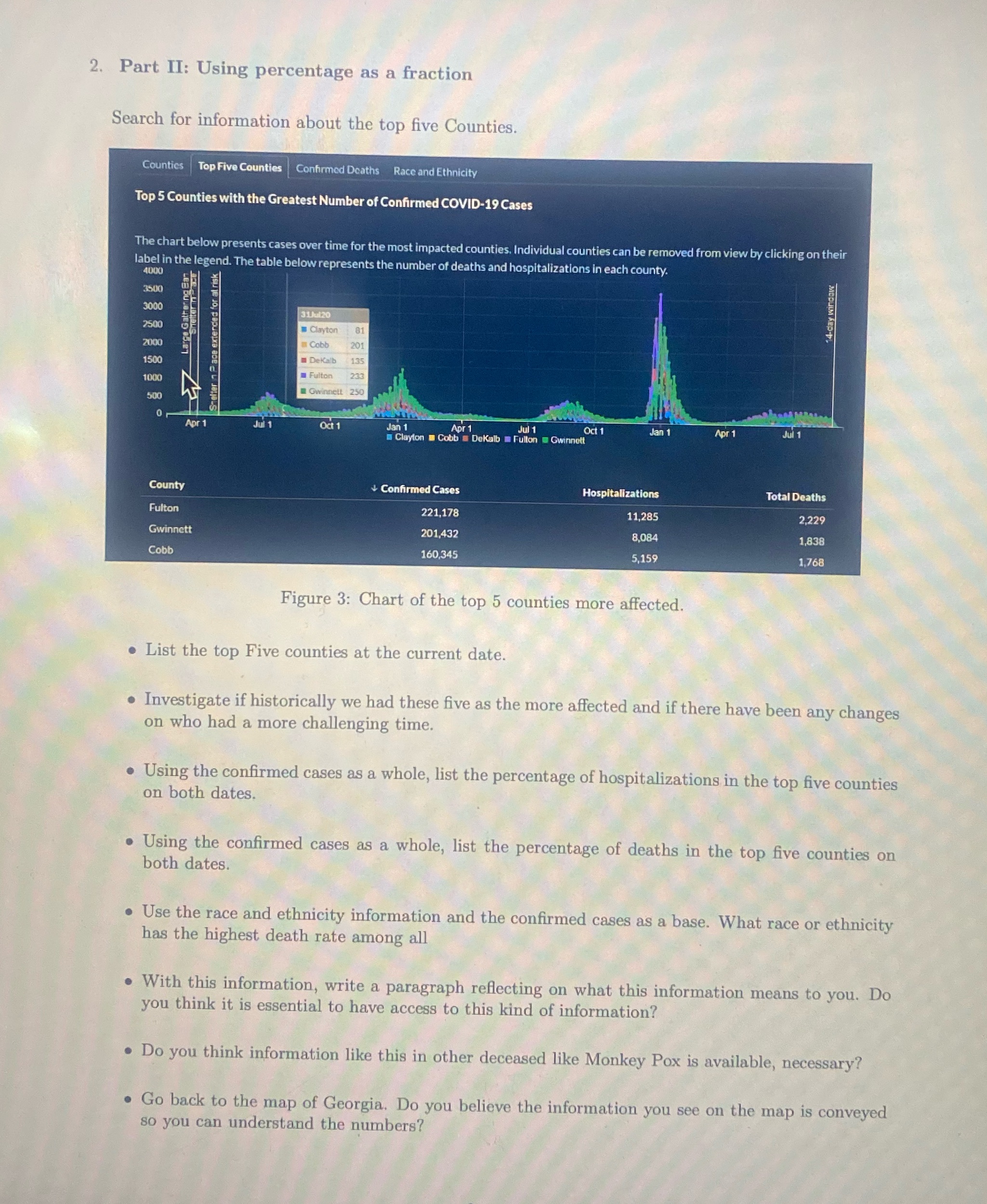
2. Part II: Using percentage as a fraction Search for information about the top five Counties. Counties Top Five Counties Confirmed Deaths Race and Ethnicity Top 5 Counties with the Greatest Number of Confirmed COVID-19 Cases The chart below presents cases over time for the most impacted counties. Individual counties can be removed from view by clicking on their label in the legend. The table below represents the number of deaths and hospitalizations in each county. 4000 3500 14-day window 31Jul20 2500 Clayton 81 Large Gat 2000 Smelter 7 2 ace extended for at risk Cobb 201 1500 Dekalb 1000 Fulton 233 " Gwinnett 250 500 Aor 1 Jui 1 Oct 1 Jul 1 Oct 1 Jan 1 Apr 1 Jul 1 Clayton = Cobb = Dekalb Fulton = Gwinnett County & Confirmed Cases Hospitalizations Total Deaths Fulton 221,178 11,285 2,229 Gwinnett 201,432 8,084 1,838 Cobb 160,345 5,159 1,768 Figure 3: Chart of the top 5 counties more affected. . List the top Five counties at the current date. . Investigate if historically we had these five as the more affected and if there have been any changes on who had a more challenging time. . Using the confirmed cases as a whole, list the percentage of hospitalizations in the top five counties on both dates. . Using the confirmed cases as a whole, list the percentage of deaths in the top five counties on both dates. . Use the race and ethnicity information and the confirmed cases as a base. What race or ethnicity has the highest death rate among all . With this information, write a paragraph reflecting on what this information means to you. Do you think it is essential to have access to this kind of information? . Do you think information like this in other deceased like Monkey Pox is available, necessary? . Go back to the map of Georgia. Do you believe the information you see on the map is conveyed so you can understand the numbers