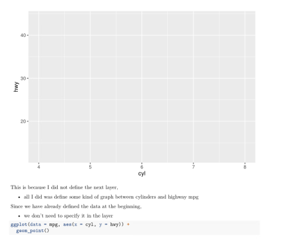
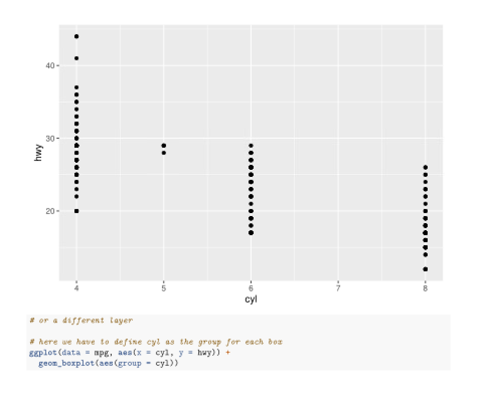
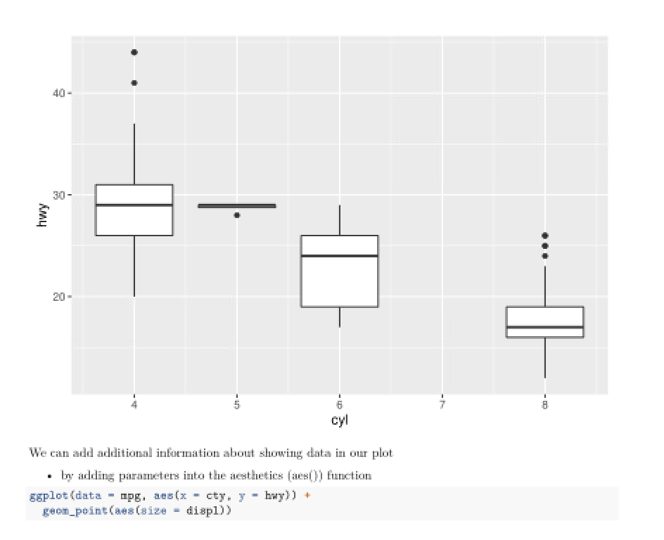
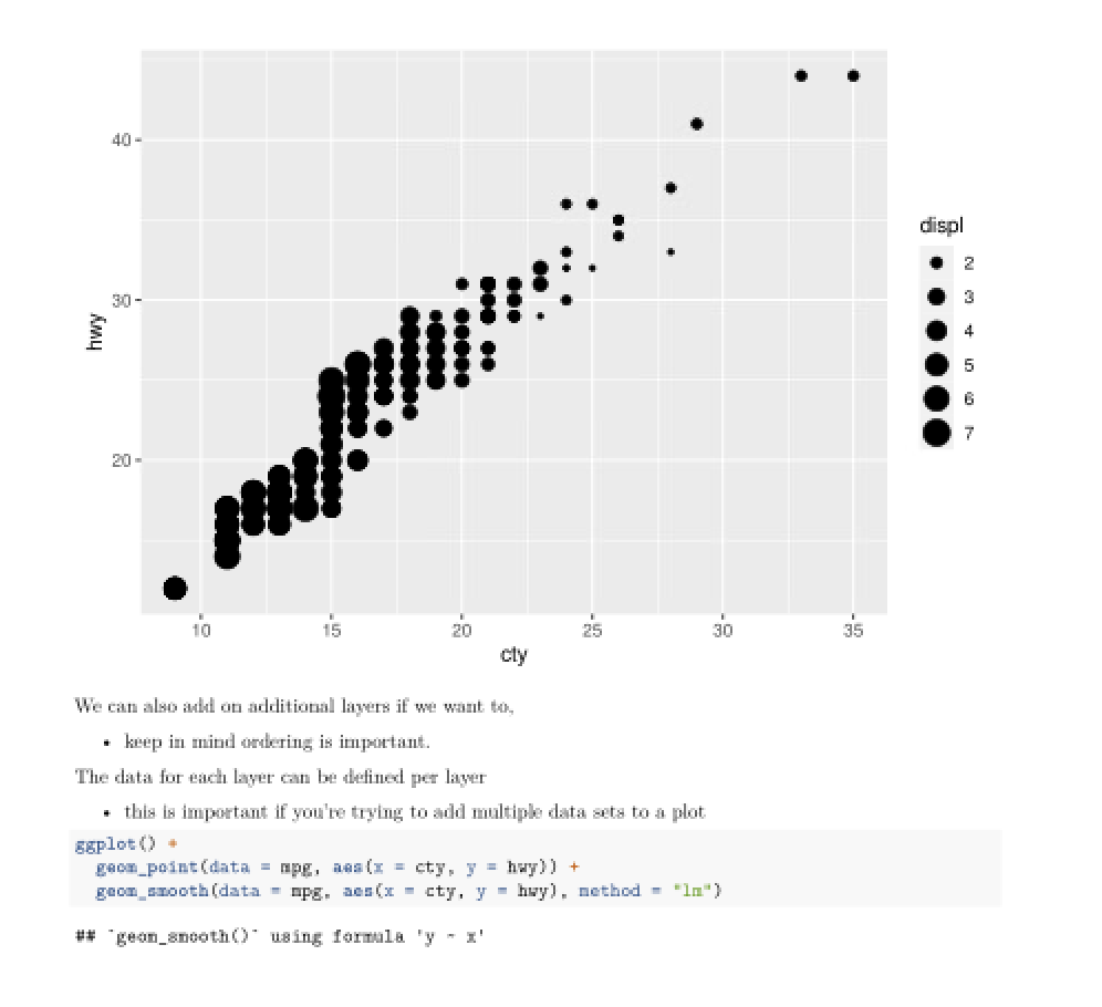
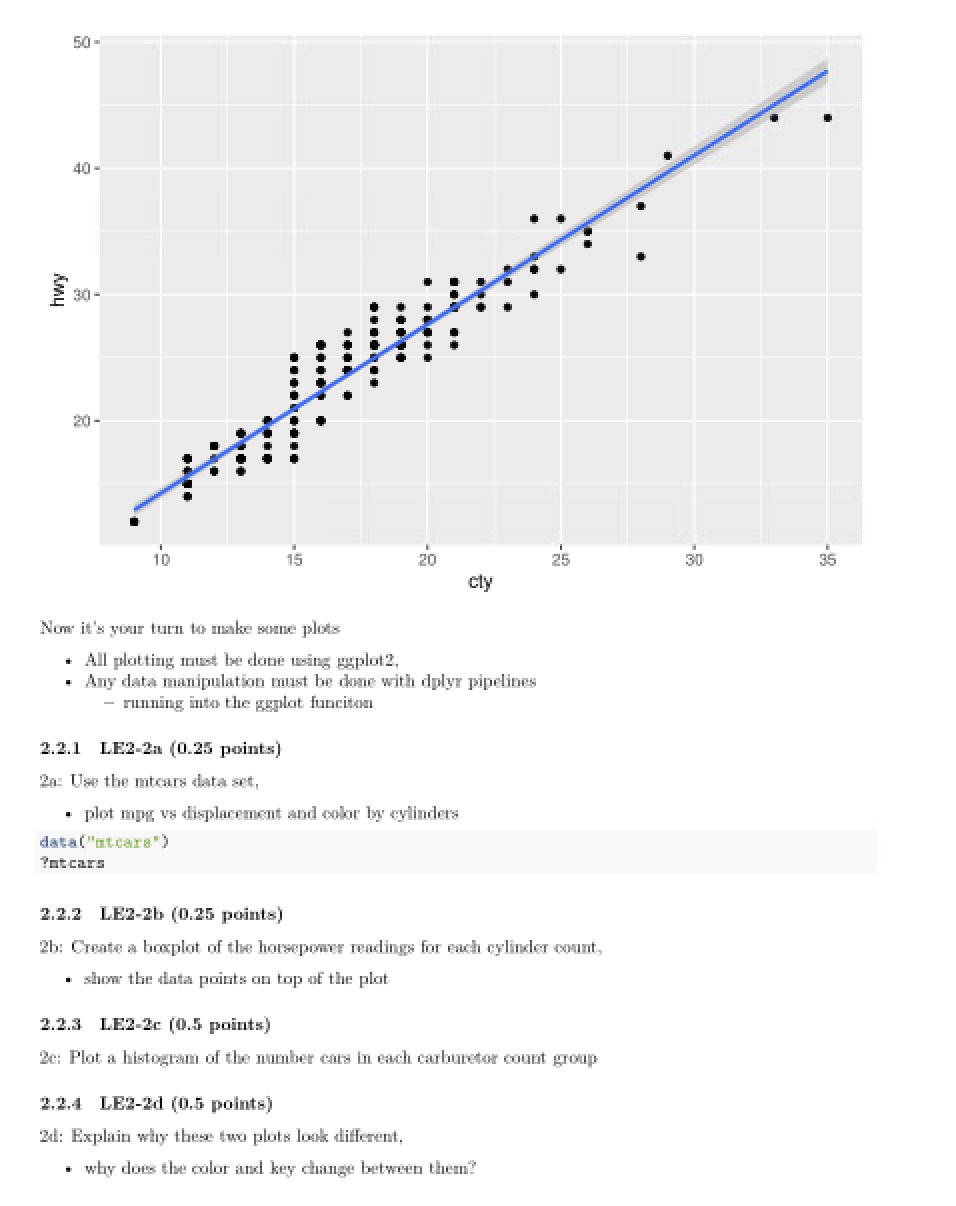
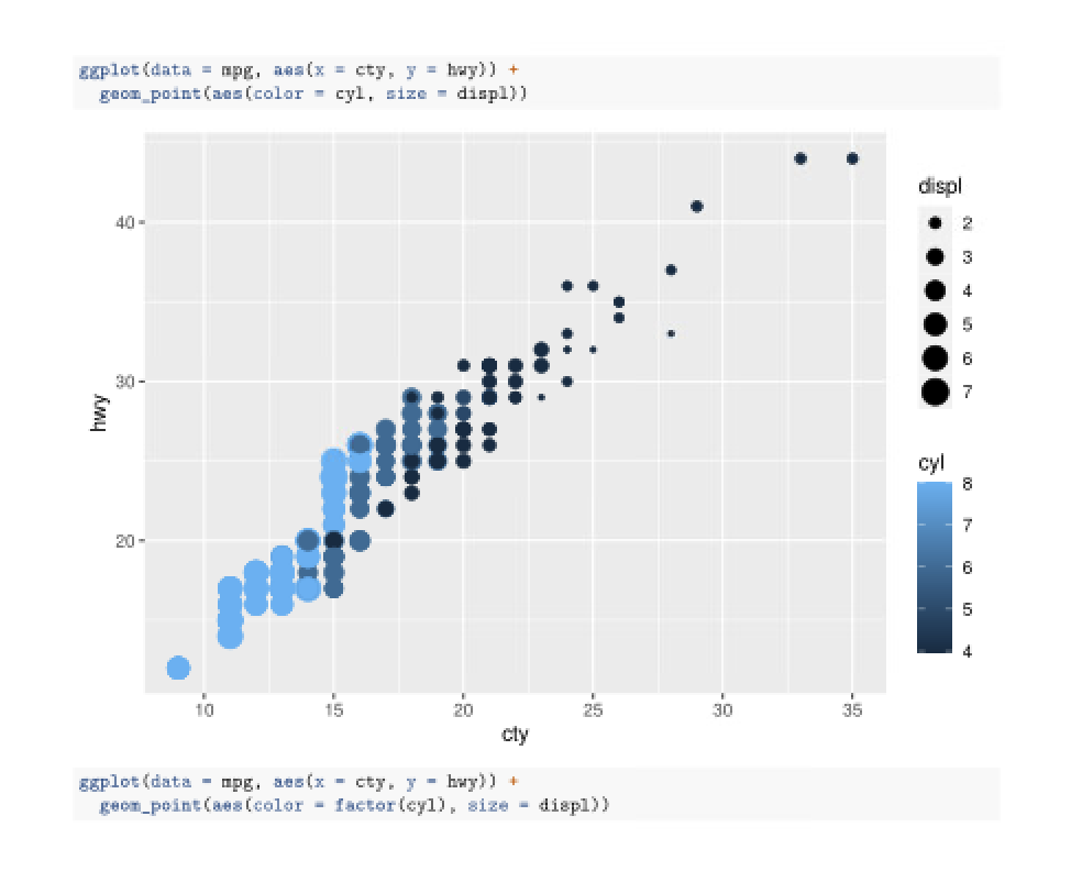
2.1.2 LE2-1b (1.5 points) Now lets try this with a real world time series. We'll be using one month of power and weather data from a solar power plant. The data set variables are as follows: . time: The timestamp at which the data was taken ghir: Global Horizontal Irradiance from a sensor at the site, - the power from the sunlight over an area normal to the surface of the earth (Watts/m?) iacp: The AC power from the power plant (*W) . temp: The air temperature (Celsius) ghi_solargis: The Global Horizontal Irradiance, not from a sensor, - but predicted using weather modeling (Watts/m ) . clear: A logical indicating whether the sky was "clear" during measurement, - determined by comparing the ghi and ghi_solargis data . ratio: the ratio of the Global Horizontal Irradiance - and the Plane of Array Irradiance (the irradiance normal to the surface of a tilted module) The power from solar panels is dependent on the irradiance hitting it. . so a power reading is often meaningless without a corresponding irradiance measurement. It is useful to have multiple sources of irradiance measurements. Sensors on the ground are useful because . they strongly represent the irradiance that is hitting the modules . however, sensors can begin to drift if not cleaned or calibrated properly. An unstable sensor can render an entire data set useless. To combat this, we also have irradiance data from SolarGIS, a company that uses satellite images to model and predict . the irradiance at the surface of the earth. . Plot the irradiance and power for the first week of data, - how does the irradiance look compared to what you would expect from the trend of sunlight? - How well does the power and irradiance match up?' # Read in the data and get a look at the structure # Find total length of dataget # Find the time interval # Plot the arradiance and power for the first week " Entire dataset to in 15-minute increments * Power plot over time # Both sources of irradianceANSWER: # All 3 Lines on the same plot with a secondary aris ANSWER: . Use the ts() functions and the stiplus() function from the stiplus package - to decompose the sensor and SolarGIS itradiance and the power for the whole month. - Plot each of the decompositions, what do you notice? # think carefully about the frequency you'll need to define for this data # what is the seasonal component to this date and how many data points make up a season? I use s window = "periodic" for the atlplus function library (atlplus) ?at1plus () ## starting httpd help server ... done ANSWER: . Lolate the trends for the 3 time series you just decomposed - and build a linear model for each one. . Compare the models to each other, how are they different? ANSWER: . Solar panel degradation leads to less power output over time - at the same irradiance conditions. . Based on the linear models you found for the trends of power and itradiance, - this system degrading over time? . How do the sensor GHI and the SolarGIS GHI compare to power? ANSWER: 2.2 LE2-2. ggplot?: (1.5 points) guplot? is a package for making plots from data. It provides tools for making complex and detailed graphs. ggplot2 builds graphs in layers. . where first the graph must be specified, . then layers are added to the plot using the '+' operator. In this example nothing appears in the plot library (ggplot2) data("opg") ggplot (data = mpg, aes(x = cyl, y = huy) )40 - 30 hwy 20 an - cyl This is because I did not define the next layer, . all I did was define some kind of graph between cylinders and highway mpg Since we have alresuly defined the data at the beginning. . we don't need to specify it in the layer ggplot (data = mpg. aes (x = cyl. y = huy) ) + goom_point ()40 - 30- hwy 20 - cn - cyl # or a different layer # here we have to define cyl as the group for each box ggplot (data = mpg, nos (x = cyl, y = huy) ) + geon_boxplot (aes (group = cyl))40 - 30 - hwy 20 - cn - CO - cyl We can add additional information about showing data in our plot . by adding parameters into the aesthetics (aes()) function ggplot (data = mpg, aes (x = cty, y = huy)) + grom_point (aes (size = displi)40 - displ 30 - hwy 5 6 210 10 15 20 25 30 35 cly We can also add on additional layers if we want to, . keep in mind ordering is important. The data for each layer can be defined per layer . this is important if you're trying to add multiple data sets to a plot ggplot () + goom_point (data = mpg, aes (x = cty, y = huy) ) + goon_smooth (data = mpg. acs(x = cty, y = hwy), method = "In" ) ## "geon_smooth()" using formula 'y = x'hwy 30 20 - 10 15 20 30 35 cty Now it's your turn to make some plots . All plotting must be done using gaplot2, . Any data manipulation must be done with dplyr pipelines - running into the ggplot funciton 2.2.1 LE2-2a (0.25 points) 20 Use the micars data set, . plot mpg vs displacement and color by cylinders data ("atcars") ?at cars 2.2.2 LE2-26 (0.25 points) 2b: Create a boxplot of the horsepower readings for each cylinder count, . show the data points on top of the plat 2.2.3 LE2-2c (0.5 points) 2c: Plot a histogram of the number cars in each carburetor count group 2.2.4 LE2-2d (0.5 points) 2d: Explain why these two plots look different, . why does the color and key change between them?ggplot (data = mpg, mom(x = cty, y = huy) ) + goon_point (aes (color = cyl, size = displj displ 40 - N 4 S 6 20 - hwy cyl 20 - 5 10 15 20 25 30 35 cty ggplot (data = mpg, aes (x = cty, y = hwy) ) + geom_point (ass (color = factor(cyl), size = displi)
