Answered step by step
Verified Expert Solution
Question
1 Approved Answer
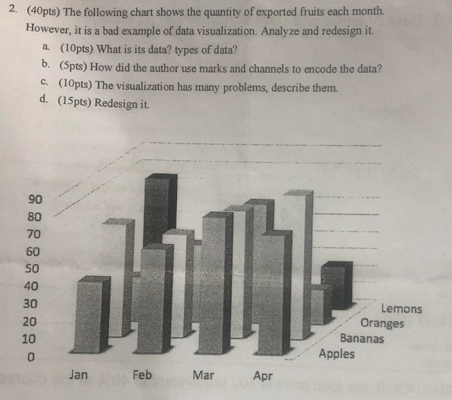
( 4 0 pts ) The following chart shows the quantity of exported fruits each month. However, it is a bad example of data visualization.
pts The following chart shows the quantity of exported fruits each month.
However, it is a bad example of data visualization. Analyze and redesign it
apts What is its data? types of data?
bpts How did the author use marks and channels to encode the data?
cpts The visualization has many problems, describe them.
dpts Redesign it
Step by Step Solution
There are 3 Steps involved in it
Step: 1

Get Instant Access to Expert-Tailored Solutions
See step-by-step solutions with expert insights and AI powered tools for academic success
Step: 2

Step: 3
Ace Your Homework with AI
Get the answers you need in no time with our AI-driven, step-by-step assistance
Get Started