Answered step by step
Verified Expert Solution
Question
1 Approved Answer
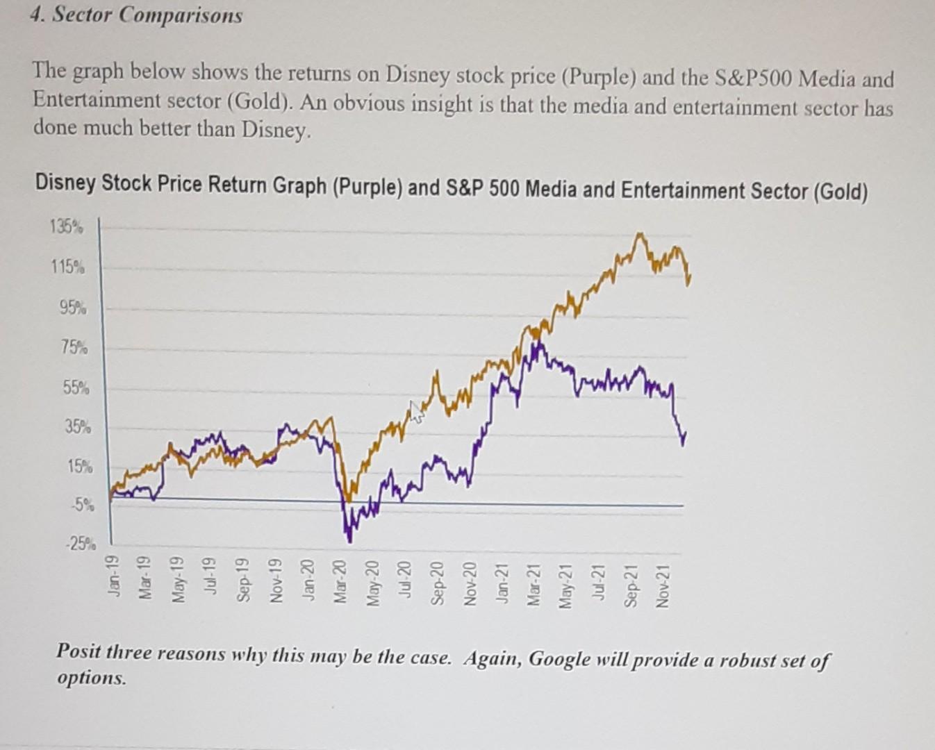
4. Sector Comparisons The graph below shows the returns on Disney stock price (Purple) and the S&P500 Media and Entertainment sector (Gold). An obvious insight


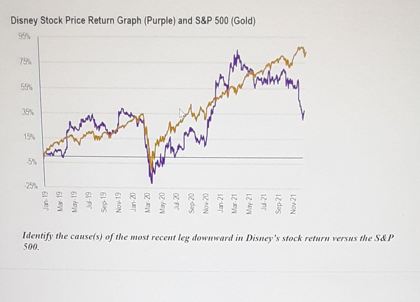
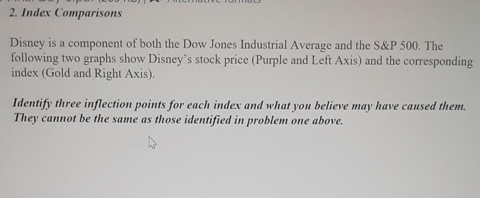
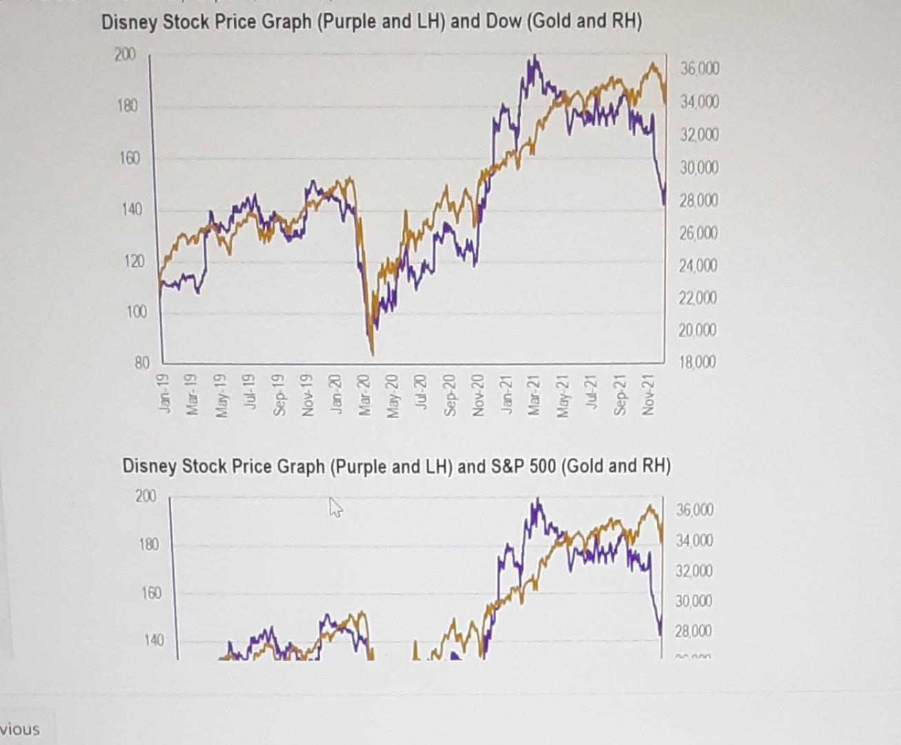
4. Sector Comparisons The graph below shows the returns on Disney stock price (Purple) and the S&P500 Media and Entertainment sector (Gold). An obvious insight is that the media and entertainment sector has done much better than Disney. Disney Stock Price Return Graph (Purple) and S&P 500 Media and Entertainment Sector (Gold) 135% 115% pl 95% hostes 75 mo 55% bruch ammy 35% 15% -5% -25% try Jan-19 Mar-19 May-19 Jul-19 Sep-19 Nov-19 Jan 20 Mar-20 May-20 Jul 20 Sep-20 Nov-20 Jan-21 Mar-21 May 21 Jul-21 Sep 21 Nov-21 Posit three reasons why this may be the case. Again, Google will provide a robust set of options. Disney Stock Price Return Graph (Purple) and S&P 500 (Gold) 95% 75% hanlar 55% 35% man 15% ter 5% -25% Jul-19 Sep 19 Nov-19 Jan-20 Mar-20 Jul-20 Sep-20 Identify the cause(s) of the most recent leg downward in Disney's stock return versus the S&P 500. 2. Index Comparisons Disney is a component of both the Dow Jones Industrial Average and the S&P 500. The following two graphs show Disney's stock price (Purple and Left Axis) and the corresponding index (Gold and Right Axis). Identify three inflection points for each index and what you believe may have caused them. They cannot be the same as those identified in problem one above. Disney Stock Price Graph (Purple and LH) and Dow (Gold and RH) 200 36000 180 34,000 hahr 32000 160 30,000 28.000 140 26000 120 100 24,000 22000 20,000 18,000 80 Jan-19 Mar-19 May-19 Jul-19 Sep-19 Nov-19 Jan-20 Mar 20 May-20 Jul-20 Sep-20 Nov-20 Jan-21 Mar 21 May 21 Jul-21 Sep-21 Nov-21 Disney Stock Price Graph (Purple and LH) and S&P 500 (Gold and RH) 200 36.000 180 34.000 32000 160 30.000 Cathy 28.000 140 vious 4. Sector Comparisons The graph below shows the returns on Disney stock price (Purple) and the S&P500 Media and Entertainment sector (Gold). An obvious insight is that the media and entertainment sector has done much better than Disney. Disney Stock Price Return Graph (Purple) and S&P 500 Media and Entertainment Sector (Gold) 135% 115% pl 95% hostes 75 mo 55% bruch ammy 35% 15% -5% -25% try Jan-19 Mar-19 May-19 Jul-19 Sep-19 Nov-19 Jan 20 Mar-20 May-20 Jul 20 Sep-20 Nov-20 Jan-21 Mar-21 May 21 Jul-21 Sep 21 Nov-21 Posit three reasons why this may be the case. Again, Google will provide a robust set of options. Disney Stock Price Return Graph (Purple) and S&P 500 (Gold) 95% 75% hanlar 55% 35% man 15% ter 5% -25% Jul-19 Sep 19 Nov-19 Jan-20 Mar-20 Jul-20 Sep-20 Identify the cause(s) of the most recent leg downward in Disney's stock return versus the S&P 500. 2. Index Comparisons Disney is a component of both the Dow Jones Industrial Average and the S&P 500. The following two graphs show Disney's stock price (Purple and Left Axis) and the corresponding index (Gold and Right Axis). Identify three inflection points for each index and what you believe may have caused them. They cannot be the same as those identified in problem one above. Disney Stock Price Graph (Purple and LH) and Dow (Gold and RH) 200 36000 180 34,000 hahr 32000 160 30,000 28.000 140 26000 120 100 24,000 22000 20,000 18,000 80 Jan-19 Mar-19 May-19 Jul-19 Sep-19 Nov-19 Jan-20 Mar 20 May-20 Jul-20 Sep-20 Nov-20 Jan-21 Mar 21 May 21 Jul-21 Sep-21 Nov-21 Disney Stock Price Graph (Purple and LH) and S&P 500 (Gold and RH) 200 36.000 180 34.000 32000 160 30.000 Cathy 28.000 140 vious
Step by Step Solution
There are 3 Steps involved in it
Step: 1

Get Instant Access to Expert-Tailored Solutions
See step-by-step solutions with expert insights and AI powered tools for academic success
Step: 2

Step: 3

Ace Your Homework with AI
Get the answers you need in no time with our AI-driven, step-by-step assistance
Get Started


