9. Click and drag the equation and r-squared value on the chart to the top of the chart and place them to the right of
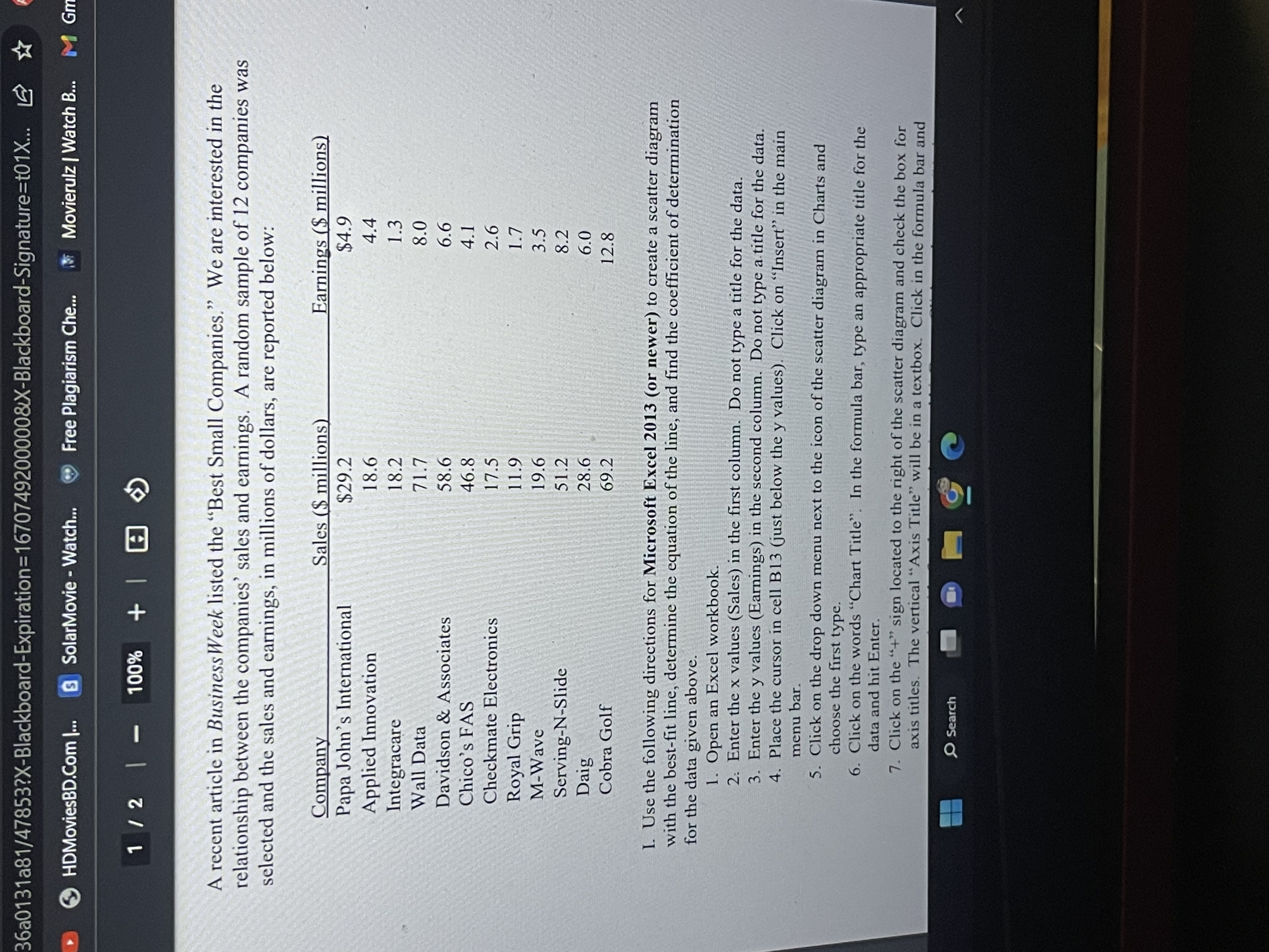
9. Click and drag the equation and r-squared value on the chart to the top of the chart and place them to the right of the chart title (to make it easier to read the equation and r-squared value). II. Find r, the correlation coefficient, using Excel for the data above: 1. On the same worksheet, place the cursor in a free cell and type "r =". Move the cursor to the next cell to the right. 2. On the formula bar, click on fx (insert function). 3. In the "Or select a category" window, choose "Statistical". 4. In the "Select a function" window, choose "correl". Click OK. 4. With the cursor in the "Array 1" dialogue box, highlight the x-values (in column A). 5. Click in the "Array 2" dialogue box, highlight the y-values (in column B). 7. Click on "OK". 6. In the cell highlighted, you now have the value of r, the correlation coefficient. III. Based on the equation found on your scatter diagram, use a calculator to answer the question below. Type the answer, using a complete sentence, in the cell below the cell containing the correlation coefficient. 1. If a company has sales of $31.2 million dollars, what does the least-squares equation forecast for the earnings? SearchX Bb 47853 X Bb 47853 X Bb Take Test: Homework - Cha X 31a81/47853?X-Blackboard-Expiration=16707492000008X-Blackboard-Signature=t01X... ABP HDMoviesBD.Com |... S SolarMovie - Watch... Free Plagiarism Che.. Movieruiz | Watch B... M Gmail 2/2 | - 100% + 7. Click on the "+" sign located to the right of the scatter diagram and check the box for axis titles. The vertical "Axis Title" will be in a textbox. Click in the formula bar and type an appropriate title for the vertical axis and hit Enter. Click on the words "Axis Title" located below the horizontal axis of the scatter diagram. Click in the formula bar and type an appropriate title for the horizontal axis and hit Enter. 8. Click on the "+" sign again and check the box for Trendline. Click on the arrow located to the right of the word "Trendline" and click on "More Options". Check the last two boxes for "Display equation on chart" and "Display r-squared value on chart". Close the "Format Trendline" window. 9. Click and drag the equation and r-squared value on the chart to the top of the chart and place them to the right of the chart title (to make it easier to read the equation and r-squared value). II. Find r, the correlation coefficient, using Excel for the data above: 1. On the same worksheet, place the cursor in a free cell and type "r=". Move the cursor to the next cell to the right. 2. On the formula bar, click on fx (insert function). 3. In the "Or select a category" window, choose "Statistical". 4. In the "Select a function" window, choose "correl". Click OK. 4. With the cursor in the "Array 1" dialogue box, highlight the x-values (in column A). 5. Click in the "Array 2" dialogue box, highlight the y-values (in column B). 7. Search G36a0131a81/47853?X-Blackboard-Expiration=1670749200000&X-Blackboard-Signature=t01X... D HDMoviesBD.Com |... SolarMovie - Watch... Free Plagiarism Che.. Movieruiz | Watch B... M G 1/2 | - 100% + 1 A recent article in Business Week listed the "Best Small Companies." We are interested in the relationship between the companies' sales and earnings. A random sample of 12 companies was selected and the sales and earnings, in millions of dollars, are reported below: Company Sales ($ millions) Earnings ($ millions) Papa John's International $29.2 $4.9 Applied Innovation 18.6 4.4 Integracare 18.2 1.3 Wall Data 71.7 8.0 Davidson & Associates 58.6 6.6 Chico's FAS 46.8 4.1 Checkmate Electronics 17.5 2.6 Royal Grip 1 1.9 1.7 M-Wave 19.6 3.5 Serving-N-Slide 51.2 8.2 Daig 28.6 6.0 Cobra Golf 69.2 12.8 I. Use the following directions for Microsoft Excel 2013 (or newer) to create a scatter diagram with the best-fit line, determine the equation of the line, and find the coefficient of determination for the data given above. 1. Open an Excel workbook. 2: Enter the x values (Sales) in the first column. Do not type a title for the data. 3. Enter the y values (Earnings) in the second column. Do not type a title for the data. 4. Place the cursor in cell B13 (just below the y values). Click on "Insert" in the main menu bar. 5. Click on the drop down menu next to the icon of the scatter diagram in Charts and choose the first type. 6. Click on the words "Chart Title". In the formula bar, type an appropriate title for the data and hit Enter. 7. Click on the "+" sign located to the right of the scatter diagram and check the box for axis titles. The vertical "Axis Title" will be in a textbox. Click in the formula bar and Search
Step by Step Solution
There are 3 Steps involved in it
Step: 1
Get Instant Access to Expert-Tailored Solutions
See step-by-step solutions with expert insights and AI powered tools for academic success
Step: 2
Step: 3
Ace Your Homework with AI
Get the answers you need in no time with our AI-driven, step-by-step assistance