Answered step by step
Verified Expert Solution
Question
1 Approved Answer
Adding text balloon: Add a text balloon that shows the names of the four big hospitals in Minneapolis, MN . For simplicity, let's call them
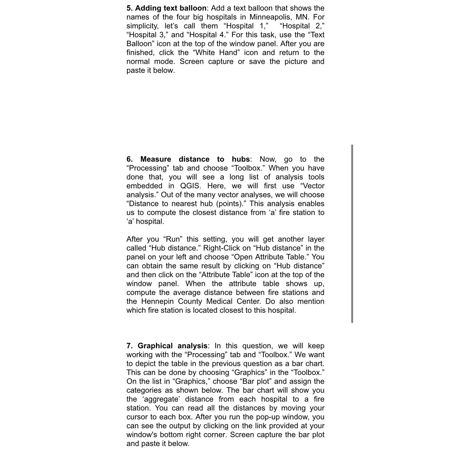
Adding text balloon: Add a text balloon that shows the names of the four big hospitals in Minneapolis, MN For simplicity, let's call them "Hospital "Hospital "Hospital and "Hospital For this task, use the "Text Balloon" icon at the top of the window panel. After you are finished, click the "White Hand" icon and return to the normal mode. Screen capture or save the picture and paste it below.
Measure distance to hubs: Now, go to the "Processing" tab and choose "Toolbox." When you have done that, you will see a long list of analysis tools embedded in QGIS. Here, we will first use "Vector analysis." Out of the many vector analyses, we will choose "Distance to nearest hub points This analysis enables us to compute the closest distance from a fire station to a hospital.
After you "Run" this setting, you will get another layer called "Hub distance." RightClick on "Hub distance" in the panel on your left and choose "Open Attribute Table." You can obtain the same result by clicking on "Hub distance" and then click on the "Attribute Table" icon at the top of the window panel. When the attribute table shows up compute the average distance between fire stations and the Hennepin County Medical Center. Do also mention which fire station is located closest to this hospital.
Graphical analysis: In this question, we will keep working with the "Processing" tab and "Toolbox." We want to depict the table in the previous question as a bar chart. This can be done by choosing "Graphics" in the "Toolbox." On the list in "Graphics," choose "Bar plot" and assign the categories as shown below. The bar chart will show you the 'aggregate' distance from each hospital to a fire station. You can read all the distances by moving your cursor to each box. After you run the popup window, you can see the output by clicking on the link provided at your window's bottom right corner. Screen capture the bar plot and paste it below.

Step by Step Solution
There are 3 Steps involved in it
Step: 1

Get Instant Access to Expert-Tailored Solutions
See step-by-step solutions with expert insights and AI powered tools for academic success
Step: 2

Step: 3

Ace Your Homework with AI
Get the answers you need in no time with our AI-driven, step-by-step assistance
Get Started


