

Question: Association rule mining is a rule-based machine learning method for discovering interesting relations between variables in large databases. It is intended to identify strong rules
Association rule mining is a rule-based machine learning method for discovering interesting relations between variables in large databases. It is intended to identify strong rules discovered in databases using some measures of interestingness.1 Your tasks are to:
1. Implement associated rule mining algorithms (NOTE: NO USE OF EXTERNAL PACKAGES for associated rule mining);
2. Apply your algorithms to the dataset that is provided together with this instruction;
3. Present the outcomes of your algorithms on the dataset;
Your implementation will be assessed based on the following aspects:
1. Basic I/O: Implement basic I/O function that can read the data from the dataset and write the results to a le.
2. Frequent Item-set: Find all possible 2, 3, 4 and 5-itemsets given the parameter of minimum-support.
3. Associated Rule: Find all interesting association rules from the frequent item-sets given the parameter of minimum-confidence.
4. Apriori Algorithm: Use Apriori algorithm for finding frequent item-sets.
5. FP-Growth Algorithm: Use FP-Growth algorithm for finding frequent item-sets.
6. Experiment on the Dataset: Apply your associated rule mining algorithms to the dataset and show some interesting rules.
7. Reusability and Coding Style: The implementation should be well structured that can be easily maintained and ported to new applications. There should be sufficient comments for the essential parts to make the implementation easy to read and understand.
8. Run-Time Performance: The implementation should consider and evaluate the run-time performance of the algorithms. The efficiency and scalability should be considered and reflected in the implementation.
Source Code: Submit your Python3 Jupyter Notebook code
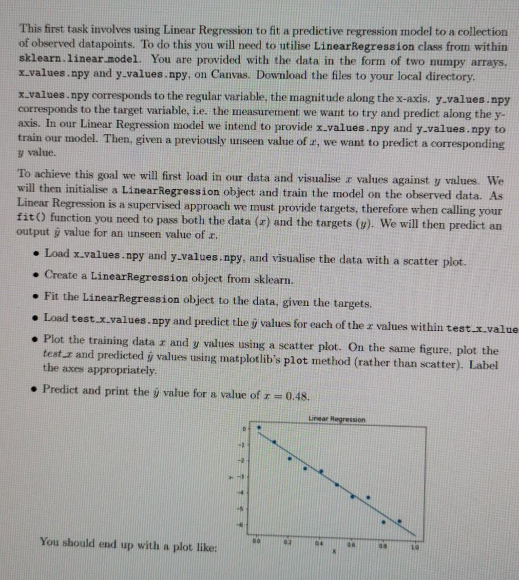
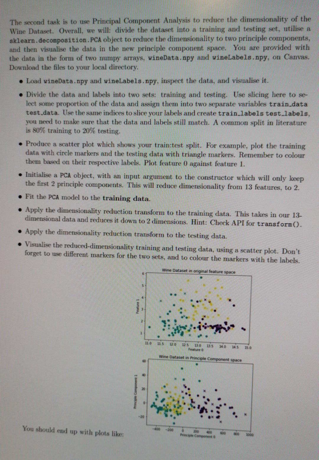
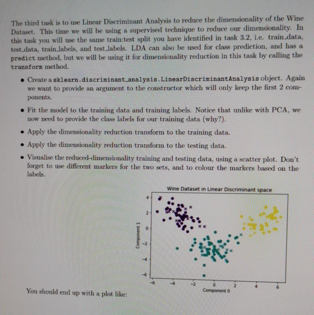

This first task involves using Linear Regression to fit a predictive regression model to a collection of observed datapoints. To do this you will need to utilise LinearRegression class from within sklearn.linear.model. You are provided with the data in the form of two numpy arrays, x_values.npy and y-values.npy, on Canvas, Download the files to your local directory. x_values.npy corresponds to the regular variable, the magnitude along the x-axis. y-values.npy corresponds to the target variable, i.e. the measurement we want to try and predict along the y- axis. In our Linear Regression model we intend to provide x_values.npy and y-values.npy to train our model. Then, given a previously unseen value of r, we want to predict a corresponding y value. To achieve this goal we will first load in our data and visualise z values against y values. We will then initialise a LinearRegression object and train the model on the observed data. As Linear Regression is a supervised approach we must provide targets, therefore when calling your fit() function you need to pass both the data (x) and the targets (y). We will then predict an output y value for an unseen value of . Load x_values.npy and y-values.npy, and visualise the data with a scatter plot. Create a LinearRegression object from sklearn. Fit the LinearRegression object to the data, given the targets. Load test x_values.npy and predict the y values for each of the r values within test x_value Plot the training data 1 and y values using a scatter plot. On the same figure, plot the test_r and predicted y values using matplotlib's plot method (rather than scatter). Label the axes appropriately. Predict and print the y value for a value of r = 0.48. Linear Regression You should end up with a plot like: 00 02 04 06 LO X The second task is to use Principal Component Analysis to reduce the dimensionality of the Wine Dataset. Overall, we will: divide the dataset into a training and testing set, utilise a sklearn.decomposition.PCA object to reduce the dimensionality to two principle components, and then visualise the data in the new principle component space. You are provided with the data in the form of two numpy arrays, wineData.npy and wineLabels.npy, on Canvas. Download the files to your local directory. Load wineData.npy and wineLabels.npy, inspect the data, and visualise it. Divide the data and labels into two sets: training and testing. Use slicing here to se- lect some proportion of the data and assign them into two separate variables train data test data. Use the same indices to slice your labels and create train_labels test_labels, you need to make sure that the data and labels still match. A common split in literature is 80% training to 20% testing. Produce a scatter plot which shows your train:test split. For example, plot the training data with circle markers and the testing data with triangle markers. Remember to colour them based on their respective labels. Plot feature 0 against feature 1. Initialise a PCA object, with an input argument to the constructor which will only keep the first 2 principle components. This will reduce dimensionality from 13 features, to 2. Fit the PCA model to the training data. Apply the dimensionality reduction transform to the training data. This takes in our 13- dimensional data and reduces it down to 2 dimensions. Hint: Check API for transform(). Apply the dimensionality reduction transform to the testing data. Visualise the reduced-dimensionality training and testing data, using a scatter plot. Don't forget to use different markers for the two sets, and to colour the markers with the labels. Wine Dataset in original feature space 5 Feature 1 110 120 125 131.0 Feature 135 140 145 15.0 Wine Dataset in Principle Component space 5 You should end up with plots like: 10 Princ Component The third task is to use Linear Discriminant Analysis to reduce the dimensionality of the Wine Dataset. This time we will be using a supervised technique to reduce our dimensionality. In this task you will use the same train:test split you have identified in task 3.2, i.e. train data, test_data, train_labels, and test labels. LDA can also be used for class prediction, and has a predict method, but we will be using it for dimensionality reduction in this task by calling the transform method. Create a sklearn.discriminant analysis.LinearDiscriminantAnalysis object. Again we want to provide an argument to the constructor which will only keep the first 2 com- ponents. Fit the model to the training data and training labels. Notice that unlike with PCA, we now need to provide the class labels for our training data (why?). Apply the dimensionality reduction transform to the training data. Apply the dimensionality reduction transform to the testing data. Visualise the reduced-dimensionality training and testing data, using a scatter plot. Don't forget to use different markers for the two sets, and to colour the markers based on the labels. Wine Dataset in Linear Discriminant space Component 1 -2 4 - 2 2 You should end up with a plot like: Component 0 The fourth task is to implement Principal Component Analysis by hand. We will perform the Singular Value Decomposition and project the data into the new principal component space, before visualising the data in the reduced dimensionality space. In this task you will use the same train:test split you have identified in task 3.2. i.e. train_data, test data, train_labels, and test labels Mean-centre the training data. To do this, you should identify the mean vector of the training data, and subtract that vector from the samples in the training data. You should save this mean vector, you will need it later for centring the test data. Calculate the Singular Value Decomposition of the mean-centred training data. You can do this with numpy.linalg.svd(), which returns the variables u, s and vh. The values returned by mumpy's svd are analogous to U, S and V? on slide 22 of the Dimensionality Reduction lecture. They form the linear system: X=USVT (4) where X is our mean-centred data. U is the left-singular vectors, S the singular values, and V the right-singular vectors. Project your data into a 2-dimensional Principle Component space. To do this you will need to select the first few significant eigenvectors of V? (see slide 23 for reasoning) and project our training data through this matrix with a matrix multiplication. You should be doing something along the lines of: projection matrix = vh(slice indices] projected train data - centred_train_data @ np. transpose (projection matrix) The slicing into vh selects our top significant eigenvectors, but why do we need the trans- pose? How can we tell that our dimensionality has been reduced? . Now that you have projected your training data into the principle component space, we will project the testing data. To do this we need to mean-centre the test data using the mean vector from the training data (why?), and we need to use the same projection matrix from before (why?). Visualise your projected training and testing data with a scatter plot. Don't forget to use different markers for the two sets, and to colour the markers based on the labels. Some questions to consider: 1. Why do we not compute a projection matrix and mean value for the testing sets? 2. Why does LDA give us nice distinct clusters for our Wine Dataset when PCA does not? 3. What benefit does dimensionality reduction provide? What are the drawbacks? 4. How could you use LDA to predict class labels? This first task involves using Linear Regression to fit a predictive regression model to a collection of observed datapoints. To do this you will need to utilise LinearRegression class from within sklearn.linear.model. You are provided with the data in the form of two numpy arrays, x_values.npy and y-values.npy, on Canvas, Download the files to your local directory. x_values.npy corresponds to the regular variable, the magnitude along the x-axis. y-values.npy corresponds to the target variable, i.e. the measurement we want to try and predict along the y- axis. In our Linear Regression model we intend to provide x_values.npy and y-values.npy to train our model. Then, given a previously unseen value of r, we want to predict a corresponding y value. To achieve this goal we will first load in our data and visualise z values against y values. We will then initialise a LinearRegression object and train the model on the observed data. As Linear Regression is a supervised approach we must provide targets, therefore when calling your fit() function you need to pass both the data (x) and the targets (y). We will then predict an output y value for an unseen value of . Load x_values.npy and y-values.npy, and visualise the data with a scatter plot. Create a LinearRegression object from sklearn. Fit the LinearRegression object to the data, given the targets. Load test x_values.npy and predict the y values for each of the r values within test x_value Plot the training data 1 and y values using a scatter plot. On the same figure, plot the test_r and predicted y values using matplotlib's plot method (rather than scatter). Label the axes appropriately. Predict and print the y value for a value of r = 0.48. Linear Regression You should end up with a plot like: 00 02 04 06 LO X The second task is to use Principal Component Analysis to reduce the dimensionality of the Wine Dataset. Overall, we will: divide the dataset into a training and testing set, utilise a sklearn.decomposition.PCA object to reduce the dimensionality to two principle components, and then visualise the data in the new principle component space. You are provided with the data in the form of two numpy arrays, wineData.npy and wineLabels.npy, on Canvas. Download the files to your local directory. Load wineData.npy and wineLabels.npy, inspect the data, and visualise it. Divide the data and labels into two sets: training and testing. Use slicing here to se- lect some proportion of the data and assign them into two separate variables train data test data. Use the same indices to slice your labels and create train_labels test_labels, you need to make sure that the data and labels still match. A common split in literature is 80% training to 20% testing. Produce a scatter plot which shows your train:test split. For example, plot the training data with circle markers and the testing data with triangle markers. Remember to colour them based on their respective labels. Plot feature 0 against feature 1. Initialise a PCA object, with an input argument to the constructor which will only keep the first 2 principle components. This will reduce dimensionality from 13 features, to 2. Fit the PCA model to the training data. Apply the dimensionality reduction transform to the training data. This takes in our 13- dimensional data and reduces it down to 2 dimensions. Hint: Check API for transform(). Apply the dimensionality reduction transform to the testing data. Visualise the reduced-dimensionality training and testing data, using a scatter plot. Don't forget to use different markers for the two sets, and to colour the markers with the labels. Wine Dataset in original feature space 5 Feature 1 110 120 125 131.0 Feature 135 140 145 15.0 Wine Dataset in Principle Component space 5 You should end up with plots like: 10 Princ Component The third task is to use Linear Discriminant Analysis to reduce the dimensionality of the Wine Dataset. This time we will be using a supervised technique to reduce our dimensionality. In this task you will use the same train:test split you have identified in task 3.2, i.e. train data, test_data, train_labels, and test labels. LDA can also be used for class prediction, and has a predict method, but we will be using it for dimensionality reduction in this task by calling the transform method. Create a sklearn.discriminant analysis.LinearDiscriminantAnalysis object. Again we want to provide an argument to the constructor which will only keep the first 2 com- ponents. Fit the model to the training data and training labels. Notice that unlike with PCA, we now need to provide the class labels for our training data (why?). Apply the dimensionality reduction transform to the training data. Apply the dimensionality reduction transform to the testing data. Visualise the reduced-dimensionality training and testing data, using a scatter plot. Don't forget to use different markers for the two sets, and to colour the markers based on the labels. Wine Dataset in Linear Discriminant space Component 1 -2 4 - 2 2 You should end up with a plot like: Component 0 The fourth task is to implement Principal Component Analysis by hand. We will perform the Singular Value Decomposition and project the data into the new principal component space, before visualising the data in the reduced dimensionality space. In this task you will use the same train:test split you have identified in task 3.2. i.e. train_data, test data, train_labels, and test labels Mean-centre the training data. To do this, you should identify the mean vector of the training data, and subtract that vector from the samples in the training data. You should save this mean vector, you will need it later for centring the test data. Calculate the Singular Value Decomposition of the mean-centred training data. You can do this with numpy.linalg.svd(), which returns the variables u, s and vh. The values returned by mumpy's svd are analogous to U, S and V? on slide 22 of the Dimensionality Reduction lecture. They form the linear system: X=USVT (4) where X is our mean-centred data. U is the left-singular vectors, S the singular values, and V the right-singular vectors. Project your data into a 2-dimensional Principle Component space. To do this you will need to select the first few significant eigenvectors of V? (see slide 23 for reasoning) and project our training data through this matrix with a matrix multiplication. You should be doing something along the lines of: projection matrix = vh(slice indices] projected train data - centred_train_data @ np. transpose (projection matrix) The slicing into vh selects our top significant eigenvectors, but why do we need the trans- pose? How can we tell that our dimensionality has been reduced? . Now that you have projected your training data into the principle component space, we will project the testing data. To do this we need to mean-centre the test data using the mean vector from the training data (why?), and we need to use the same projection matrix from before (why?). Visualise your projected training and testing data with a scatter plot. Don't forget to use different markers for the two sets, and to colour the markers based on the labels. Some questions to consider: 1. Why do we not compute a projection matrix and mean value for the testing sets? 2. Why does LDA give us nice distinct clusters for our Wine Dataset when PCA does not? 3. What benefit does dimensionality reduction provide? What are the drawbacks? 4. How could you use LDA to predict class labels
Step by Step Solution
There are 3 Steps involved in it

Get step-by-step solutions from verified subject matter experts