a.Stem and Leaf, one for each cashier b.Line graphs that represent the number of items (you can combine both lines on one graph or you
a.Stem and Leaf, one for each cashier
b.Line graphs that represent the number of items (you can combine both lines on one graph or you can submit 2 graphs.)
c.Explanation of which cashier has better metrics
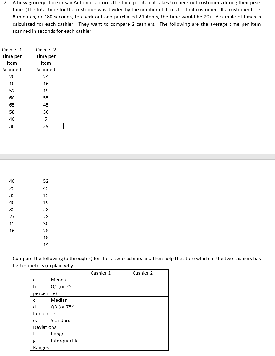
The question is to find the above information with a stem and leaf plot for each cashier.
Creating a line graph for both of the cashiers
Explaining which cashier has the better metrics
And with the table in the image filling in the information on the left side of the table that is being requested.
Example from picture
A what is the mean for cashier 1 and cashier 2
B what is the 25 percentile
and so fourth down the line for each cashier until the table is completed
 2. A busy grocery store in San Antonio captures the time per item it takes to check out customers during their peak time. [The total time for the customer was divided by the number of items for that customer. If a customer took 8 minutes, or 480 seconds, to check out and purchased 24 items, the time would be 2D]. A sample of times is calculated for each cashier. They,r want to compare 2 cashiers. The following are the average time per item scanned in seconds for each cashier: Cashier 1 Cashier 2 Time per Time per Item Item Scan ned Scan ned 20 24 10 16 52 19 60 55 65 45 58 36 40 5 38 29 40 52 25 45 35 15 40 19 35 28 27 28 15 30 15 28 18 19 Compare the following [a through k} for these two cashiers and then help the store which of the two cashiers has better metrics (explain why]: Cashier 1 Cashier 2 a. Means b. [11 [or 25th percentile} [13 [or 75th Percentile e. Standard Deviations Ranges Interquartile Ranges
 Step by Step Solution
There are 3 Steps involved in it
Step: 1

See step-by-step solutions with expert insights and AI powered tools for academic success
Step: 2

Step: 3

Ace Your Homework with AI
Get the answers you need in no time with our AI-driven, step-by-step assistance
Get Started


