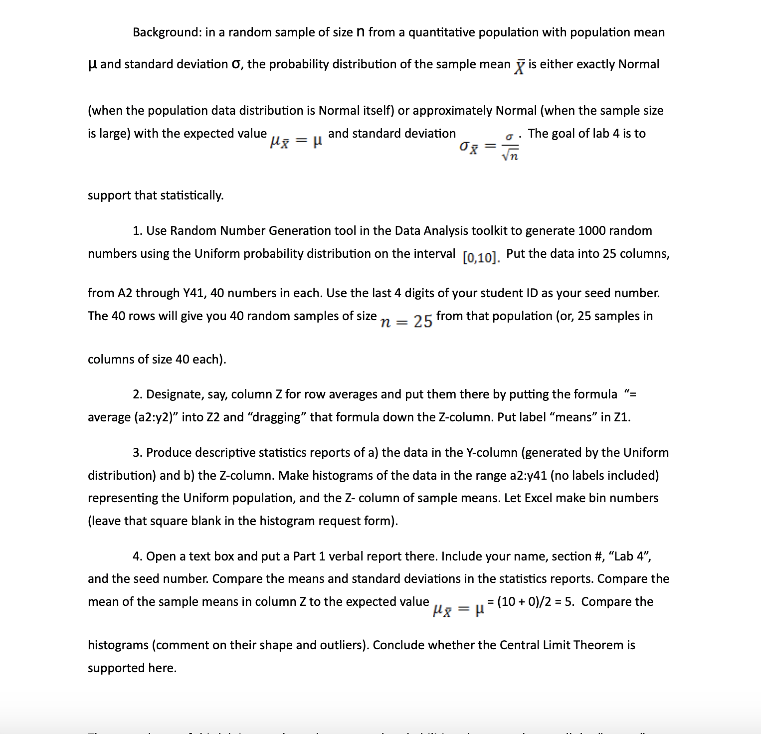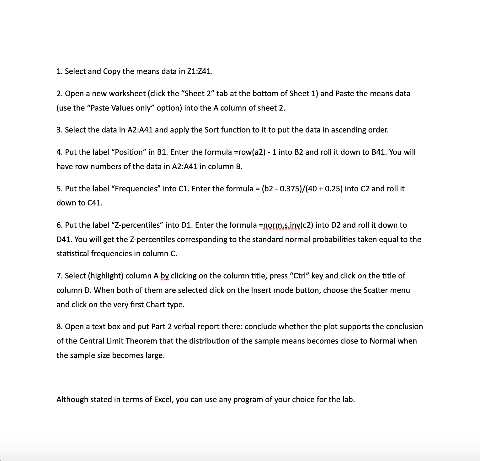

Background: in a random sample of size n from a quantitative population with population mean U and standard deviation o, the probability distribution of the sample mean is either exactly Normal (when the population data distribution is Normal itself) or approximately Normal (when the sample size is large) with the expected value and standard deviation The goal of lab 4 is to Mg = va support that statistically. 1. Use Random Number Genera tool in the Data Analysis toolkit to generate 10 random numbers using the Uniform probability distribution on the interval [0,10]. Put the data into 25 columns, from A2 through Y41, 40 numbers in each. Use the last 4 digits of your student ID as your seed number. The 40 rows will give you 40 random samples of size n = from that population (or, 25 samples in 25 columns of size 40 each). 2. Designate, say, column Z for row averages and put them there by putting the formula "= average (a2:y2) into Z2 and "dragging that formula down the Z-column. Put label means in 21. 3. Produce descriptive statistics reports of a) the data in the Y-column (generated by the Uniform distribution) and b) the Z-column. Make histograms of the data in the range a2:y41 (no labels included) representing the Uniform population, and the Z-column of sample means. Let Excel make bin numbers (leave that square blank in the histogram request form). 4. Open a text box and put a Part 1 verbal report there. Include your name, section #, Lab 4, and the seed number. Compare the means and standard deviations in the statistics reports. Compare the mean of the sample means in column Z to the expected value (10 + 0)/2 = 5. Compare the Mx = 1 histograms (comment on their shape and outliers). Conclude whether the Central Limit Theorem is supported here. 1. Select and Copy the means data in 21:241. 2. Open a new worksheet (click the "Sheet 2" tab at the bottom of Sheet 1) and Paste the means data (use the "Paste Values only" option) into the A column of sheet 2. 3. Select the data in A2:A41 and apply the Sort function to it to put the data in ascending order. 4. Put the label Position in B1. Enter the formula =row(a2) - 1 into B2 and roll it down to B41. You will have row numbers of the data in A2:A41 in column B. 5. Put the label Frequencies into C1. Enter the formula = (b2 -0.375)/(40+ 0.25) into C2 and roll it down to C41. 6. Put the label Z-percentiles into D1. Enter the formula =norm.s.inv(c2) into D2 and roll it down to D41. You will get the Z-percentiles corresponding to the standard normal probabilities taken equal to the statistical frequencies in column C. 7. Select (highlight) column A by clicking on the column title, press "Ctrl key and click on the title of column D. When both of them are selected click on the Insert mode button, choose the Scatter menu and click on the very first Chart type. 8. Open a text box and put Part 2 verbal report there: conclude whether the plot supports the conclusion of the Central Limit Theorem that the distribution of the sample means becomes close to Normal when the sample size becomes large. Although stated in terms of Excel, you can use any program of your choice for the lab. Background: in a random sample of size n from a quantitative population with population mean U and standard deviation o, the probability distribution of the sample mean is either exactly Normal (when the population data distribution is Normal itself) or approximately Normal (when the sample size is large) with the expected value and standard deviation The goal of lab 4 is to Mg = va support that statistically. 1. Use Random Number Genera tool in the Data Analysis toolkit to generate 10 random numbers using the Uniform probability distribution on the interval [0,10]. Put the data into 25 columns, from A2 through Y41, 40 numbers in each. Use the last 4 digits of your student ID as your seed number. The 40 rows will give you 40 random samples of size n = from that population (or, 25 samples in 25 columns of size 40 each). 2. Designate, say, column Z for row averages and put them there by putting the formula "= average (a2:y2) into Z2 and "dragging that formula down the Z-column. Put label means in 21. 3. Produce descriptive statistics reports of a) the data in the Y-column (generated by the Uniform distribution) and b) the Z-column. Make histograms of the data in the range a2:y41 (no labels included) representing the Uniform population, and the Z-column of sample means. Let Excel make bin numbers (leave that square blank in the histogram request form). 4. Open a text box and put a Part 1 verbal report there. Include your name, section #, Lab 4, and the seed number. Compare the means and standard deviations in the statistics reports. Compare the mean of the sample means in column Z to the expected value (10 + 0)/2 = 5. Compare the Mx = 1 histograms (comment on their shape and outliers). Conclude whether the Central Limit Theorem is supported here. 1. Select and Copy the means data in 21:241. 2. Open a new worksheet (click the "Sheet 2" tab at the bottom of Sheet 1) and Paste the means data (use the "Paste Values only" option) into the A column of sheet 2. 3. Select the data in A2:A41 and apply the Sort function to it to put the data in ascending order. 4. Put the label Position in B1. Enter the formula =row(a2) - 1 into B2 and roll it down to B41. You will have row numbers of the data in A2:A41 in column B. 5. Put the label Frequencies into C1. Enter the formula = (b2 -0.375)/(40+ 0.25) into C2 and roll it down to C41. 6. Put the label Z-percentiles into D1. Enter the formula =norm.s.inv(c2) into D2 and roll it down to D41. You will get the Z-percentiles corresponding to the standard normal probabilities taken equal to the statistical frequencies in column C. 7. Select (highlight) column A by clicking on the column title, press "Ctrl key and click on the title of column D. When both of them are selected click on the Insert mode button, choose the Scatter menu and click on the very first Chart type. 8. Open a text box and put Part 2 verbal report there: conclude whether the plot supports the conclusion of the Central Limit Theorem that the distribution of the sample means becomes close to Normal when the sample size becomes large. Although stated in terms of Excel, you can use any program of your choice for the lab


