Question
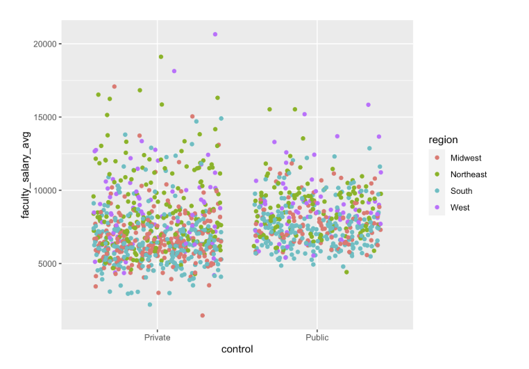
Below question we used R and Rstudio You are given the college data set college.csv Download college.csv The visualization below shows the average faculty salaries
Below question we used R and Rstudio
You are given the college data setcollege.csvDownload college.csv
The visualization below shows the average faculty salaries in each university in USA for public and private universites across different regions, such as midwest, northeast, south, and west. The x-axis is jitters. It uses the colors to show the difference among different regions. Here is the code:
college=read.csv("college.csv", header=TRUE)
library(tidyverse)
ggplot(college)+
geom_jitter(aes(control, faculty_salary_avg, color=region))
For this visualization, what are some of the weaknesses in the visualization? Can you provide an improved version? Pleaese submit your code and visualization.

Step by Step Solution
There are 3 Steps involved in it
Step: 1

Get Instant Access to Expert-Tailored Solutions
See step-by-step solutions with expert insights and AI powered tools for academic success
Step: 2

Step: 3

Ace Your Homework with AI
Get the answers you need in no time with our AI-driven, step-by-step assistance
Get Started


