can you explain 3,4,5

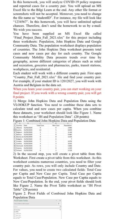
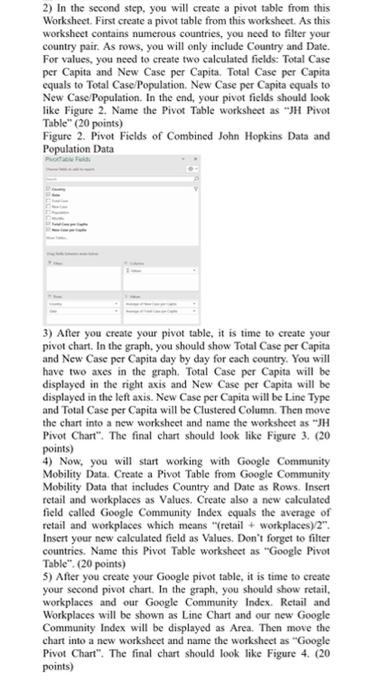
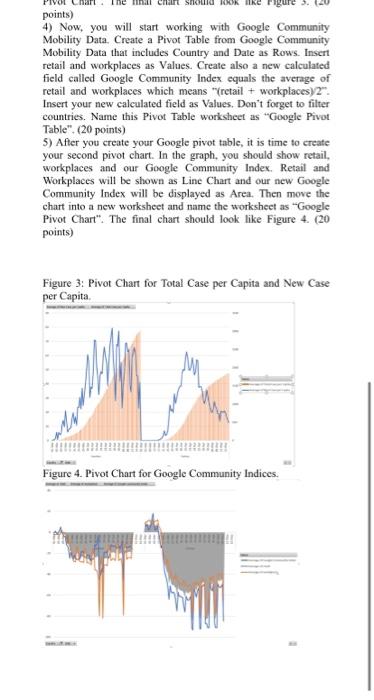
In this homework, you will analyze COVID-19 policy response and reported cases for a country pair. You will upload an MS Excel file to the Bilgi Lear at the end. Any other file formator screenshots will not be accepted. Moreover, you need to change the file name as "studentID". For instance, my file will look like "1234567". In this homework, you will have unlimited upload chances. Therefore, don't send the homework to us by e-mail. We wish you success. You have been supplied an MS Excel file called "Final Project Data Fall 2021.xlsx" for this project including three worksheets: Population, John Hopkins Data and Google Community Data. The population worksheet displays population of countries. The John Hopkins Data worksheet presents total cases and new cases per day for each country. The Google Community Mobility Data presents trends over time by geography, across different categories of places such as retail and recreation, groceries and pharmacies, parks, transit stations, workplaces, and residential Each student will work with a different country pair. First open Country Pair Fall_2021.xlsx" file and find your country pair For example, if your student ID is 12012027, you will work with Austria and Belgium in the data set. When you learn your country pair, you can start working on your final project. If you work with a wrong country pair, you will get 0 points 1) Merge John Hopkins Data and Population Data using the VLOOKUP function. You need to combine these data sets to calculate total and new cases per capita. When you combine these datasets, your worksheet should look like Figure 1. Name this worksheet as "JH and Population Data". (20 points) Figure 1: Combined John Hopkins Data and Population Data Cyw he 5 2 Senaste . It SS 2) In the second step, you will create a pivot table from this Worksheet. First create a pivot table from this worksheet. As this worksheet contains numerous countries, you need to filter your country pair. As rows, you will only include Country and Date For values, you need to create two calculated fields. Total Case per Capita and New Case per Capita. Total Case per Capita equals to Total Case Population. New Case per Capita equals to New Case Population. In the end, your pivot fields should look like Figure 2. Name the Pivot Table worksheet as "JH Pivot Table" (20 points) Figure 2. Pivot Fields of Combined John Hopkins Data and Population Data 2) In the second step, you will create a pivot table from this Worksheet. First create a pivot table from this worksheet. As this worksheet contains numerous countries, you need to filter your country pair. As rows, you will only include Country and Date. For values, you need to create two calculated fields: Total Case per Capita and New Case per Capita, Total Case per Capita equals to Total Case Population. New Case per Capita equals to New Case/Population. In the end, your pivot fields should look like Figure 2. Name the Pivot Table worksheet as "JH Pivot Table" (20 points) Figure 2. Pivot Fields of Combined John Hopkins Data and Population Data 3) After you create your pivot table, it is time to create your pivot chart. In the graph, you should show Total Case per Capita and New Case per Capita day by day for each country. You will have two axes in the graph. Total Case per Capita will be displayed in the right axis and New Case per capita will be displayed in the left axis. New Case per Capita will be Line Type and Total Case per Capita will be Clustered Column. Then move the chart into a new worksheet and name the worksheet as "JH Pivot Chart". The final chart should look like Figure 3. (20 points) 4) Now, you will start working with Google Community Mobility Data. Create a Pivot Table from Google Community Mobility Data that includes Country and Date as Rows. Insert retail and workplaces as Values. Create also a new calculated field called Google Community Index cquals the average of retail and workplaces which means "retail + workplaces) 2". Insert your new calculated field as Values. Don't forget to filter countries. Name this Pivot Table worksheet as "Google Pivot Table". (20 points) 5) After you create your Google pivot table, it is time to create your second pivot chart. In the graph, you should show retail. workplaces and our Google Community Index. Retail and Workplaces will be shown as Line Chart and our new Google Community Index will be displayed as Area. Then move the chart into a new worksheet and name the worksheet as "Google Pivot Chart". The final chart should look like Figure 4. (20 points) mit Suid kike points) 4) Now, you will start working with Google Community Mobility Data. Create a Pivot Table from Google Community Mobility Data that includes Country and Date as Rows. Insert retail and workplaces as Values. Create also a new calculated field called Google Community Index equals the average of retail and workplaces which means "(retail + workplacesy 2". Insert your new calculated field as Values. Don't forget to filter countries. Name this Pivot Table worksheet as "Google Pivot Table". (20 points) 5) After you create your Google pivot table, it is time to create your second pivot chart. In the graph, you should show retail, workplaces and our Google Community Index. Retail and Workplaces will be shown as Line Chart and our new Google Community Index will be displayed as Area. Then move the chart into a new worksheet and name the worksheet as "Google Pivot Chart". The final chart should look like Figure 4. (20 points) Figure 3: Pivot Chart for Total Case per Capita and New Case per Capita Figure 4. Pivot Chart for Google Community Indices. In this homework, you will analyze COVID-19 policy response and reported cases for a country pair. You will upload an MS Excel file to the Bilgi Lear at the end. Any other file formator screenshots will not be accepted. Moreover, you need to change the file name as "studentID". For instance, my file will look like "1234567". In this homework, you will have unlimited upload chances. Therefore, don't send the homework to us by e-mail. We wish you success. You have been supplied an MS Excel file called "Final Project Data Fall 2021.xlsx" for this project including three worksheets: Population, John Hopkins Data and Google Community Data. The population worksheet displays population of countries. The John Hopkins Data worksheet presents total cases and new cases per day for each country. The Google Community Mobility Data presents trends over time by geography, across different categories of places such as retail and recreation, groceries and pharmacies, parks, transit stations, workplaces, and residential Each student will work with a different country pair. First open Country Pair Fall_2021.xlsx" file and find your country pair For example, if your student ID is 12012027, you will work with Austria and Belgium in the data set. When you learn your country pair, you can start working on your final project. If you work with a wrong country pair, you will get 0 points 1) Merge John Hopkins Data and Population Data using the VLOOKUP function. You need to combine these data sets to calculate total and new cases per capita. When you combine these datasets, your worksheet should look like Figure 1. Name this worksheet as "JH and Population Data". (20 points) Figure 1: Combined John Hopkins Data and Population Data Cyw he 5 2 Senaste . It SS 2) In the second step, you will create a pivot table from this Worksheet. First create a pivot table from this worksheet. As this worksheet contains numerous countries, you need to filter your country pair. As rows, you will only include Country and Date For values, you need to create two calculated fields. Total Case per Capita and New Case per Capita. Total Case per Capita equals to Total Case Population. New Case per Capita equals to New Case Population. In the end, your pivot fields should look like Figure 2. Name the Pivot Table worksheet as "JH Pivot Table" (20 points) Figure 2. Pivot Fields of Combined John Hopkins Data and Population Data 2) In the second step, you will create a pivot table from this Worksheet. First create a pivot table from this worksheet. As this worksheet contains numerous countries, you need to filter your country pair. As rows, you will only include Country and Date. For values, you need to create two calculated fields: Total Case per Capita and New Case per Capita, Total Case per Capita equals to Total Case Population. New Case per Capita equals to New Case/Population. In the end, your pivot fields should look like Figure 2. Name the Pivot Table worksheet as "JH Pivot Table" (20 points) Figure 2. Pivot Fields of Combined John Hopkins Data and Population Data 3) After you create your pivot table, it is time to create your pivot chart. In the graph, you should show Total Case per Capita and New Case per Capita day by day for each country. You will have two axes in the graph. Total Case per Capita will be displayed in the right axis and New Case per capita will be displayed in the left axis. New Case per Capita will be Line Type and Total Case per Capita will be Clustered Column. Then move the chart into a new worksheet and name the worksheet as "JH Pivot Chart". The final chart should look like Figure 3. (20 points) 4) Now, you will start working with Google Community Mobility Data. Create a Pivot Table from Google Community Mobility Data that includes Country and Date as Rows. Insert retail and workplaces as Values. Create also a new calculated field called Google Community Index cquals the average of retail and workplaces which means "retail + workplaces) 2". Insert your new calculated field as Values. Don't forget to filter countries. Name this Pivot Table worksheet as "Google Pivot Table". (20 points) 5) After you create your Google pivot table, it is time to create your second pivot chart. In the graph, you should show retail. workplaces and our Google Community Index. Retail and Workplaces will be shown as Line Chart and our new Google Community Index will be displayed as Area. Then move the chart into a new worksheet and name the worksheet as "Google Pivot Chart". The final chart should look like Figure 4. (20 points) mit Suid kike points) 4) Now, you will start working with Google Community Mobility Data. Create a Pivot Table from Google Community Mobility Data that includes Country and Date as Rows. Insert retail and workplaces as Values. Create also a new calculated field called Google Community Index equals the average of retail and workplaces which means "(retail + workplacesy 2". Insert your new calculated field as Values. Don't forget to filter countries. Name this Pivot Table worksheet as "Google Pivot Table". (20 points) 5) After you create your Google pivot table, it is time to create your second pivot chart. In the graph, you should show retail, workplaces and our Google Community Index. Retail and Workplaces will be shown as Line Chart and our new Google Community Index will be displayed as Area. Then move the chart into a new worksheet and name the worksheet as "Google Pivot Chart". The final chart should look like Figure 4. (20 points) Figure 3: Pivot Chart for Total Case per Capita and New Case per Capita Figure 4. Pivot Chart for Google Community Indices
