Choose the letter
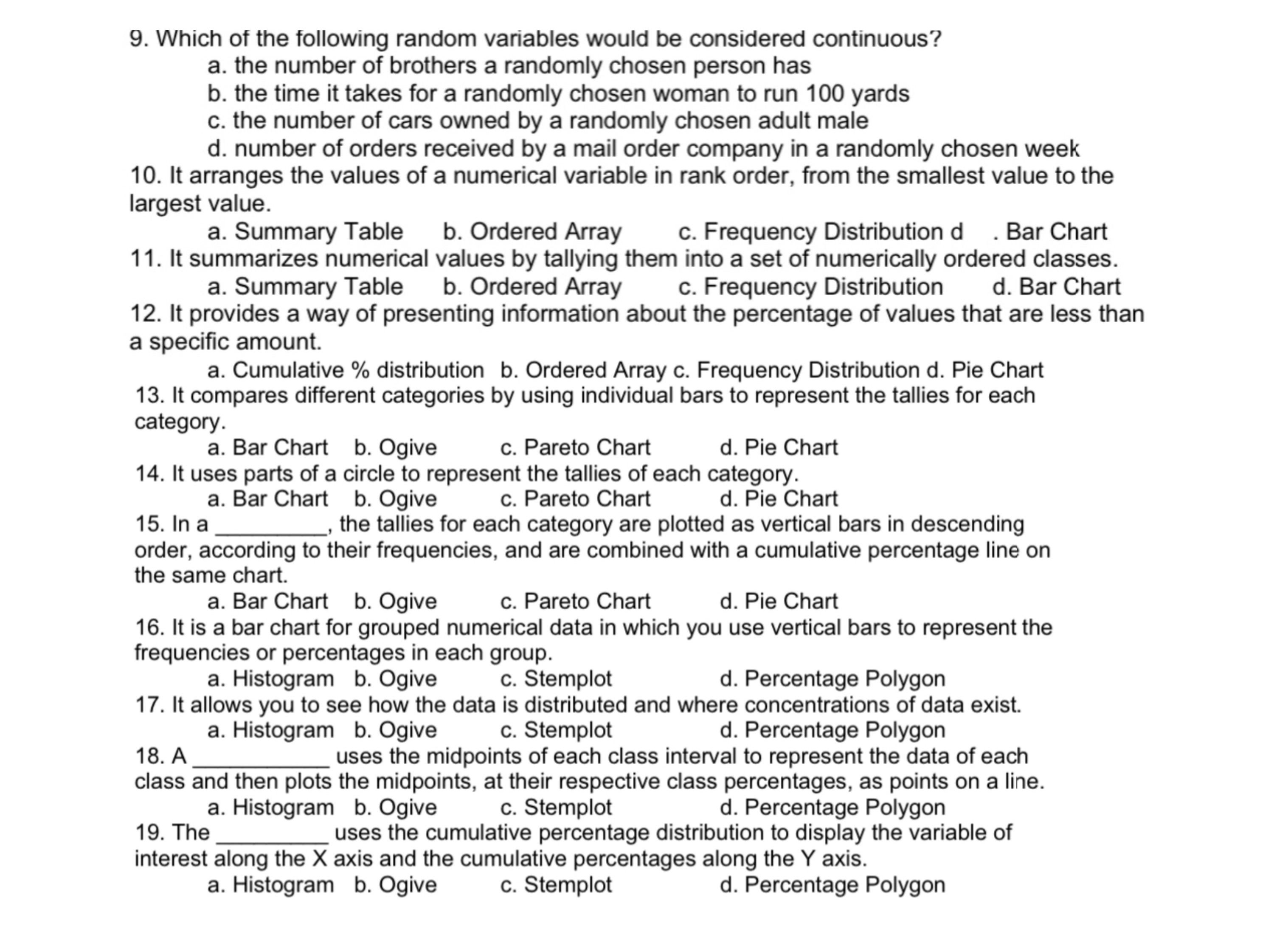
9. Which of the following random variables would be considered continuous? a. the number of brothers a randomly chosen person has b. the time it takes for a randomly chosen woman to run 100 yards 0. the number of cars owned by a randomly chosen adult male d. number of orders received by a mail order company in a randomly chosen week 10. It arranges the values of a numerical variable in rank order, from the smallest value to the largest value. a. Summary Table b. Ordered Array c. Frequency Distribution d . Bar Chart 11. It summarizes numerical values by tallying them into a set of numerically ordered classes. a. Summary Table b. Ordered Array c. Frequency Distribution d. Bar Chart 12. It provides a way of presenting information about the percentage of values that are less than a specic amount. a. Cumulative % distribution b. Ordered Array c. Frequency Distribution d. Pie Chart 13. It compares different categories by using individual bars to represent the tallies for each category. a. Bar Chart b. Ogive c. Pareto Chart d. Pie Chart 14. It uses parts of a circle to represent the tallies of each category. a. Bar Chart b. Ogive c. Pareto Chart d. Pie Chart 15. In a , the tallies for each category are plotted as vertical bars in descending order, according to their frequencies, and are combined with a cumulative percentage line on the same chart. a. Bar Chart b. Ogive c. Pareto Chart d. Pie Chart 16. It is a bar chart for grouped numerical data in which you use vertical bars to represent the frequencies or percentages in each group. a. Histogram b. Ogive c. Stemplot d. Percentage Polygon 17. It allows you to see how the data is distributed and where concentrations of data exist a. Histogram b. Ogive c. Stemplot d. Percentage Polygon 18. A uses the midpoints of each class interval to represent the data of each class and then plots the midpoints, at their respective class percentages. as points on a line. a. Histogram b. Ogive c. Stemplot d. Percentage Polygon 19. The uses the cumulative percentage distribution to display the variable of interest along the X axis and the cumulative percentages along the Y axis. a. Histogram b. Ogive c. Stemplot d. Percentage Polygon


