Answered step by step
Verified Expert Solution
Question
1 Approved Answer
Conceptual (Qualitative) Comparison: Bar chart Pie chart Stacked bar chart Tree map Heat map Geographic data: Symbol map Text data: Word cloud Data-Driven (Quantitative)


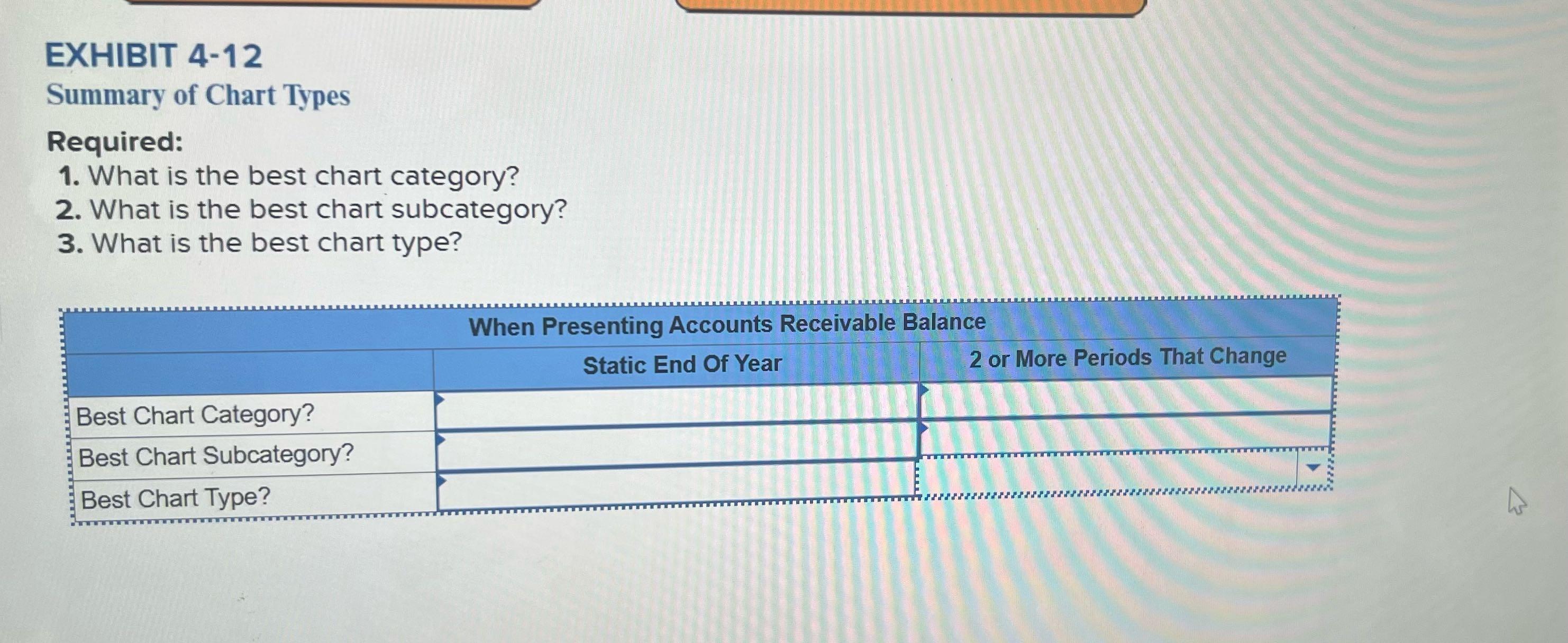
Conceptual (Qualitative) Comparison: Bar chart Pie chart Stacked bar chart Tree map Heat map Geographic data: Symbol map Text data: Word cloud Data-Driven (Quantitative) Outlier detection: Box and whisker plot Relationship between two variables: Scatter plot Trend over time: Line chart Geographic data: Filled map EXHIBIT 4-12 Summary of Chart Types Required: 1. What is the best chart category? 2. What is the best chart subcategory? 3. What is the best chart type? Best Chart Category? Best Chart Subcategory? Best Chart Type? When Presenting Accounts Receivable Balance Static End Of Year 2 or More Periods That Change
Step by Step Solution
★★★★★
3.43 Rating (156 Votes )
There are 3 Steps involved in it
Step: 1
Based on the provided options the best chart category for comparing earnings per share over time would be Trend over time 1 Best Chart Category Trend ...
Get Instant Access to Expert-Tailored Solutions
See step-by-step solutions with expert insights and AI powered tools for academic success
Step: 2

Step: 3

Ace Your Homework with AI
Get the answers you need in no time with our AI-driven, step-by-step assistance
Get Started


