Answered step by step
Verified Expert Solution
Question
1 Approved Answer
Data Science/Seaborn/Plot Question Below is my code The plot below is what I got. But the output plot is supposed look like the following: Can
Data Science/Seaborn/Plot Question
Below is my code

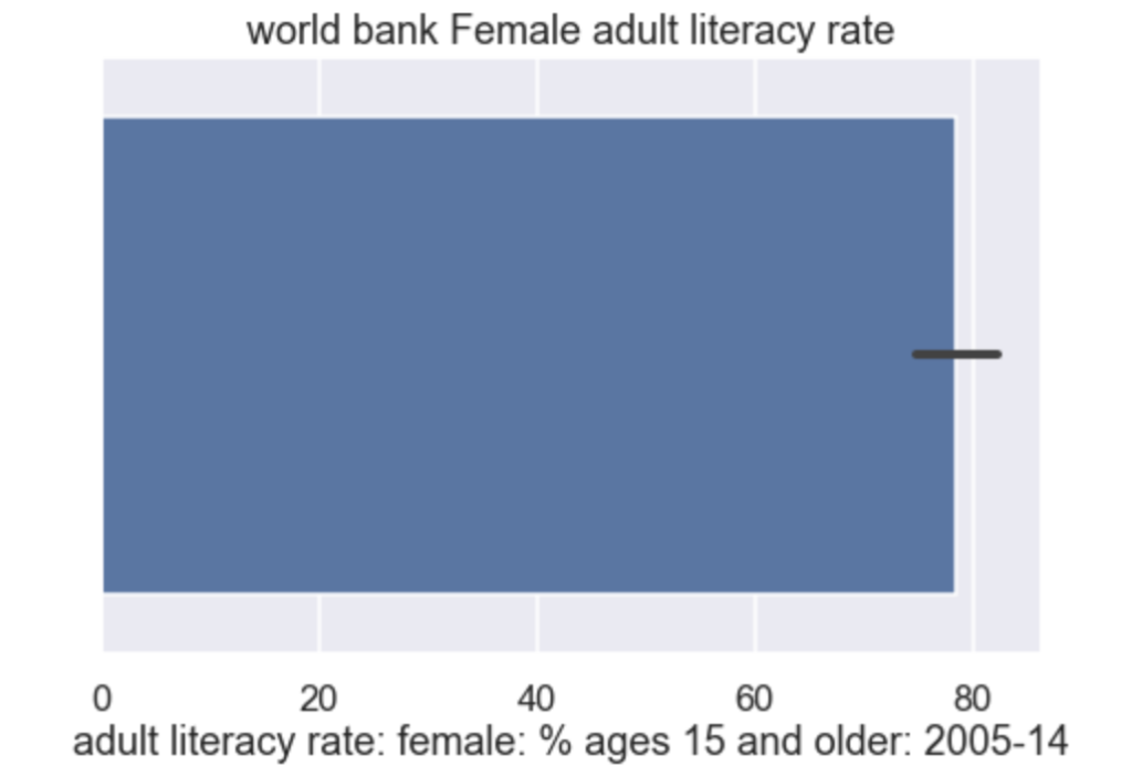
The plot below is what I got.

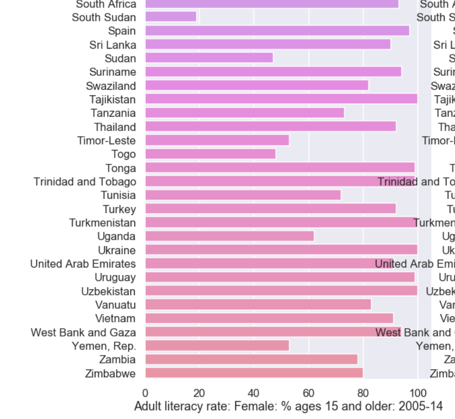
But the output plot is supposed look like the following:

Can someone help me why I am not getting the same plot as the solution output barplot?
An alternate type of plot is the barplot, which as you'll obtain below, provides some vague idea of the distribution, but this is also not what we want ## BEGIN SOLUTION plt.figure(figsize-(15,5)) plt.subplot (1,2,1) sns.barplot (df['literacy']) pit.xlabel("adult literacy rate: female: % ages 15 and older: 2005-14") plt.title( 'world bank Female adult literacy rate') plt.show) # END SOLUTION world bank Female adult literacy rate 20 40 60 80 adult literacy rate: female: % ages 15 and older: 2005-14 South Africa South Sudan Spain Sri Lanka Sudan Suriname Swaziland Tajikistan Tanzania Thailand Timor-Leste Togo Tonga Trinidad and Tobago Tunisia Turkey Turkmenistan Uganda Ukraine United Arab Emirates Uruguay Uzbekistan Vanuatu Vietnam West Bank and Gaza South South S Sri L Suri Swaz Tajik Tan Tha Timor- Trinidad and To Tu urkmen Ug Uk United Arab Emi Uru Uzbek Var Vie est Bank and Zambia Zimbabwe Yemen, Za Zimb 20 40 60 80 100 Adult literacy rate: Female: % ages 15 and older: 2005-14Step by Step Solution
There are 3 Steps involved in it
Step: 1

Get Instant Access to Expert-Tailored Solutions
See step-by-step solutions with expert insights and AI powered tools for academic success
Step: 2

Step: 3

Ace Your Homework with AI
Get the answers you need in no time with our AI-driven, step-by-step assistance
Get Started


