

Question
Draw probability density plot To compare 5 different distributions in three different ways. The five distributions are as follows: a t-distribution with 9, 99, 999,
Draw probability density plot
To compare 5 different distributions in three different ways. The five distributions are as follows:
-
a t-distribution with 9, 99, 999, and 9999 degrees of freedom with mean 0 and standard deviation 2.
-
a normal distribution with mean 0 and standard deviation 2.
First, compare the five distributions using a probability density plot within a single figure so that each of the curves is in a different color and line type.
Next, compare the five distributions using a violin plot within a single figure so that each of the curves is in a different color.
Next, compare the five distributions using a box and wiskers within a single figure so that each of the distributions is in a different color.
If you need points for a particular plot type, take a sample of 500 points.
Please make well-designed and well-annotated plots (e.g. visually appealing, titles, labels, etc).
Hint: You can use the method ".ppf()" to get the density at a point of a scipy distribution. You might want to use scipy.stats.t, scipy.stats.norm, scipy.stats.norm.rvs, and/or stats.t.rvs.
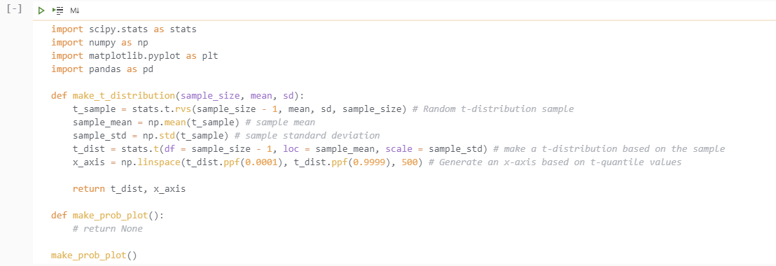
import scipy.stats as stats
import numpy as np
import matplotlib.pyplot as plt
import pandas as pd
def make_t_distribution(sample_size, mean, sd):
t_sample = stats.t.rvs(sample_size - 1, mean, sd, sample_size) # Random t-distribution sample
sample_mean = np.mean(t_sample) # sample mean
sample_std = np.std(t_sample) # sample standard deviation
t_dist = stats.t(df = sample_size - 1, loc = sample_mean, scale = sample_std) # make a t-distribution based on the sample
x_axis = np.linspace(t_dist.ppf(0.0001), t_dist.ppf(0.9999), 500) # Generate an x-axis based on t-quantile values
return t_dist, x_axis
def make_prob_plot():
make_prob_plot()
[-] Mb import scipy.stats as stats import numpy as np import matplotlib.pyplot as plt import pandas as pd def make_t_distribution (sample_size, mean, sd): t_sample = stats.t.rvs (sample_size - 1, mean, sd, sample_size) # Random t-distribution sample sample_mean = np.mean(t_sample) # sample mean sample_std = np.std(t_sample) # sample standard deviation t_dist = stats.t(df = sample_size - 1, loc = sample_mean, scale = sample_std) # make a t-distribution based on the sample x_axis = np.linspace(t_dist.ppf(0.0001), t_dist.ppf(0.9999), 500) # Generate an x-axis based on t-quantile values return t_dist, x_axis def make_prob_plot(): # return None make_prob_plot() [-] Mb import scipy.stats as stats import numpy as np import matplotlib.pyplot as plt import pandas as pd def make_t_distribution (sample_size, mean, sd): t_sample = stats.t.rvs (sample_size - 1, mean, sd, sample_size) # Random t-distribution sample sample_mean = np.mean(t_sample) # sample mean sample_std = np.std(t_sample) # sample standard deviation t_dist = stats.t(df = sample_size - 1, loc = sample_mean, scale = sample_std) # make a t-distribution based on the sample x_axis = np.linspace(t_dist.ppf(0.0001), t_dist.ppf(0.9999), 500) # Generate an x-axis based on t-quantile values return t_dist, x_axis def make_prob_plot(): # return None make_prob_plot()Step by Step Solution
There are 3 Steps involved in it
Step: 1

Get Instant Access to Expert-Tailored Solutions
See step-by-step solutions with expert insights and AI powered tools for academic success
Step: 2

Step: 3
Ace Your Homework with AI
Get the answers you need in no time with our AI-driven, step-by-step assistance
Get Started
Database Processing
Authors: David M. Kroenke, David Auer
11th Edition
B003Y7CIBU, 978-0132302678