Epidemiology and Biostatistics
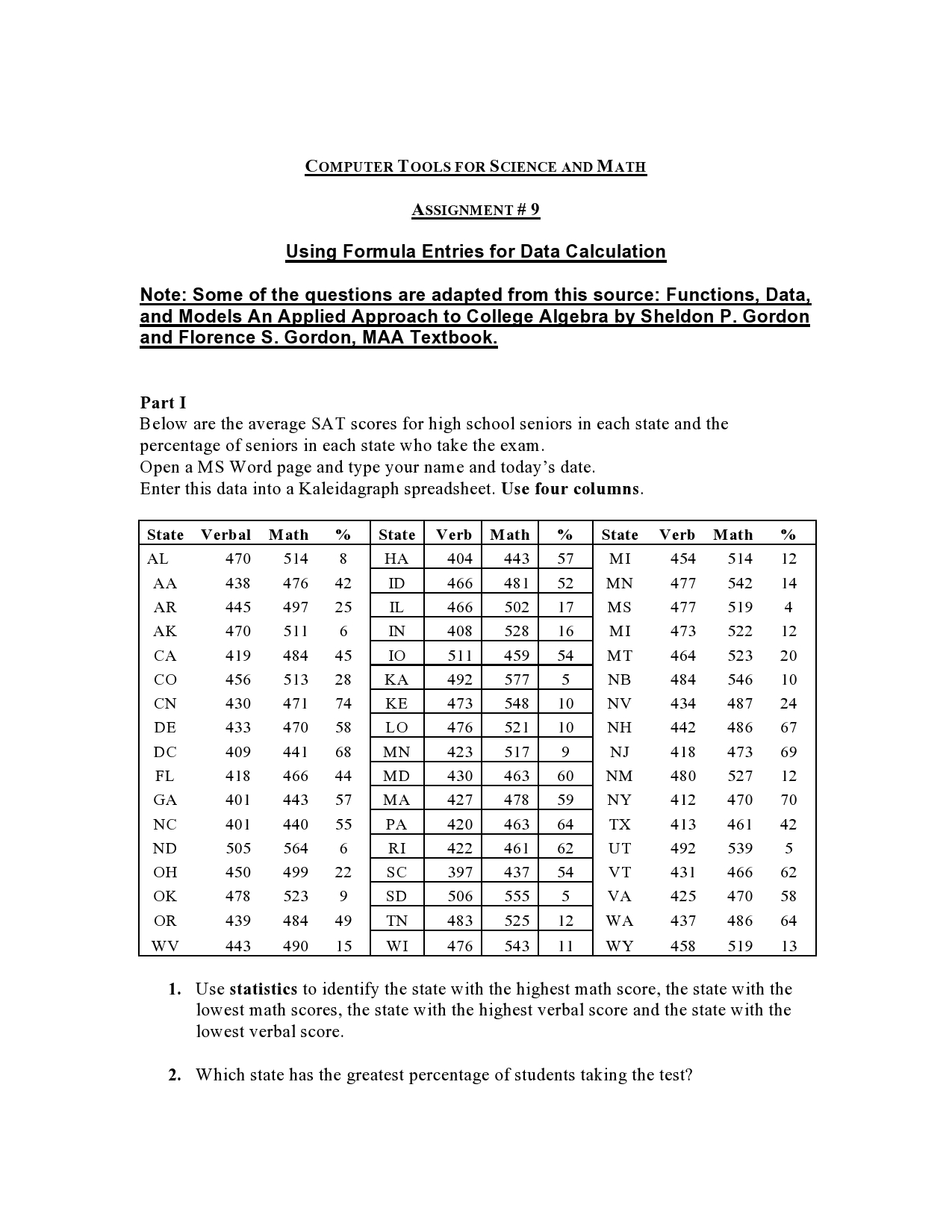
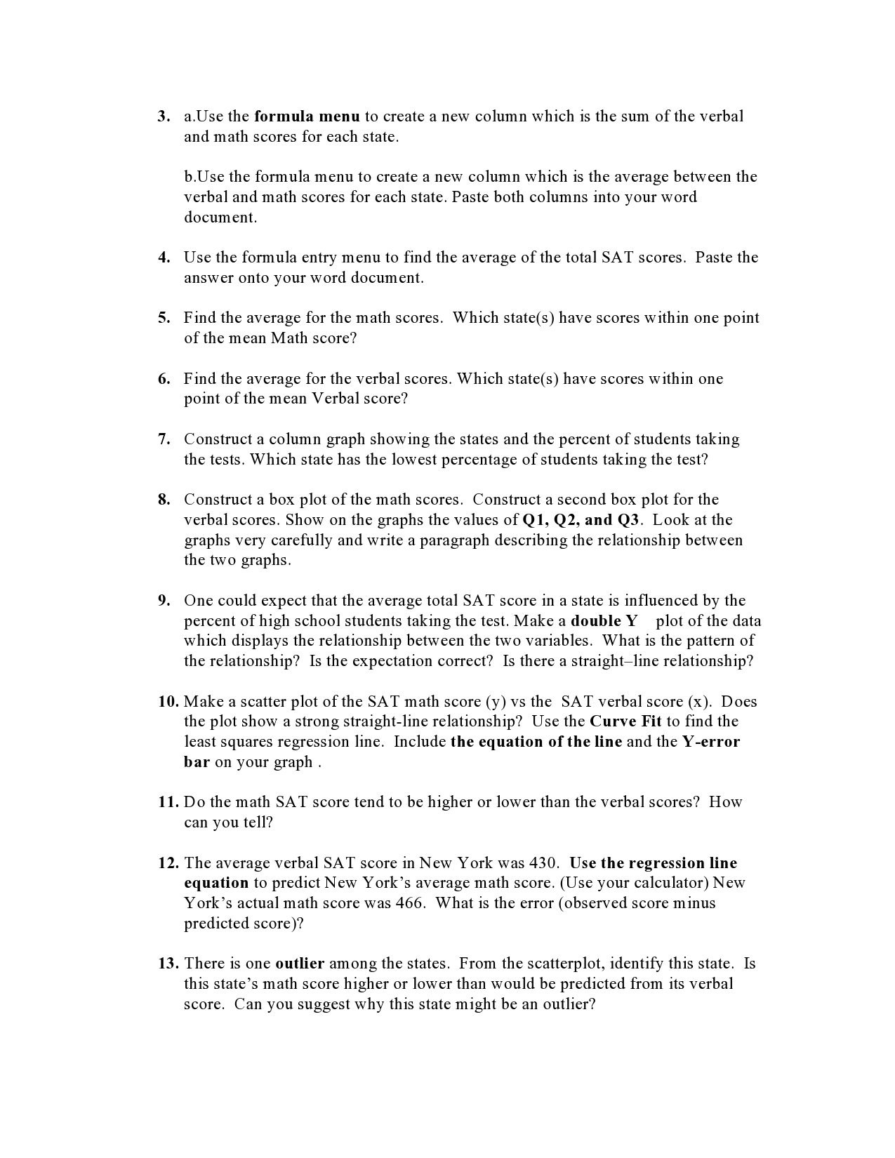
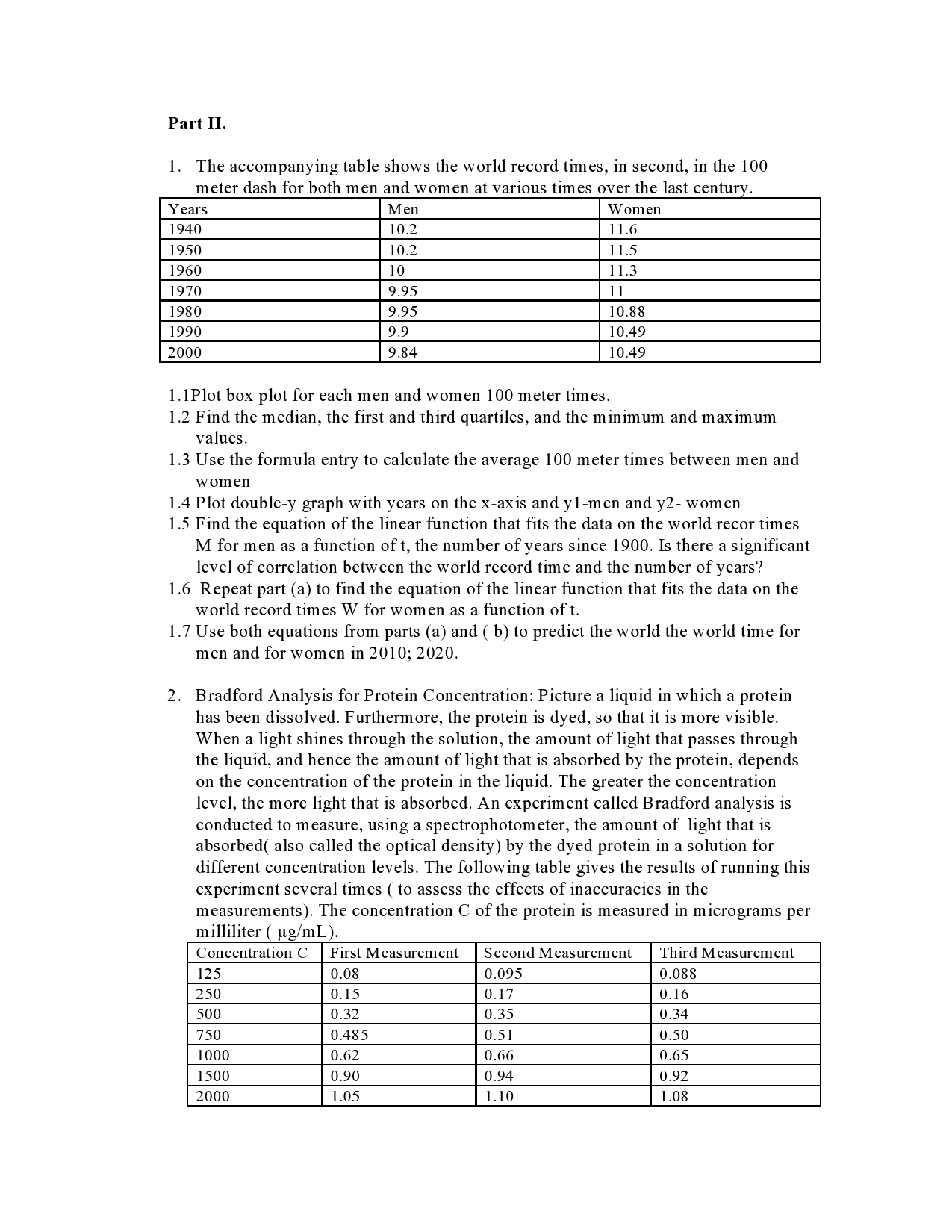
COMPUTER TOOLS FOR SCIENCE AND MATH ASSIGNMENT # 9 Using Formula Entries for Data Calculation Note: Some of the guestions are adapted from this source: FunctionsI DataI and Models An Applied Approach to College Algebra by Sheldon P. Gordon and Florence S. Gordon MAA Textbook. Part I Below are the average SAT scores for high school seniors in each state and the percentage of seniors in each state who take the exam. Open a MS Word page and type your name and today's date. Enter this data into a Kaleidagraph spreadsheet. Use four columns. @- ---- MI IEI-- 52 mm mm 423 427 478 59 \""5! TN 483 525 12 11 1. Use statistics to identify the state with the highest math score, the state with the lowest math scores, the state with the highest verbal score and the state with the lowest verbal score. 2. Which state has the greatest percentage of students taking the test? 10. ll. 12. 13. a.Use the formula menu to create a new column which is the sum ofthe verbal and math scores for each state. b.Use the formula menu to create a new column which is the average between the verbal and math scores for each state. Paste both columns into your word document. Use the formula entry menu to find the average of the total SAT scores. Paste the answer onto your word document. Find the average for the math scores. Which state(s) have scores within one point of the mean Math score? Find the average for the verbal scores. Which state(s) have scores within one point of the mean Verbal score? Construct a column graph showing the states and the percent of students taking the tests. Which state has the lowest percentage of students taking the test? Construct a box plot ofthe math scores. Construct a second box plot for the verbal scores. Show on the graphs the values on1, Q2, and Q3. Look at the graphs very carefully and write a paragraph describing the relationship between the two graphs. One could expect that the average total SAT score in a state is inuenced by the percent of high school students taking the test. Make a double Y plot of the data which displays the relationship between the two variables. What is the pattern of the relationship? [s the expectation correct? Is there a straightline relationship? Make a scatter plot ofthe SAT math score (y) vs the SAT verbal score (x). Does the plot show a strong straight-line relationship? Use the Curve Fit to nd the least squares regression line. Include the equation ofthe line and the Yerror bar on your graph . Do the math SAT score tend to be higher or lower than the verbal scores? How can you tell? The average verbal SAT score in New York was 430. Use the regression line equation to predict New York's average math score. (Use your calculator) New York's actual math score was 466. What is the error (observed score minus predicted score)? There is one outlier among the states. From the scatterplot, identify this state. Is this state's math score higher or lower than would be predicted from its verbal score. Can you suggest why this state might be an outlier? Part II. 1. The accompanying table shows the world record times, in second, in the 100 meter dash for both men and women at various times over the last cent l.lPlot box plot for each men and women 100 meter times. 1.2 Find the median, the first and third quartiles, and the minimum and maximum values. 1.3 Use the formula entry to calculate the average 100 meter times between men and women [.4 Plot double-y graph with years on the XaXis and yl-men and y2 women 1.5 Find the equation of the linear function that fits the data on the world recor times M for men as a function of t, the number of years since 1900. Is there a significant level of correlation between the world record time and the number ofyears? [.6 Repeat part (a) to find the equation of the linear function that fits the data on the world record times W for women as a function of t. 1.7 Use both equations from parts (a) and ( b) to predict the world the world time for men and for women in 2010; 2020. 2. Bradford Analysis for Protein Concentration: Picture a liquid in which a protein has been dissolved. Furthermore, the protein is dyed, so that it is more visible. When a light shines through the solution, the amount oflight that passes through the liquid, and hence the amount of light that is absorbed by the protein, depends on the concentration of the protein in the liquid. The greater the concentration level, the more light that is absorbed. An experiment called Bradford analysis is conducted to measure, using a spectrophotometer, the amount of light that is absorbed( also called the optical density) by the dyed protein in a solution for different concentration levels. The following table gives the results of running this experiment several times ( to assess the effects of inaccuracies in the measurements). The concentration C of the protein is measured in micrograms per milliliter ( ug/mL). Concentration C First Measurement Second Measurement Third Measurement 2.1 Calculate the average between the three measurements 2.2 Calculate the sum between rst, second and third measurement for each concentration. 2.3 Calculate the average for the first measurement 2.4 Calculate the average for the second measurement 2.5 Calculate the average for the third measurement 2.6 Plot a double-y scatterplot With concentration on the X-axis and y 1 first measurent 312- second measurement, y- third measurements
