Answered step by step
Verified Expert Solution
Question
1 Approved Answer
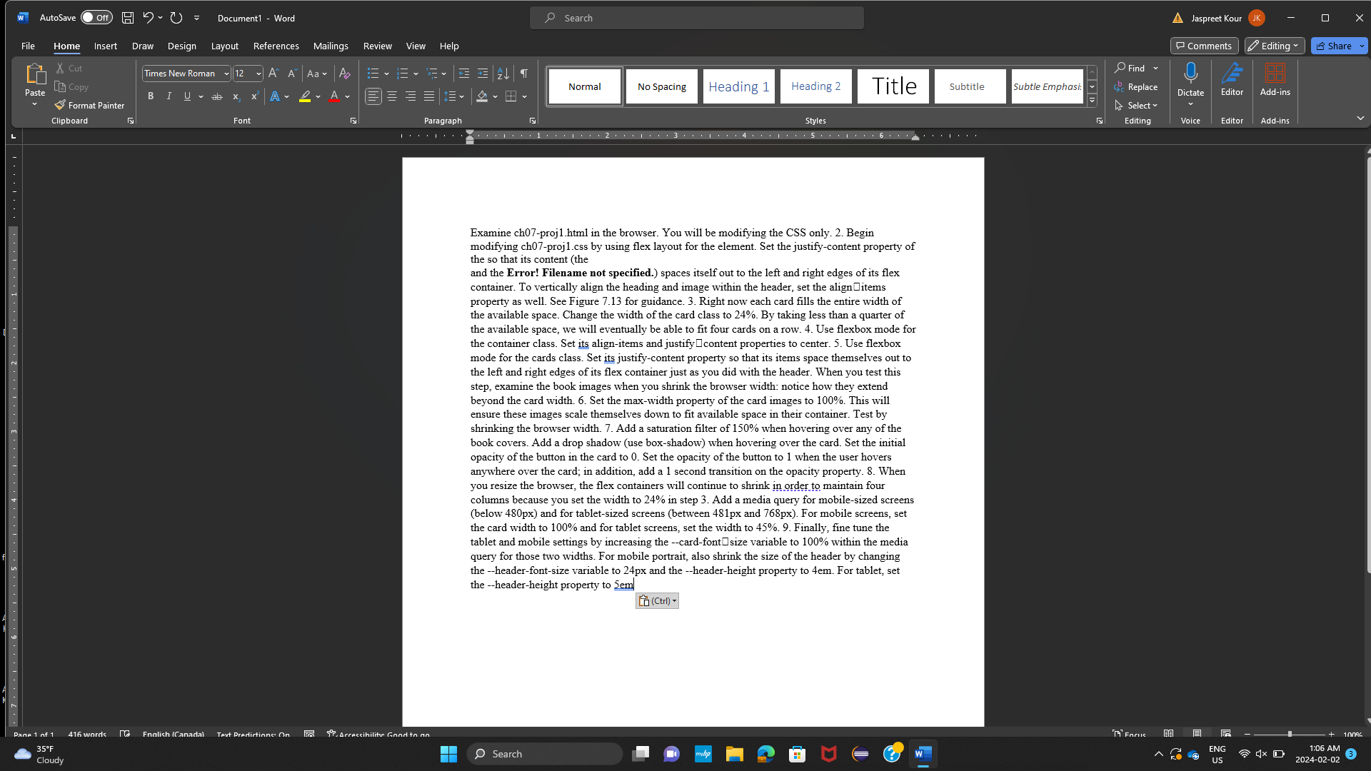
Examine ch 0 7 - proj 1 . html in the browser. You will be modifying the CSS only. 2 . Begin modifying ch 0
Examine chprojhtml in the browser. You will be modifying the CSS only. Begin
modifying ch projcss by using flex layout for the element. Set the justifycontent property of
the so that its content the
and the Error! Filename not specified. spaces itself out to the left and right edges of its flex
container. To vertically align the heading and image within the header, set the align items
property as well. See Figure for guidance. Right now each card fills the entire width of
the available space. Change the width of the card class to By taking less than a quarter of
the available space, we will eventually be able to fit four cards on a row. Use flexbox mode for
mode for the cards class. Set its justifycontent property so that its items space themselves out to
the left and right edges of its flex container just as you did with the header. When you test this
step, examine the book images when you shrink the browser width: notice how they extend
beyond the card width. Set the maxwidth property of the card images to This will
ensure these images scale themselves down to fit available space in their container. Test by
shrinking the browser width. Add a saturation filter of when hovering over any of the
book covers. Add a drop shadow use boxshadow when hovering over the card. Set the initial
opacity of the button in the card to Set the opacity of the button to when the user hovers
anywhere over the card; in addition, add a second transition on the opacity property. When
you resize the browser, the flex containers will continue to shrink in order to maintain four
columns because you set the width to in step Add a media query for mobilesized screens
below px and for tabletsized screens between px and px For mobile screens, set
the card width to and for tablet screens, set the width to Finally, fine tune the
tablet and mobile settings by increasing the cardfont size variable to within the media
query for those two widths. For mobile portrait, also shrink the size of the header by changing
the headerfontsize variable to and the headerheight property to For tablet, set
the headerheight property to
n Ctrl

Step by Step Solution
There are 3 Steps involved in it
Step: 1

Get Instant Access to Expert-Tailored Solutions
See step-by-step solutions with expert insights and AI powered tools for academic success
Step: 2

Step: 3

Ace Your Homework with AI
Get the answers you need in no time with our AI-driven, step-by-step assistance
Get Started


