

Question: Excel 2019 Project Grader - Instructions Exp19_Excel_Ch03_Cap_Gym Project Description: You and a business partner opened a fitness gym three years ago. Your partner oversees managing
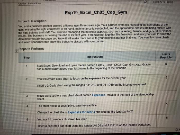
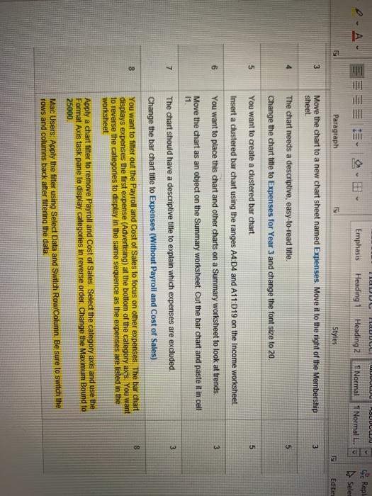
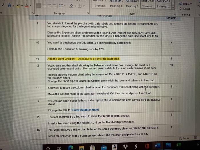
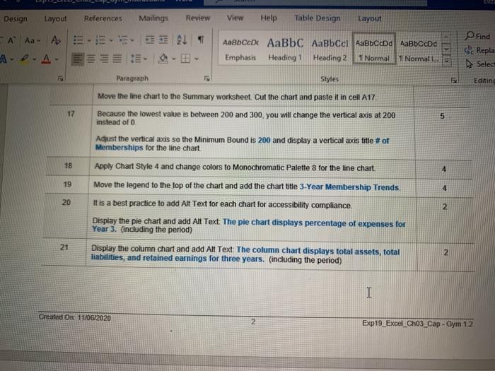
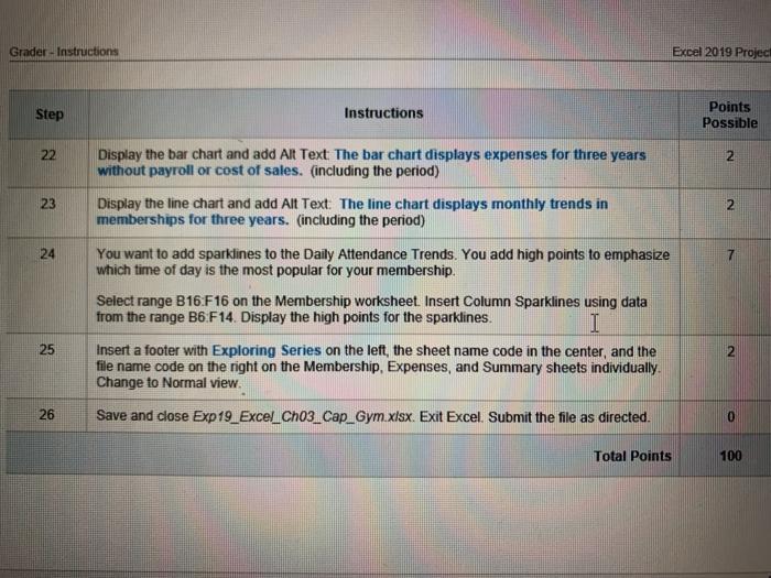
Excel 2019 Project Grader - Instructions Exp19_Excel_Ch03_Cap_Gym Project Description: You and a business partner opened a fitness gym three years ago. Your partner oversees managing the operations of the gym, ensuring the right equipment is on hand, maintenance is conducted, and the appropriate classes are being offered with the right trainers and staff You oversee managing the business aspects, such as marketing, finance, and general personnel issues. The business is nearing the end of its third year. You have put together the financials, and now you want to show the data more visually because you know it will make more sense to your business partner that way. You want to create charts and insert sparklines that show the trends to discuss with your partner Steps to Perform: Step Instructions Points Possible 0 1 Start Excel Download and open the file named Exp19_Excel_Cho3_Cap_Gym.xlsx. Grader has automatically added your last name to the beginning of the filename. 5 2 You will create a pie chart to focus on the expenses for the current year, Insert a 2-D pie chart using the ranges A11 A19 and D11:019 on the Income worksheet 3 Move the chart to a new chart sheet named Expenses. Move it to the right of the Membership sheet The chart needs a descriptive, easy-to-read title. Change the chart title to Expenses for Year 3 and change the font size to 20. 5 4 6 5 You want to create a clustered bar chart Insert a clustered bar chart using the ranges A4D4 and A11 D19 on the Income worksheet IDUL UCU -A 5 . Emphasis Heading Heading 2 Normal 11 Normal L. KU Repl A Selec Paragraph Styles E Editin 3 Move the chart to a new chart sheet named Expenses. Move it to the right of the Membership sheet 3 4 The chart needs a descriptive, easy-to-read title 5 5 5 6 3 7 Change the chart title to Expenses for Year 3 and change the font size to 20. You want to create a clustered bar chart Insert a clustered bar chart using the ranges A4:04 and A11:019 on the Income worksheet You want to place this chart and other charts on a Summary worksheet to look at trends. Move the chart as an object on the Summary worksheet Cut the bar chart and paste it in cell 11 The chart should have a descriptive title to explain which expenses are excluded Change the bar chart title to Expenses (Without Payroll and Cost of Sales) You want to filter out the Payroll and Cost of Sales to focus on other expenses. The bar chart displays expenses the first expense (Advertising) at the bottom of the category ax's. You want to reverse the categories to display in the same sequence as the expenses are listed in the worksheet Apply a chart filter to remove Payroll and Cost of Sales Select the category axis and use the Format Axis task pane to display categories in reverse order. Change the Maximum Bound to 25000 3 8 8 Mac Users. Apply the filter using Seled Data and Switch Row/Column. Be sure to switch the rows and columns back after filtering the data. * APA Emphasis Heading 1 AaBbcc Aabbccod Aa8bccd Heading 2 Normal 1 Normal L.. Replace Select D Paragraph Styles RET Editing V Possible 9 8 You decide to format the pie chart with data labels and remove the legend because there are too many categories for the legend to be effective Display the Expenses sheet and remove the legend. Add Percent and Category Name data labets and choose Outside End position for the labels. Change the data labels font size to 10 You want to emphasize the Education & Training slice by exploding it Explode the Education & Training slice by 12%. 10 2 2 11 2 10 12 5 13 Add the Light Gradient - Accent 2 fil color to the chart area. You create another chart showing the Balance sheet items. You change the chart to a clustered column and switch the row and column data to focus on each balance sheet item Insert a stacked column chart using the ranges A4 D4, A10:010, A15 D15, and A16D16 on the Balance sheet Change the chart type to Clustered Column and switch the rows and columns in the chart You want to move the column chart to be on the Summary worksheet along with the bar chart Move the column chart to the Summary worksheet. Cut the chart and paste it in cell A1 The column chart needs to have a descriptive title to indicate the data comes from the Balance sheet Change the title to 3-Year Balance Sheet The last chart will be a line chart to show the trends in Memberships Insert a line chart using the range 13:115 on the Membership worksheet 2 14 15 16 You want to move the line chart to be on the same Summary sheet as column and bar charts Move the line chart to the Summary worksheet. Cut the chart and paste it in cell A17 Focus a $ a Design Layout References Mailings Review View Help Table Design Layout EL 1 - A A A A ... AaBDCD AaBbc AaBbcci AaBbcend AaBbCcDd Emphasis Heading 1 Heading 2 I Normal Normalt KR Find Repla Select 15 Paragraph Styles Editing Move the line chart to the Summary worksheet Cut the chart and paste it in cell A17 Because the lowest value is between 200 and 300, you will change the vertical axis at 200 17 5 instead of O 18 4 19 4 20 Adjust the vertical axis so the Minimum Bound is 200 and display a vertical axis title # of Memberships for the line chart Apply Chart Style 4 and change colors to Monochromatic Palette 8 for the line chart Move the legend to the top of the chart and add the chart title 3-Year Membership Trends It is a best practice to add Alt Text for each chart for accessibility compliance. Display the pie chart and add Alt Text The pie chart displays percentage of expenses for Year 3 (including the period) Display the column chart and add Alt Text. The column chart displays total assets, total liabilities, and retained earnings for three years. (including the period) 2 21 2 I Created on 11/06/2020 2 Exp19 Excel Cho3_Cap - Gym 12 Grader-Instructions Excel 2019 Project Step Instructions Points Possible 22 2 23 2 24 Display the bar chart and add Alt Text The bar chart displays expenses for three years without payroll or cost of sales. (including the period) Display the line chart and add Alt Text: The line chart displays monthly trends in memberships for three years. (including the period) You want to add sparklines to the Daily Attendance Trends. You add high points to emphasize which time of day is the most popular for your membership. Select range B16:F16 on the Membership worksheet. Insert Column Sparklines using data from the range B6 F14. Display the high points for the sparklines. I Insert a footer with Exploring Series on the left, the sheet name code in the center, and the file name code on the right on the Membership Expenses, and Summary sheets individually. Change to Normal view. 25 2 26 Save and close Exp19_Excel_Ch03_Cap_Gym.xlsx. Exit Excel Submit the file as directed. 0 Total Points 100 Excel 2019 Project Grader - Instructions Exp19_Excel_Ch03_Cap_Gym Project Description: You and a business partner opened a fitness gym three years ago. Your partner oversees managing the operations of the gym, ensuring the right equipment is on hand, maintenance is conducted, and the appropriate classes are being offered with the right trainers and staff You oversee managing the business aspects, such as marketing, finance, and general personnel issues. The business is nearing the end of its third year. You have put together the financials, and now you want to show the data more visually because you know it will make more sense to your business partner that way. You want to create charts and insert sparklines that show the trends to discuss with your partner Steps to Perform: Step Instructions Points Possible 0 1 Start Excel Download and open the file named Exp19_Excel_Cho3_Cap_Gym.xlsx. Grader has automatically added your last name to the beginning of the filename. 5 2 You will create a pie chart to focus on the expenses for the current year, Insert a 2-D pie chart using the ranges A11 A19 and D11:019 on the Income worksheet 3 Move the chart to a new chart sheet named Expenses. Move it to the right of the Membership sheet The chart needs a descriptive, easy-to-read title. Change the chart title to Expenses for Year 3 and change the font size to 20. 5 4 6 5 You want to create a clustered bar chart Insert a clustered bar chart using the ranges A4D4 and A11 D19 on the Income worksheet IDUL UCU -A 5 . Emphasis Heading Heading 2 Normal 11 Normal L. KU Repl A Selec Paragraph Styles E Editin 3 Move the chart to a new chart sheet named Expenses. Move it to the right of the Membership sheet 3 4 The chart needs a descriptive, easy-to-read title 5 5 5 6 3 7 Change the chart title to Expenses for Year 3 and change the font size to 20. You want to create a clustered bar chart Insert a clustered bar chart using the ranges A4:04 and A11:019 on the Income worksheet You want to place this chart and other charts on a Summary worksheet to look at trends. Move the chart as an object on the Summary worksheet Cut the bar chart and paste it in cell 11 The chart should have a descriptive title to explain which expenses are excluded Change the bar chart title to Expenses (Without Payroll and Cost of Sales) You want to filter out the Payroll and Cost of Sales to focus on other expenses. The bar chart displays expenses the first expense (Advertising) at the bottom of the category ax's. You want to reverse the categories to display in the same sequence as the expenses are listed in the worksheet Apply a chart filter to remove Payroll and Cost of Sales Select the category axis and use the Format Axis task pane to display categories in reverse order. Change the Maximum Bound to 25000 3 8 8 Mac Users. Apply the filter using Seled Data and Switch Row/Column. Be sure to switch the rows and columns back after filtering the data. * APA Emphasis Heading 1 AaBbcc Aabbccod Aa8bccd Heading 2 Normal 1 Normal L.. Replace Select D Paragraph Styles RET Editing V Possible 9 8 You decide to format the pie chart with data labels and remove the legend because there are too many categories for the legend to be effective Display the Expenses sheet and remove the legend. Add Percent and Category Name data labets and choose Outside End position for the labels. Change the data labels font size to 10 You want to emphasize the Education & Training slice by exploding it Explode the Education & Training slice by 12%. 10 2 2 11 2 10 12 5 13 Add the Light Gradient - Accent 2 fil color to the chart area. You create another chart showing the Balance sheet items. You change the chart to a clustered column and switch the row and column data to focus on each balance sheet item Insert a stacked column chart using the ranges A4 D4, A10:010, A15 D15, and A16D16 on the Balance sheet Change the chart type to Clustered Column and switch the rows and columns in the chart You want to move the column chart to be on the Summary worksheet along with the bar chart Move the column chart to the Summary worksheet. Cut the chart and paste it in cell A1 The column chart needs to have a descriptive title to indicate the data comes from the Balance sheet Change the title to 3-Year Balance Sheet The last chart will be a line chart to show the trends in Memberships Insert a line chart using the range 13:115 on the Membership worksheet 2 14 15 16 You want to move the line chart to be on the same Summary sheet as column and bar charts Move the line chart to the Summary worksheet. Cut the chart and paste it in cell A17 Focus a $ a Design Layout References Mailings Review View Help Table Design Layout EL 1 - A A A A ... AaBDCD AaBbc AaBbcci AaBbcend AaBbCcDd Emphasis Heading 1 Heading 2 I Normal Normalt KR Find Repla Select 15 Paragraph Styles Editing Move the line chart to the Summary worksheet Cut the chart and paste it in cell A17 Because the lowest value is between 200 and 300, you will change the vertical axis at 200 17 5 instead of O 18 4 19 4 20 Adjust the vertical axis so the Minimum Bound is 200 and display a vertical axis title # of Memberships for the line chart Apply Chart Style 4 and change colors to Monochromatic Palette 8 for the line chart Move the legend to the top of the chart and add the chart title 3-Year Membership Trends It is a best practice to add Alt Text for each chart for accessibility compliance. Display the pie chart and add Alt Text The pie chart displays percentage of expenses for Year 3 (including the period) Display the column chart and add Alt Text. The column chart displays total assets, total liabilities, and retained earnings for three years. (including the period) 2 21 2 I Created on 11/06/2020 2 Exp19 Excel Cho3_Cap - Gym 12 Grader-Instructions Excel 2019 Project Step Instructions Points Possible 22 2 23 2 24 Display the bar chart and add Alt Text The bar chart displays expenses for three years without payroll or cost of sales. (including the period) Display the line chart and add Alt Text: The line chart displays monthly trends in memberships for three years. (including the period) You want to add sparklines to the Daily Attendance Trends. You add high points to emphasize which time of day is the most popular for your membership. Select range B16:F16 on the Membership worksheet. Insert Column Sparklines using data from the range B6 F14. Display the high points for the sparklines. I Insert a footer with Exploring Series on the left, the sheet name code in the center, and the file name code on the right on the Membership Expenses, and Summary sheets individually. Change to Normal view. 25 2 26 Save and close Exp19_Excel_Ch03_Cap_Gym.xlsx. Exit Excel Submit the file as directed. 0 Total Points 100
Step by Step Solution
There are 3 Steps involved in it

Get step-by-step solutions from verified subject matter experts