For each chart that you create, add a main title and axis titles. When
the chart contains more than one line, use a different color and shape for each line and add a legend.
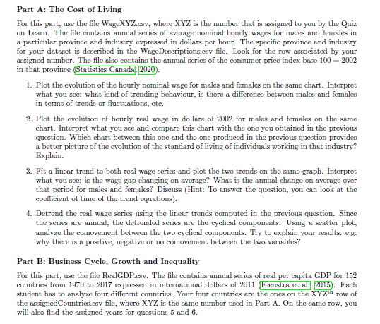
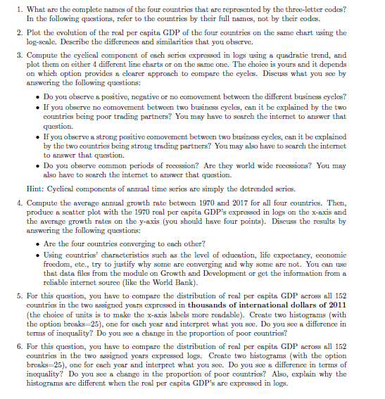
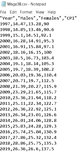
Part A: The Cost of Living For this part, use the file WageXYZ.cav, where XYZ is the number that is assigned to you by the Quiz on Learn. The file contains annual series of average nominal hourly wages for males and females in a particular province and industry expressed in dollars per hour. The specific province and industry for your dataset is described in the WageDescriptions.cav file. Look for the row associated by your assigned number. The file also contains the annual series of the consumer price index base 100 = 2002 in that province (Statistics Canada, 2020) 1. Plot the evolution of the hourly nominal wage for males and females on the same chart. Interpret what you see: what kind of trending behaviour, is there a difference between males and females in terms of trends or fluctuations, etc. 2. Plot the evolution of hourly real wage in dollars of 2002 for males and females on the same chart. Interpret what you see and compare this chart with the one you obtained in the previous question. Which chart between this one and the one produced in the previous question provides a better picture of the evolution of the standard of living of individuals working in that industry? Explain. 3. Fit a linear trend to both real wage series and plot the two trends on the same graph. Interpret what you see: is the wage gap changing on average? What is the annual change on average over that period for males and females? Discuss (Hint: To answer the question, you can look at the coefficient of time of the trend equations). 4. Detrend the real wage series using the linear trends computed in the previous question. Since the series are annual, the detrended series are the cyclical components. Using a scatter plot, analyze the comovement between the two cyclical components. Try to explain your results: .g. why there is a positive, negative or no comovement between the two variables? Part B: Business Cycle, Growth and Inequality For this part, use the file RealGDP cav. The file contains annual series of real per capita GDP for 152 countries from 1970 to 2017 expressed in international dollars of 2011 (Feenstra et al. 2015). Each student has to analyze four different countries. Your four countries are the ones on the XYZthrow off the assignedCountries cav file, where XYZ is the same number used in Part A. On the same row, you will also find the assigned years for questions 5 and 6.\fWage38.csv - Notepad File Edit Format View Help "Year", "Males", "Females", "CPI" 1997, 14. 47, 13. 28,90 1998, 14.85, 13. 46, 90.6 1999, 15. 1, 14. 51, 92. 1 2000, 16. 28, 14.91,95.3 2001, 16. 91, 15.84, 97.1 2002, 18. 16, 16. 15, 100 2003, 18. 5, 16.73, 103.4 2004, 19. 1, 18. 14, 105.3 2005, 19.7, 18. 39, 108.2 2006, 20. 03, 19.36, 110.4 2007, 20.71, 19.7, 112.5 2008, 21. 39, 20.27, 115.9 2009, 23.29, 21.65, 115.7 2010, 23. 36, 21. 94, 118.2 2011, 25. 11, 22. 34, 122.7 2012, 26.36, 22.92, 125.1 2013, 26.34, 23. 01, 126.6 2014, 26. 01, 24. 06, 128.8 2015, 25.83, 24.28, 129.3 2016, 25. 74, 25. 04, 130.9 2017, 27. 86, 25.32, 132.4 2018, 28. 86, 25.75,135.3 2019, 26.36, 26.6,137.5


