General Procedure for Transforming Data You must always start by looking at a scatterplot of your original data, and examining the pattern. Are there outliers
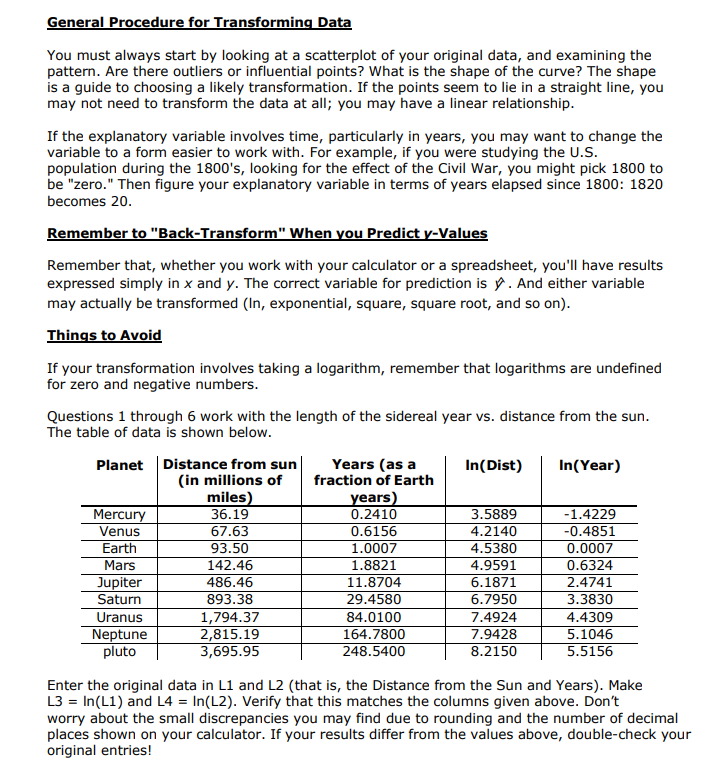
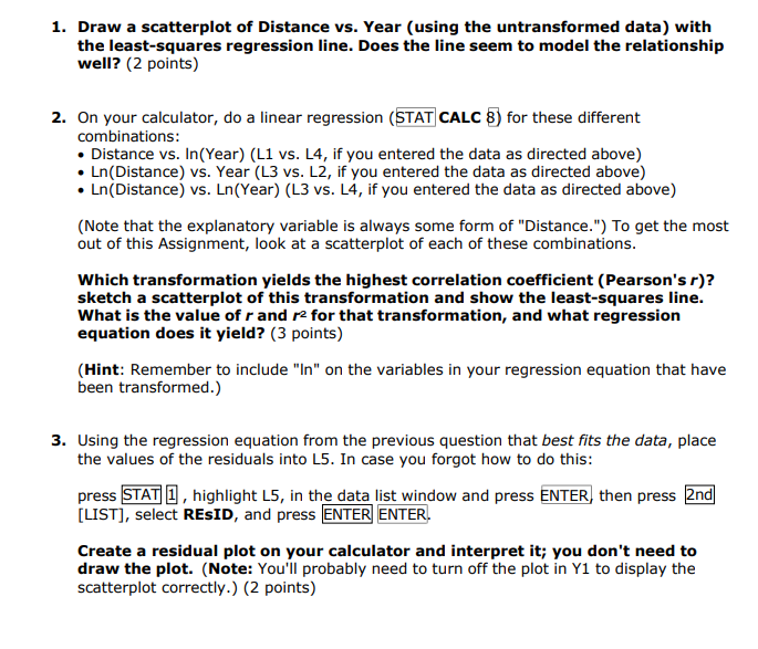
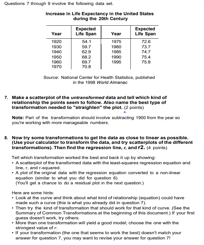
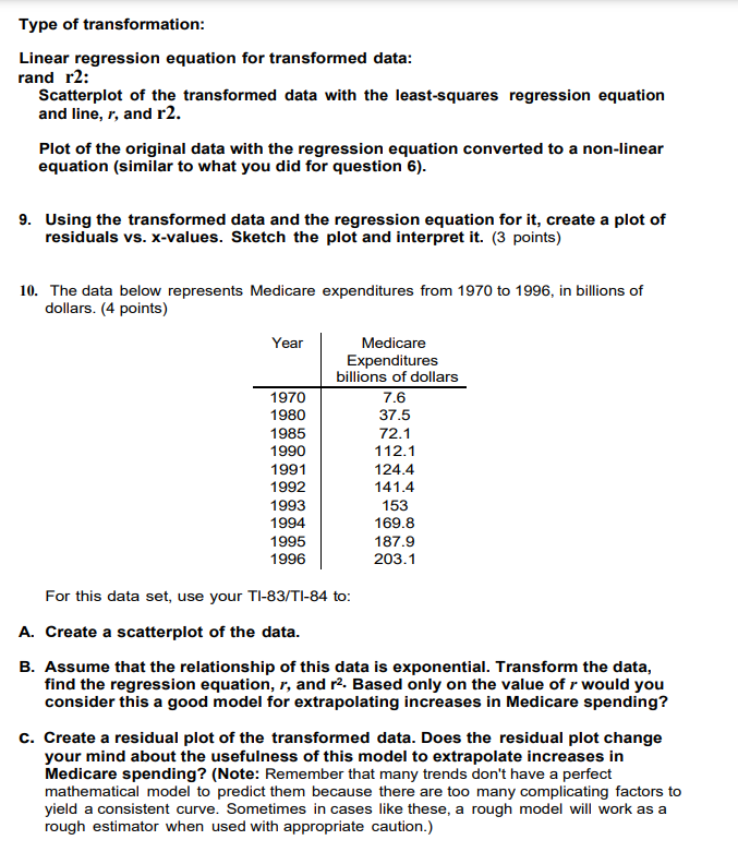
General Procedure for Transforming Data You must always start by looking at a scatterplot of your original data, and examining the pattern. Are there outliers or influential points? What is the shape of the curve? The shape is a guide to choosing a likely transformation. If the points seem to lie in a straight line, you may not need to transform the data at all; you may have a linear relationship. If the explanatory variable involves time, particularly in years, you may want to change the variable to a form easier to work with. For example, if you were studying the U.S. population during the 1800's, looking for the effect of the Civil War, you might pick 1800 to be "zero." Then figure your explanatory variable in terms of years elapsed since 1800: 1820 becomes 20. Remember to "Back-Transform"\" When you Predict y-Values Remember that, whether you work with your calculator or a spreadsheet, you'll have results expressed simply in x and y. The correct variable for prediction is . And either variable may actually be transformed (In, exponential, square, square root, and so on). Things to Avoid If your transformation invalves taking a logarithm, remember that logarithms are undefined for zero and negative numbers. Questions 1 through 6 work with the length of the sidereal year vs. distance from the sun. The table of data is shown below. Planet |Distance from sun Years (as a In{Dist) In(Year) (in millions of fraction of Earth miles ears Mercury 36.19 0.2410 3.588%9 -1.4229 Venus 67.63 0.6156 4.2140 -0.4851 Earth 93.50 1.0007 4.5380 0.0007 Mars 142.46 1.8821 4.9591 0.6324 Jupiter 486.46 11.8704 6.1871 2.4741 Saturn 893.38 29.4580 6.7950 3.3830 Uranus 1,794.37 84.0100 7.4924 4.4309 Neptune 2,815.19 164.7800 7.9428 5.1046 pluto 3,695.95 248.5400 8.2150 5.5156 Enter the original data in L1 and L2 (that is, the Distance from the Sun and Years). Make L3 = In(L1) and L4 = In(L2). Verify that this matches the columns given above. Don't worry about the small discrepancies you may find due to rounding and the number of decimal places shown on your calculator. If your results differ from the values above, double-check your original entries! 1. Draw a scatterplot of Distance vs. Year (using the untransformed data) with the least-squares regression line. Does the line seem to model the relationship well? (2 points) On your calculator, do a linear regression (STAT|CALC B) for these different combinations: Distance vs. In{Year) (L1 vs. L4, if you entered the data as directed above) Ln(Distance) vs. Year (L3 vs. L2, if you entered the data as directed above) Ln(Distance) vs. Ln(Year) (L3 vs. L4, if you entered the data as directed above) (Note that the explanatory variable is always some form of "Distance.") To get the most out of this Assignment, look at a scatterplot of each of these combinations. Which transformation yields the highest correlation coefficient (Pearson's r)? sketch a scatterplot of this transformation and show the least-squares line. What is the value of r and r2 for that transformation, and what regression equation does it yield? (3 points) (Hint: Remember to include "In" on the variables in your regression equation that have been transformed.) Using the regression equation from the previous question that best fits the data, place the values of the residuals into L5. In case you forgot how to do this: press [STAT|[1, highlight L5, in the data list window and press ENTER] then press [2nd| [LIST], select RESID, and press [ENTER| [ENTER. Create a residual plot on your calculator and interpret it; you don't need to draw the plot. (Note: You'll probably need to turn off the plot in Y1 to display the scatterplot correctly.) (2 points) 4. Using algebra, convert your regression e ation toa power equation (show your work below). Enter this equation in Y2 (press |Y..=J and enter the equation) and make a scatterplot of LI, L2, with Y2, verifying that the power equation is a good fit for this data. As you set up your regression equation, keep in mind that the variables are Iny and Inx. Here's what the graph of the scatterplot and power equation will look like. (It's upto you to derive the power equation.) Finally, summarize, in plain English, what you've done in questions 1-4. {3 points) 5. The purpose of the transformations you're studying is to find a simple model to describe the relationship in a data set. The model can be used to predict a response value (called interpolation for values within the range of the data set and extrapofation for values outside the range of the data set). Recall that extrapolation is usually not a valid way to predict y-values. A well-known feature of our solar system is the asteroid belt between Mars and Jupiter. One theory about the asteroid belt is that it's made of primordial material that was prevented from forming another planet by the gravitational pull of Jupiter when the solar system was formed. One of the largest asteroids is 951 Gaspra. Its distance from the Sun is 207.16 million miles. Use your linear regression equation to interpolate the length of its sidereal year. (1 point) Remember that you need to take the natural log of Distance before you plug it in, and that your first result will be the natural log of Year. Show your work. 6. Finally, calculate the length of the year for 951 Gaspra from the power function you developed in Question 4. (Show all your work) (1 point) Note: Theoretically, the answers from 5 and 6 should be the same, but they'll probably come out differently due to rounding between steps. The more digits you carry throughout the calculations, the closer the two answers will be. Questions 7 through 9 involve the following data set. Increase in Life Expectancy in the United States during the 20th Century Expected Expected Year Life Span Year Life Span 1920 541 1975 726 1930 59.7 1980 73.7 1940 62.9 1985 74.7 1950 68.2 1990 75.4 1960 69.7 1995 758 1970 70.8 Source: National Center for Health Statistics, published in the 1998 World Almanac 7. Make a scatterplot of the untransformed data and tell which kind of relationship the points seem to follow. Also name the best type of transformation needed to "straighten\" the plot. (2 points) A Note: Part of the transformation should invelve subtracting 1900 from the year so you're working with more manageable numbers. 8. Now try some transformations to get the data as close to linear as possible. {Use your calculator to transform the data, and try scatterplots of the different transformations). Then find the regression line, r, and r2. (4 points) Tell which transformation worked the best and back it up by showing: * A scatterplot of the transformed data with the least-squares regression equation and line, r, and r-squared. = A plot of the original data with the regression equation converted to a non-linear equation (similar to what you did for question &) (You'll get a chance to do a residual plot in the next question.) Here are some hints: * Look at the curve and think about what kind of relationship (equation) could have made such a curve (this is what you already did in question 7). * Then try the kind of transformation that should work for that kind of curve. (See the Summary of Common Transformations at the beginning of this document.) If your first guess doesn't work, try others. * More than one transformation will yield a good model; choose the one with the strongest value of r. = If your transformation (the one that seems to work the best) doesn't match your answer for question 7, you may want to revise your answer for question 7! Type of transformation: Linear regression equation for transformed data: rand r2: Scatterplot of the transformed data with the least-squares regression equation and line, r, and r2. Plot of the original data with the regression equation converted to a non-linear equation (similar to what you did for question 6). 9. Using the transformed data and the regression equation for it, create a plot of residuals vs. x-values. Sketch the plot and interpret it. (3 points) 10. The data below represents Medicare expenditures from 1970 to 1996, in billions of dollars. (4 points) Year Medicare Expenditures billions of dollars 1970 76 1980 375 1985 72.1 1990 112.1 1991 124 .4 1992 141.4 1993 153 1994 169.8 1995 187.9 1996 2031 For this data set, use your TI-83/TI-84 to: A. Create a scatterplot of the data. B. Assume that the relationship of this data is exponential. Transform the data, find the regression equation, r, and rZ Based only on the value of r would you consider this a good model for extrapolating increases in Medicare spending? c. Create a residual plot of the transformed data. Does the residual plot change your mind about the usefulness of this model to extrapolate increases in Medicare spending? (Note: Remember that many trends don't have a perfect mathematical model to predict them because there are too many complicating factors to yield a consistent curve. Sometimes in cases like these, a rough model will work as a rough estimator when used with appropriate caution.)
Step by Step Solution
There are 3 Steps involved in it
Step: 1
Get Instant Access to Expert-Tailored Solutions
See step-by-step solutions with expert insights and AI powered tools for academic success
Step: 2
Step: 3
Ace Your Homework with AI
Get the answers you need in no time with our AI-driven, step-by-step assistance