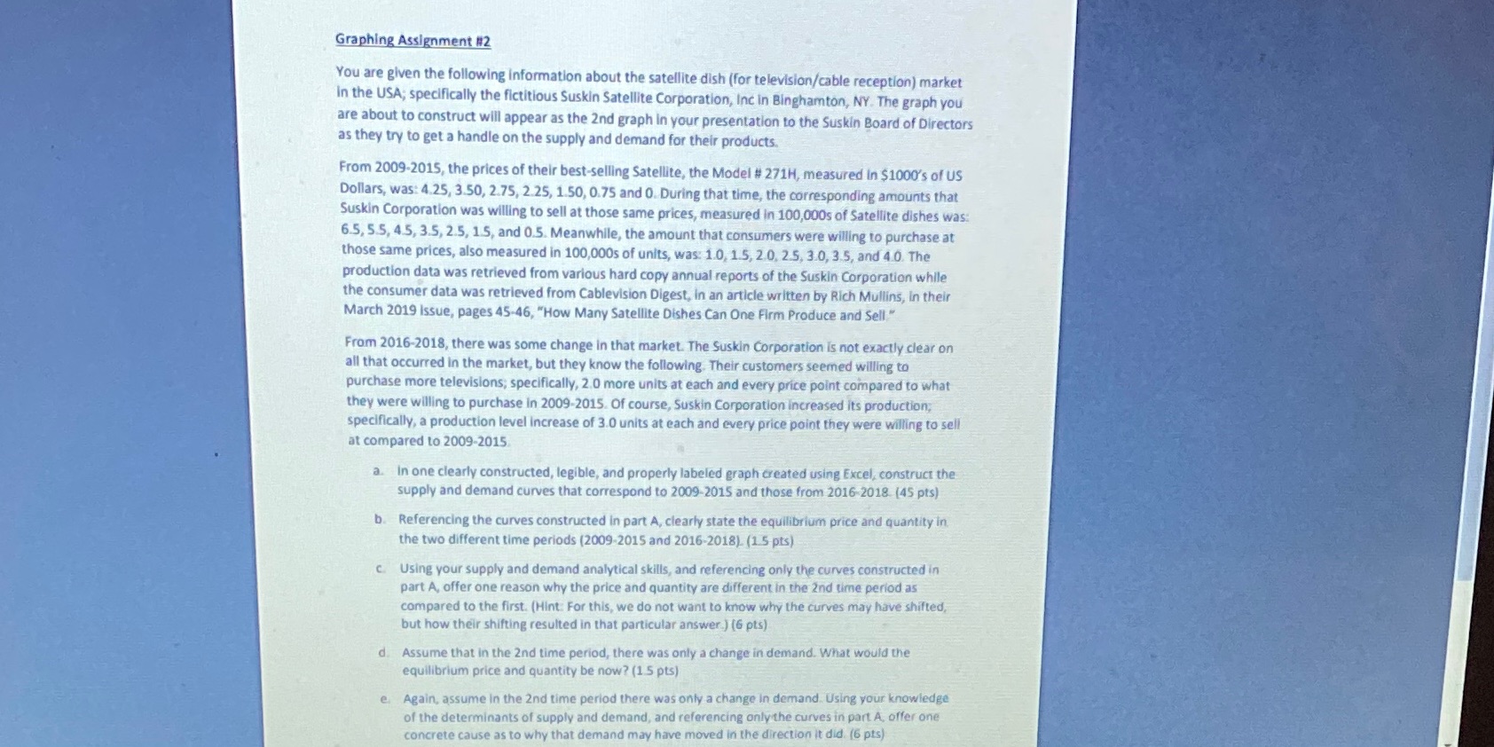
Graphing Assignment #2 You are given the following information about the satellite dish (for television/cable reception) market in the USA; specifically the fictitious Suskin Satellite Corporation, Inc in Binghamton, NY. The graph you are about to construct will appear as the 2nd graph in your presentation to the Suskin Board of Directors as they try to get a handle on the supply and demand for their products. From 2009-2015, the prices of their best-selling Satellite, the Model # 271H, measured In $1000's of US Dollars, was: 4.25, 3.50, 2.75, 2.25, 1.50, 0.75 and 0. During that time, the corresponding amounts that Suskin Corporation was willing to sell at those same prices, measured in 100,000s of Satellite dishes was: 6.5, 5.5, 4.5, 3.5, 2.5, 15, and 0.5. Meanwhile, the amount that consumers were willing to purchase at those same prices, also measured in 100,000s of units, was: 1.0, 1.5, 2.0, 2.5, 3.0, 3.5, and 4.0. The production data was retrieved from various hard copy annual reports of the Suskin Corporation while the consumer data was retrieved from Cablevision Digest, in an article written by Rich Mullins, In their March 2019 Issue, pages 45-46, "How Many Satellite Dishes Can One Firm Produce and Sell" From 2016-2018, there was some change in that market. The Suskin Corporation is not exactly clear on all that occurred in the market, but they know the following. Their customers seemed willing to purchase more televisions; specifically, 2.0 more units at each and every price point compared to what they were willing to purchase in 2009-2015. Of course, Suskin Corporation increased its production; specifically, a production level increase of 3.0 units at each and every price point they were willing to sell at compared to 2009-2015 a. in one clearly constructed, legible, and properly labeled graph created using Excel, construct the supply and demand curves that correspond to 2009-2015 and those from 2016-2018. (45 pts) b. Referencing the curves constructed in part A, clearly state the equilibrium price and quantity in the two different time periods (2009-2015 and 2016-2018). (1 5 pts) c. Using your supply and demand analytical skills, and referencing only the curves constructed in part A, offer one reason why the price and quantity are different in the 2nd time period as compared to the first. (Hint: For this, we do not want to know why the curves may have shifted, but how their shifting resulted in that particular answer ) (6 pts) d. Assume that in the 2nd time period, there was only a change in demand. What would the equilibrium price and quantity be now? (1 5 pts) e. Again, assume in the 2nd time period there was only a change in demand. Using your knowledge of the determinants of supply and demand, and referencing only the curves in part A, offer one concrete cause as to why that demand may have moved in the direction it did. (6 pts)


