Hello, I am inquiring for information on part 1 of this exploration activity for Stats class. And rather just giving me the answer, I would much appreciate it if I could get a thorough description on how to best tackle these solutions with relative ease. Thank you in advance-for all the help given!!
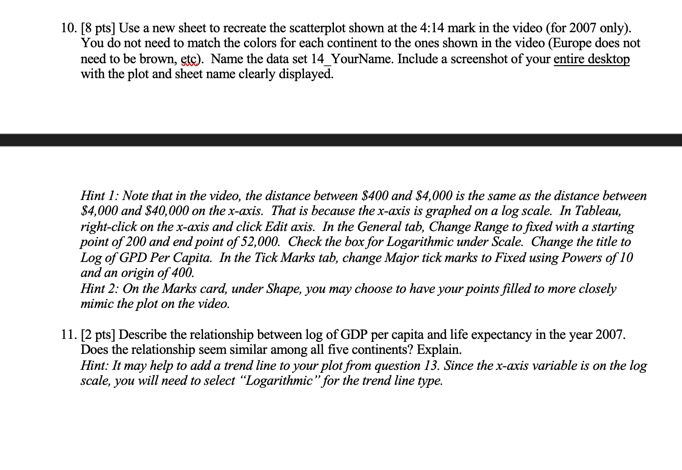
10. [8 pts] Use a new sheet to recreate the scatterplot shown at the 4:14 mark in the video (for 2007 only). You do not need to match the colors for each continent to the ones shown in the video (Europe does not need to be brown, etc). Name the data set 14_YourName. Include a screenshot of your entire desktop with the plot and sheet name clearly displayed. Hint 1: Note that in the video, the distance between $400 and $4,000 is the same as the distance between $4,000 and $40,000 on the x-axis. That is because the x-axis is graphed on a log scale. In Tableau, right-click on the x-axis and click Edit axis. In the General tab, Change Range to fixed with a starting point of 200 and end point of 52,000. Check the box for Logarithmic under Scale. Change the title to Log of GPD Per Capita. In the Tick Marks tab, change Major tick marks to Fixed using Powers of 10 and an origin of 400. Hint 2: On the Marks card, under Shape, you may choose to have your points filled to more closely mimic the plot on the video. 11. [2 pts] Describe the relationship between log of GDP per capita and life expectancy in the year 2007. Does the relationship seem similar among all five continents? Explain. Hint: It may help to add a trend line to your plot from question 13. Since the x-axis variable is on the log scale, you will need to select "Logarithmic" for the trend line type.Part 1 - Additional Resources Allowed Download the GapMinder data file from the course webpage and load the data into Tableau: http://www.math.montana.edu/courses/s216/index.html#data This file contains the same data Hans Rosling displayed in the video, but only for the years 1952 through 2007. Important information: Tableau will automatically treat a number as continuous, but we want to treat year in the data set as a categorical variable, so use the drop down menu next to Year under Dimensions to convert Year to a discrete variable. Also note that in the video, Hans Rosling only displays data for a single year at a time. We can do this in Tableau using the Filters box. 1. [2 pts] Drag Year to Filter and make sure 1952 is the only box checked. This will allow us to only plot data from 1952. Create a bar chart displaying the number of countries for each continent in 1952. Name the sheet 5_YourName. Include a screenshot of your entire desktop with the plot and sheet name clearly displayed. Hint: After dragging Country to Rows, use the drop down menu next to Country to make Tableau treat country as a Measure displaying the Count. 2. Which continent has the most countries included in the data set in 1952? How many countries are included for this continent? 3. The video displays data from 200 countries over 200 years. In 1952, how many total countries do we have data from? 4. [4 pts] Use a new sheet to create a bar graph of GDP per capita for each of 1952 and 1977 which is segmented by continent. As with all segmented bar graphs, we want the y-axis to show the percentage of total GDP per capita for each continent rather than total GDP per capita for each. Name the sheet displayed. 8_YourName. Include a screenshot of your entire desktop with the plot and sheet name clearly 5. [3 pts] What three variables are displayed in this segmented bar graph? What type of variable is each? 6. How does this graph differ from the segmented bar graph created of sector, segmented by sex in class? 7. For which continent(s) does the percentage of GDP per capita increase by more than 2% between 1952 and 1977? 8. [4 pts] Use a new sheet to create parallel (or side-by-side) boxplots of life expectancy in 1977, with one boxplot for each continent in the data set. Name the sheet 12_YourName. Include a screenshot of your entire desktop with the plot and sheet name clearly displayed. 9. [3 pts] In 1977, which continent had the lowest median life expectancy? Report the value and interpret the value in the context of the


