Hello:
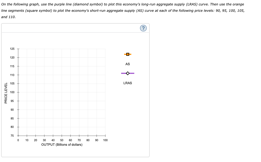
In this problem i am asked to graph and plot the number into it. they are proving a formula to obtain the numbers and then to plot into the Graph:
QuantityofOutputSupplied==NaturalLevelofOutput+?(PriceLevel Actual?PriceLevel
Expected)
I do not know how to identify the numbers from the given problem what is Quantity of output supplied , natural level out and alpha (?). Can you help identify them?
Thank you!
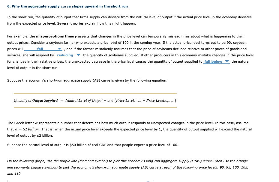
6. Why the aggregate supply curve slopes upward in the short run In the short run, the quantity of output that firms supply can deviate from the natural level of output if the actual price level in the economy deviates from the expected price level. Several theories explain how this might happen. For example, the misperceptions theory asserts that changes in the price level can temporarily mislead firms about what is happening to their output prices. Consider a soybean farmer who expects a price level of 100 in the coming year. If the actual price level turns out to be 90, soybean prices will fall , and if the farmer mistakenly assumes that the price of soybeans declined relative to other prices of goods and services, she will respond by _reducing the quantity of soybeans supplied. If other producers in this economy mistake changes in the price level for changes in their relative prices, the unexpected decrease in the price level causes the quantity of output supplied to fall below the natural level of output in the short run. Suppose the economy's short-run aggregate supply (AS) curve is given by the following equation: Quantity of Output Supplied = Natural Level of Output + a X (Price LevelAcmal - Price LevelExpected) The Greek letter a represents a number that determines how much output responds to unexpected changes in the price level. In this case, assume that a = $2 billion. That is, when the actual price level exceeds the expected price level by 1, the quantity of output supplied will exceed the natural level of output by $2 billion. Suppose the natural level of output is $50 billion of real GDP and that people expect a price level of 100. On the following graph, use the purple line (diamond symbol) to plot this economy's long-run aggregate supply (LRAS) curve. Then use the orange line segments (square symbol) to plot the economy's short-run aggregate supply (AS) curve at each of the following price levels: 90, 95, 100, 105, and 110.On the following graph, use the purple line (diamond symbol) to plot this economy's long-run aggregate supply (LRAS) curve. Then use the orange line segments (square symbol) to plot the economy's short-run aggregate supply (AS) curve at each of the following price levels: 90, 95, 100, 105, and 110. 125 120 115 AS 110 PRICE LEVEL 105 LRAS 100 95 90 85 80 75 0 10 20 30 40 50 60 70 80 90 100 OUTPUT (Billions of dollars)