Answered step by step
Verified Expert Solution
Question
1 Approved Answer
Her requirement is to be able to select a division and then to immediately see what the division's net profit percentage, net profit and revenue


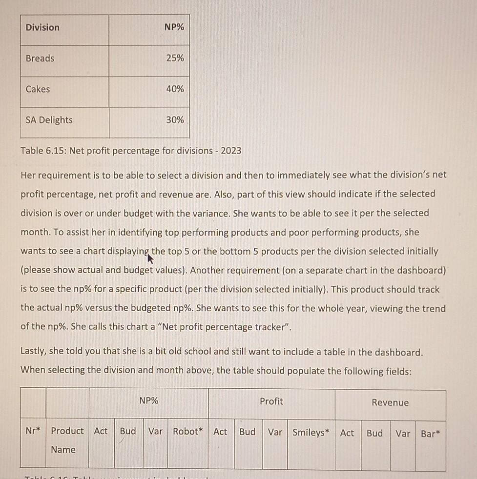
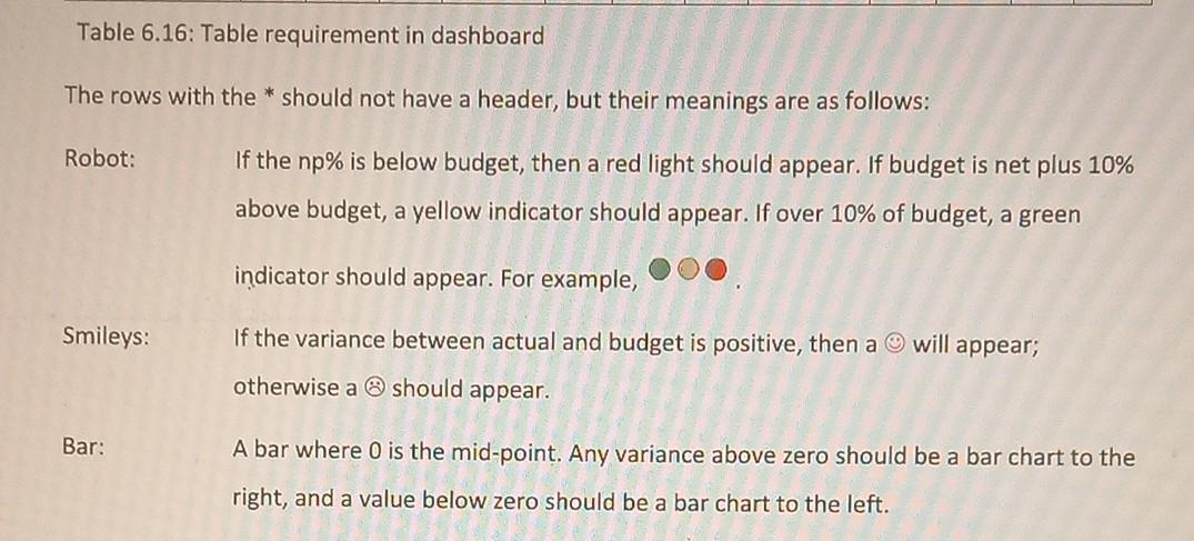
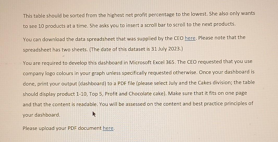
Her requirement is to be able to select a division and then to immediately see what the division's net profit percentage, net profit and revenue are. Also, part of this view should indicate if the selected division is over or under budget with the variance. She wants to be able to see it per the selected month. To assist her in identifying top performing products and poor performing products, she wants to see a chart displaying the top 5 or the bottom 5 products per the division selected initially (please show actual and budget values). Another requirement (on a separate chart in the dashboard) is to see the np% for a specific product (per the division selected initially). This product should track the actual np% versus the budgeted np%. She wants to see this for the whole year, viewing the trend of the np%. She calls this chart a "Net profit percentage tracker". Lastly, she told you that she is a bit old school and still want to include a table in the dashboard. When selecting the division and month above, the table should populate the following fields: This table should be sorted from the highest net profit percentage to the lowest. She also only wants to see 10 products at a time. She asks you to insert a scroll bar to scroll to the next products. You can download the data spreadsheet that was supplied by the CEO here. Please note that the spreadsheet has two sheets. (The date of this dataset is 31 July 2023.) You are required to develop this dashboard in Microsoft Excel 365. The CEO requested that you use company logo colours in your graph unless specifically requested otherwise. Once your dashboard is done, print your output (dashboard) to a PDF file (please select July and the Cakes division; the table should display product 1-10, Top 5, Profit and Chocolate cake). Make sure that it fits on one page and that the content is readable. You will be assessed on the content and best practice principles of your dashboard. Please upload your PDF document here. The CEO of Ikhishi Likagogo was very impressed after you have developed the initial dashboard. Due to the dashboard of 2022, she was able to identify that cash was not a KPI for the company. She also looked at other KPIs for similar companies and decided the major KPI will be net profit percentage (NP\%). She decided that the budgeted np\% for the divisions would be as follows: Table 6.16: Table requirement in dashboard The rows with the * should not have a header, but their meanings are as follows: Robot: If the np% is below budget, then a red light should appear. If budget is net plus 10% above budget, a yellow indicator should appear. If over 10% of budget, a green indicator should appear. For example, Smileys: If the variance between actual and budget is positive, then a (-) will appear; otherwise a should appear. Bar: A bar where 0 is the mid-point. Any variance above zero should be a bar chart to the right, and a value below zero should be a bar chart to the left. Her requirement is to be able to select a division and then to immediately see what the division's net profit percentage, net profit and revenue are. Also, part of this view should indicate if the selected division is over or under budget with the variance. She wants to be able to see it per the selected month. To assist her in identifying top performing products and poor performing products, she wants to see a chart displaying the top 5 or the bottom 5 products per the division selected initially (please show actual and budget values). Another requirement (on a separate chart in the dashboard) is to see the np% for a specific product (per the division selected initially). This product should track the actual np% versus the budgeted np%. She wants to see this for the whole year, viewing the trend of the np%. She calls this chart a "Net profit percentage tracker". Lastly, she told you that she is a bit old school and still want to include a table in the dashboard. When selecting the division and month above, the table should populate the following fields: This table should be sorted from the highest net profit percentage to the lowest. She also only wants to see 10 products at a time. She asks you to insert a scroll bar to scroll to the next products. You can download the data spreadsheet that was supplied by the CEO here. Please note that the spreadsheet has two sheets. (The date of this dataset is 31 July 2023.) You are required to develop this dashboard in Microsoft Excel 365. The CEO requested that you use company logo colours in your graph unless specifically requested otherwise. Once your dashboard is done, print your output (dashboard) to a PDF file (please select July and the Cakes division; the table should display product 1-10, Top 5, Profit and Chocolate cake). Make sure that it fits on one page and that the content is readable. You will be assessed on the content and best practice principles of your dashboard. Please upload your PDF document here. The CEO of Ikhishi Likagogo was very impressed after you have developed the initial dashboard. Due to the dashboard of 2022, she was able to identify that cash was not a KPI for the company. She also looked at other KPIs for similar companies and decided the major KPI will be net profit percentage (NP\%). She decided that the budgeted np\% for the divisions would be as follows: Table 6.16: Table requirement in dashboard The rows with the * should not have a header, but their meanings are as follows: Robot: If the np% is below budget, then a red light should appear. If budget is net plus 10% above budget, a yellow indicator should appear. If over 10% of budget, a green indicator should appear. For example, Smileys: If the variance between actual and budget is positive, then a (-) will appear; otherwise a should appear. Bar: A bar where 0 is the mid-point. Any variance above zero should be a bar chart to the right, and a value below zero should be a bar chart to the left
Step by Step Solution
There are 3 Steps involved in it
Step: 1

Get Instant Access to Expert-Tailored Solutions
See step-by-step solutions with expert insights and AI powered tools for academic success
Step: 2

Step: 3

Ace Your Homework with AI
Get the answers you need in no time with our AI-driven, step-by-step assistance
Get Started


