hi can somone help me with these question? I'm stuck from2. Scatter Plots using Matplotlib & Numpy. i want to check my answer with you, so I would be confirmed its good. if you familiar with jupyter notebook, then you can help me. you have to use jupyter notebook, the Marking Raw Data and matplotlib-logo.jpg you have to download and upload into jupyter notebook thanks!
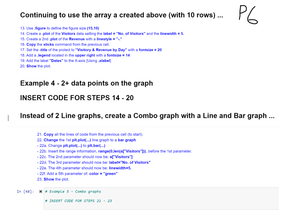
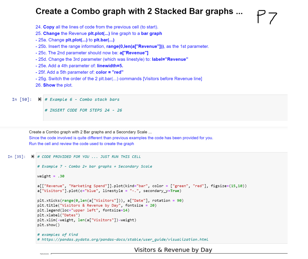
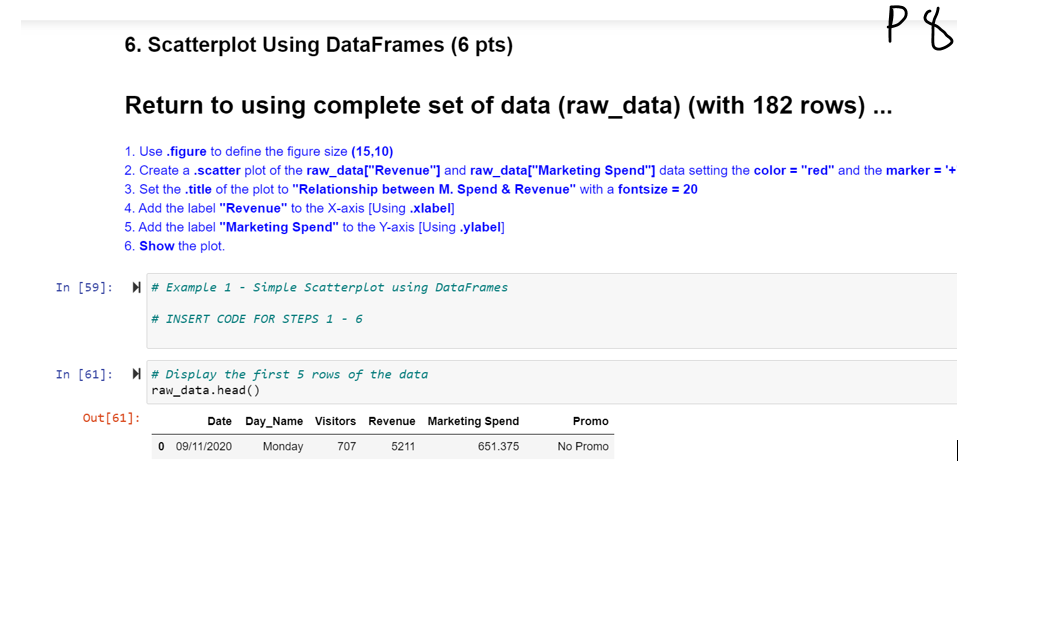
\f\f\f\f\fContinuing to use the array a created above (with 10 rows) ... P6 13. Use .figure to define the figure size (15,10) 14. Create a .plot of the Visitors data setting the label = "No. of Visitors" and the linewidth = 5. 15. Create a 2nd .plot of the Revenue with a linestyle = "-." 16. Copy the xticks command from the previous cell. 17. Set the . title of the prolect to "Visitory & Revenue by Day" with a fontsize = 20 18. Add a .legend located in the upper right with a fontsize = 14 19. Add the label "Dates" to the X-axis [Using .xlabel] 20. Show the plot. Example 4 - 2+ data points on the graph INSERT CODE FOR STEPS 14 - 20 Instead of 2 Line graphs, create a Combo graph with a Line and Bar graph ... 21. Copy all the lines of code from the previous cell (to start). 22. Change the 1st pit.plot(...) line graph to a bar graph - 22a. Change pit.plot(...) to pit.bar(...) - 22b. Insert the range information, range(0,len(a["Visitors"])), before the 1st parameter. - 22c. The 2nd parameter should now be: a["Visitors"] - 22d. The 3rd parameter should now be: label="No. of Visitors" - 22e. The 4th parameter should now be: linewidth=5. - 22f. Add a 5th parameter of: color = "green" 23. Show the plot. In [48]: ) # Example 5 - Combo graphs # INSERT CODE FOR STEPS 21 - 23Create a Combo graph with 2 Stacked Bar graphs ... P7 24. Copy all the lines of code from the previous cell (to start). 25. Change the Revenue pit.plot(...) line graph to a bar graph 25a. Change plt.plot(...) to pit.bar(...) - 25b. Insert the range information, range(0,len(a["Revenue"])), as the 1st parameter. - 25c. The 2nd parameter should now be: a["Revenue"] 25d. Change the 3rd parameter (which was linestyle) to: label="Revenue" 25e. Add a 4th parameter of: linewidth=5. - 25f. Add a 5th parameter of: color = "red" - 25g. Switch the order of the 2 pit.bar(...) commands [Visitors before Revenue line] 26. Show the plot. In [50]: M # Example 6 - Combo stack bars # INSERT CODE FOR STEPS 24 - 26 Create a Combo graph with 2 Bar graphs and a Secondary Scale ... Since the code involved is quite different than previous examples the code has been provided for you. Run the cell and review the code used to create the graph In [35]: # CODE PROVIDED FOR YOU ... JUST RUN THIS CELL # Example 7 - Combo 2+ bar graphs + Secondary Scale weight = .30 a[ ["Revenue", "Marketing Spend"]] . plot(kind="bar", color = ["green", "red"], figsize=(15, 10)) a ["Visitors"].plot(c="blue", linestyle = "-.", secondary_y=True) pit. xticks (range(0, len(a["Visitors"])), a["Date"], rotation = 90) pit. title("Visitors & Revenue by Day", fontsize = 20) pit. legend (loc="upper left", fontsize=14) plt. xlabel ("Dates") pit. xlim(-weight, len(a["Visitors"])-weight) pit. show ( ) # examples of Kind # https://pandas. pydata. org/pandas-docs/stable/user_guide/visualization. html Visitors & Revenue by Day6. Scatterplot Using DataFrames (6 pts) Return to using complete set of data (raw_data) (with 182 rows) ... 1. Use .figure to define the figure size (15,10) 2. Create a .scatter plot of the raw_data["Revenue"] and raw_data["Marketing Spend"] data setting the color = "red" and the marker = '+ 3. Set the . title of the plot to "Relationship between M. Spend & Revenue" with a fontsize = 20 4. Add the label "Revenue" to the X-axis [Using .xlabel] 5. Add the label "Marketing Spend" to the Y-axis [Using .ylabel] 6. Show the plot. In [59]: M # Example 1 - Simple Scatterplot using DataFrames # INSERT CODE FOR STEPS 1 - 6 In [61]: M # Display the first 5 rows of the data raw_data . head ( ) Out [ 61 ] : Date Day_Name Visitors Revenue Marketing Spend Promo 0 09/11/2020 Monday 707 5211 651.375 No Promo\f