

Answered step by step
Verified Expert Solution
Question
1 Approved Answer
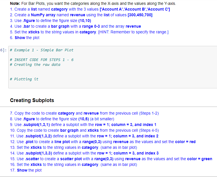
Hope you can help. Note: For Bar Plots, you want the categories along the X-axis and the values along the Y-axis. 1. Create a list
Hope you can help.
Step by Step Solution
There are 3 Steps involved in it
Step: 1

Get Instant Access to Expert-Tailored Solutions
See step-by-step solutions with expert insights and AI powered tools for academic success
Step: 2

Step: 3
Ace Your Homework with AI
Get the answers you need in no time with our AI-driven, step-by-step assistance
Get Started
Professional Microsoft SQL Server 2012 Administration
Authors: Adam Jorgensen, Steven Wort
1st Edition
1118106881, 9781118106884