Answered step by step
Verified Expert Solution
Question
1 Approved Answer
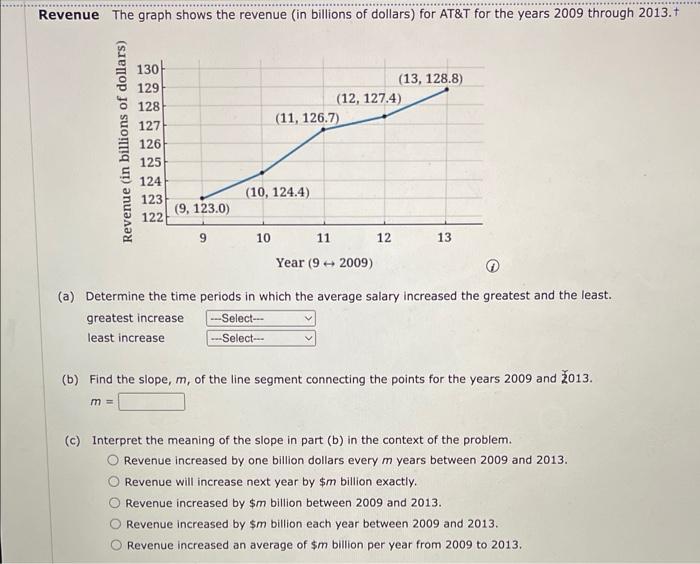
Revenue The graph shows the revenue (in billions of dollars) for AT&T for the years 2009 through 2013. Revenue (in billions of dollars) 130

Revenue The graph shows the revenue (in billions of dollars) for AT&T for the years 2009 through 2013. Revenue (in billions of dollars) 130 129 128 127 126 125 124 123 122 m= (9, 123.0) 9 (10, 124.4) 10 (11, 126.7) ---Select--- ---Select--- 11 (12, 127.4) Year (92009) (13, 128.8) 12 (a) Determine the time periods in which the average salary increased the greatest and the least. greatest increase least increase 13 (b) Find the slope, m, of the line segment connecting the points for the years 2009 and 2013. (c) Interpret the meaning of the slope in part (b) in the context of the problem. Revenue increased by one billion dollars every m years between 2009 and 2013. Revenue will increase next year by $m billion exactly. Revenue increased by $m billion between 2009 and 2013. Revenue increased by $m billion each year between 2009 and 2013. Revenue increased an average of $m billion per year from 2009 to 2013.
Step by Step Solution
★★★★★
3.58 Rating (158 Votes )
There are 3 Steps involved in it
Step: 1
Solved Between 2007200 200910 201011 201112 201213 Revenue Increased an slope greatest ...
Get Instant Access to Expert-Tailored Solutions
See step-by-step solutions with expert insights and AI powered tools for academic success
Step: 2

Step: 3

Ace Your Homework with AI
Get the answers you need in no time with our AI-driven, step-by-step assistance
Get Started


