

Answered step by step
Verified Expert Solution
Question
1 Approved Answer
HTML. Create the page below using Grid Layouts. Use grid-template-areas to create the following web page. Create 3 different responsive screen web pages with media.
HTML. Create the page below using Grid Layouts. Use grid-template-areas to create the following web page. Create 3 different responsive screen web pages with media. No bootstrap. 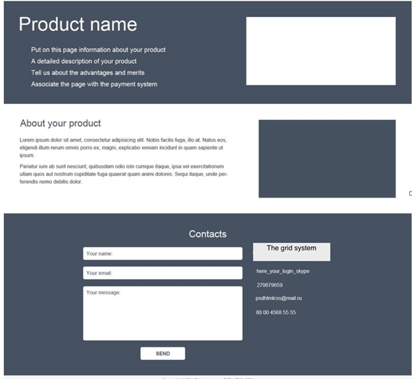
Step by Step Solution
There are 3 Steps involved in it
Step: 1

Get Instant Access to Expert-Tailored Solutions
See step-by-step solutions with expert insights and AI powered tools for academic success
Step: 2

Step: 3
Ace Your Homework with AI
Get the answers you need in no time with our AI-driven, step-by-step assistance
Get Started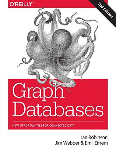
Graph Databases New Opportunities For Connected Data
Authors: Ian Robinson, Jim Webber, Emil Eifrem
2nd Edition
1491930896, 978-1491930892