Question
I continue to brake my head with this assignment to the point that my professor says I keep getting this wrong. I got a 10/50
I continue to brake my head with this assignment to the point that my professor says I keep getting this wrong. I got a 10/50 last time I tried this and I truly don't know what I Am doing wrong. Can someone please help me understand this? She wants this in an excel document which I get that because it's easier to write formula and do graphs there but I give up.
The data file attached consists of 3 worksheets:
1. Housing Features
2. Housing Median 1996-2018
3. Stock Returns
Excel Project Output I
1. Data: Housing Features
1.1 Frequency Distribution & Bar chart.Which variable of data 1. Housing Features is described best with a bar chart? Choose the variable and make a frequency distribution and a bar chart with the data.
1.2 Frequency Distribution & Pie chart. Which variable of data 1. Housing Features is described best with a pie chart? Choose the variable and make a frequency distribution and a pie chart the data.
1.3 Frequency Distribution & Histogram. Which variable of data 1. Housing Features is described best with a histogram?Organize the data into a frequency distribution and a histogram.
Follow the guideline: The data for 1.3 need to be organized into 10 classes and the first class begins from 70.Figure out class width and define 10 classes.Based on your class definition, make frequency distribution and histogram.
2. Data: Housing Median 1996-2018
2.1 Which chart is the best for this type of data?Make the chart to show median price change over time (Aug. 1996 ~ July 2018).On one chart, show the change of both ('median of top tier' and 'median of bottom tier') over time.
3. Data: Stock Returns: There is nothing for you to submit for output I submission
Excel Project Output II
(Numbering continues from output I)
1. Data: Housing Features.
(1.1 through 1.3 belong to output I submission)
1.4"Descriptive Statistics" Table for the variable "sale price per square foot"
2. Data: Housing Median 1996-2018 -------Output of this belongs to output I.You have nothing to submit in output II
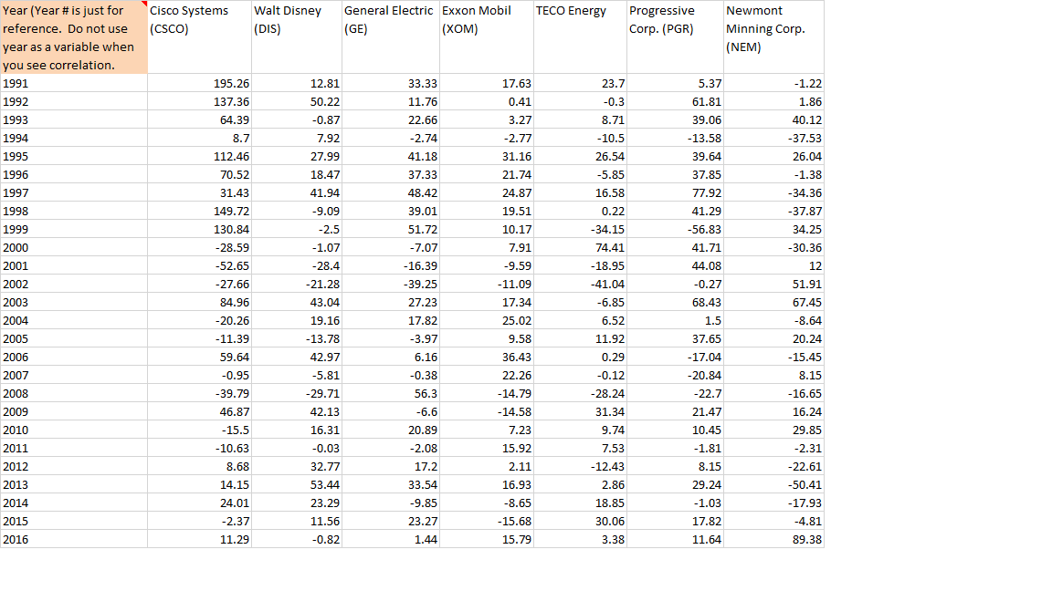
3. Data: Stock Returns
3.1 Correlation Coefficient Matrix
3.2 Read your correlation coefficient matrix.Choose a pair that has the strongest positive correlation.With the two stocks your chose, make a scatter Plot.
3.3 Read your correlation coefficient matrix.Choose a pair that has the strongest negative correlation.With the two stocks your chose, make a scatter Plot.


Step by Step Solution
There are 3 Steps involved in it
Step: 1

Get Instant Access to Expert-Tailored Solutions
See step-by-step solutions with expert insights and AI powered tools for academic success
Step: 2

Step: 3

Ace Your Homework with AI
Get the answers you need in no time with our AI-driven, step-by-step assistance
Get Started


