Question: I dont know how this works...But i need this worksheet done in an hour with work so i can understand BIO 270 Lab 1: Statistics




I dont know how this works...But i need this worksheet done in an hour with work so i can understand
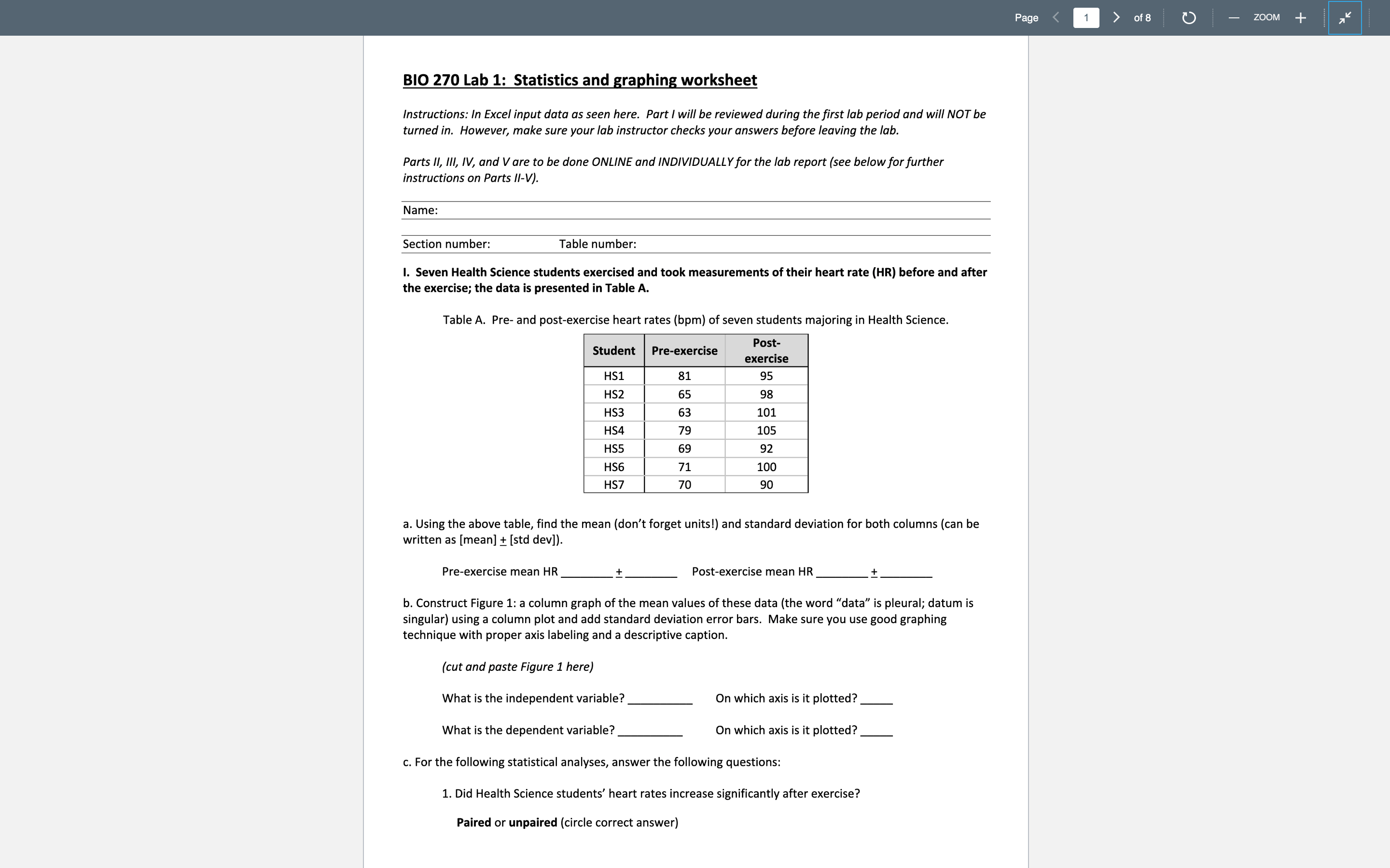
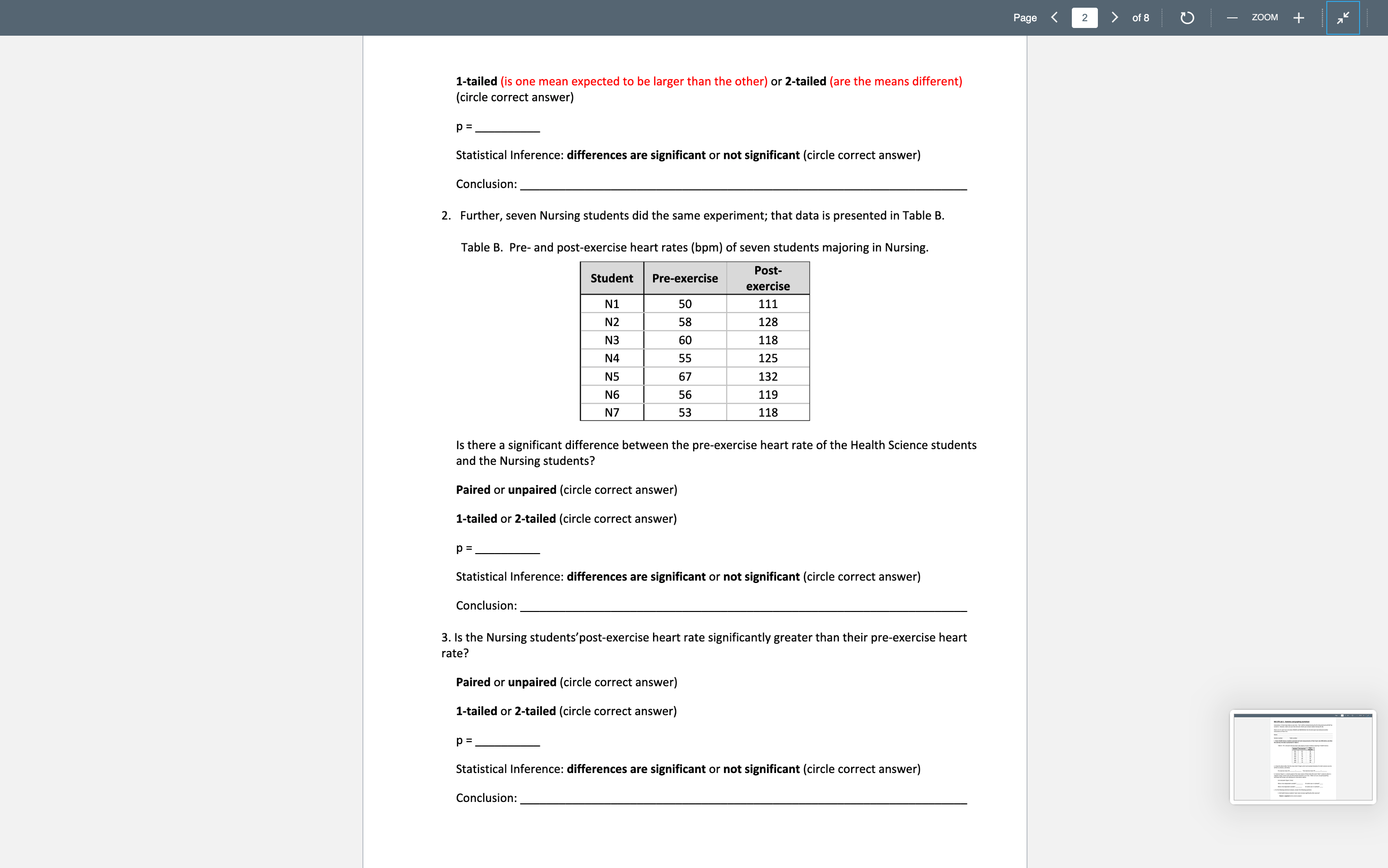
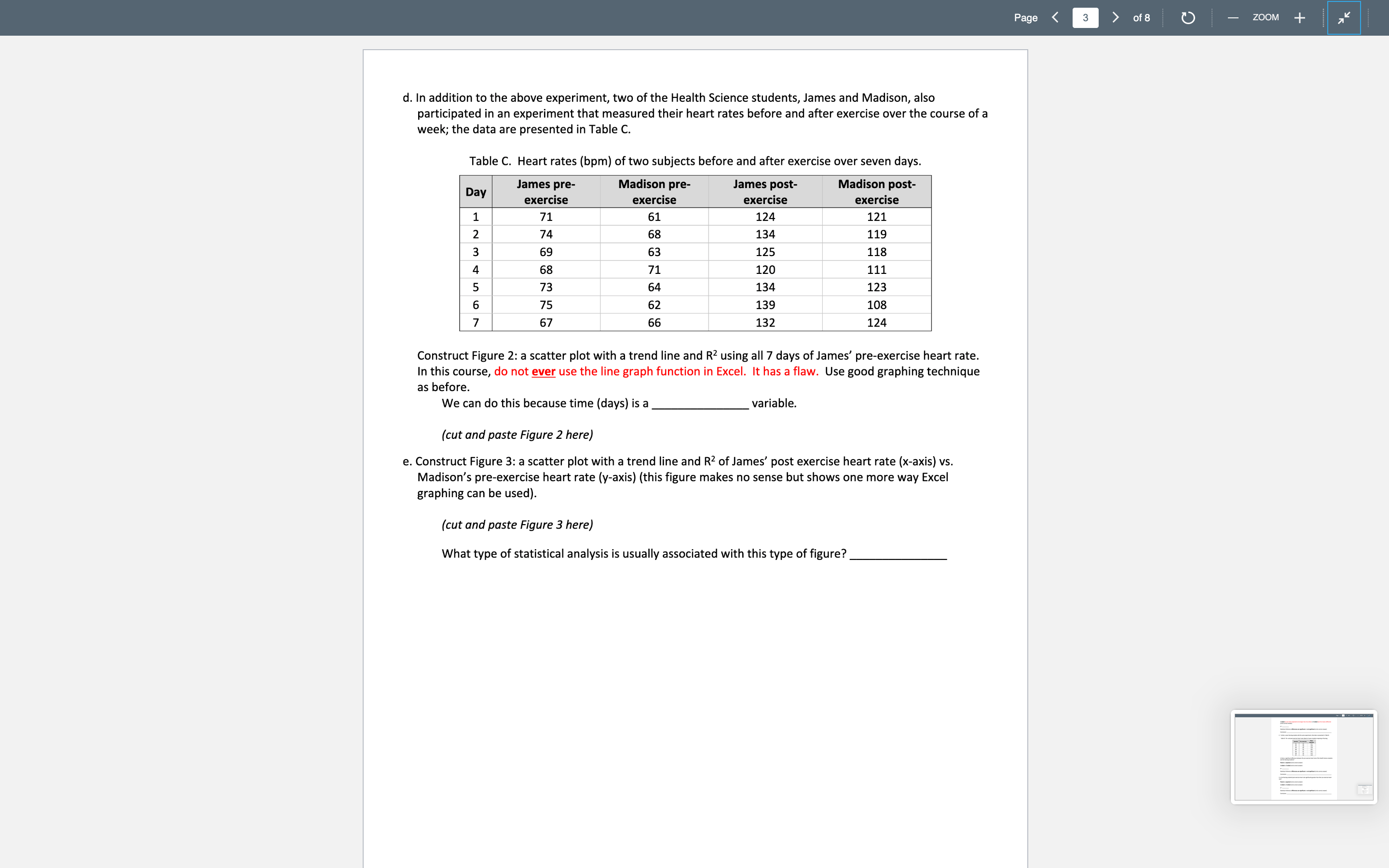

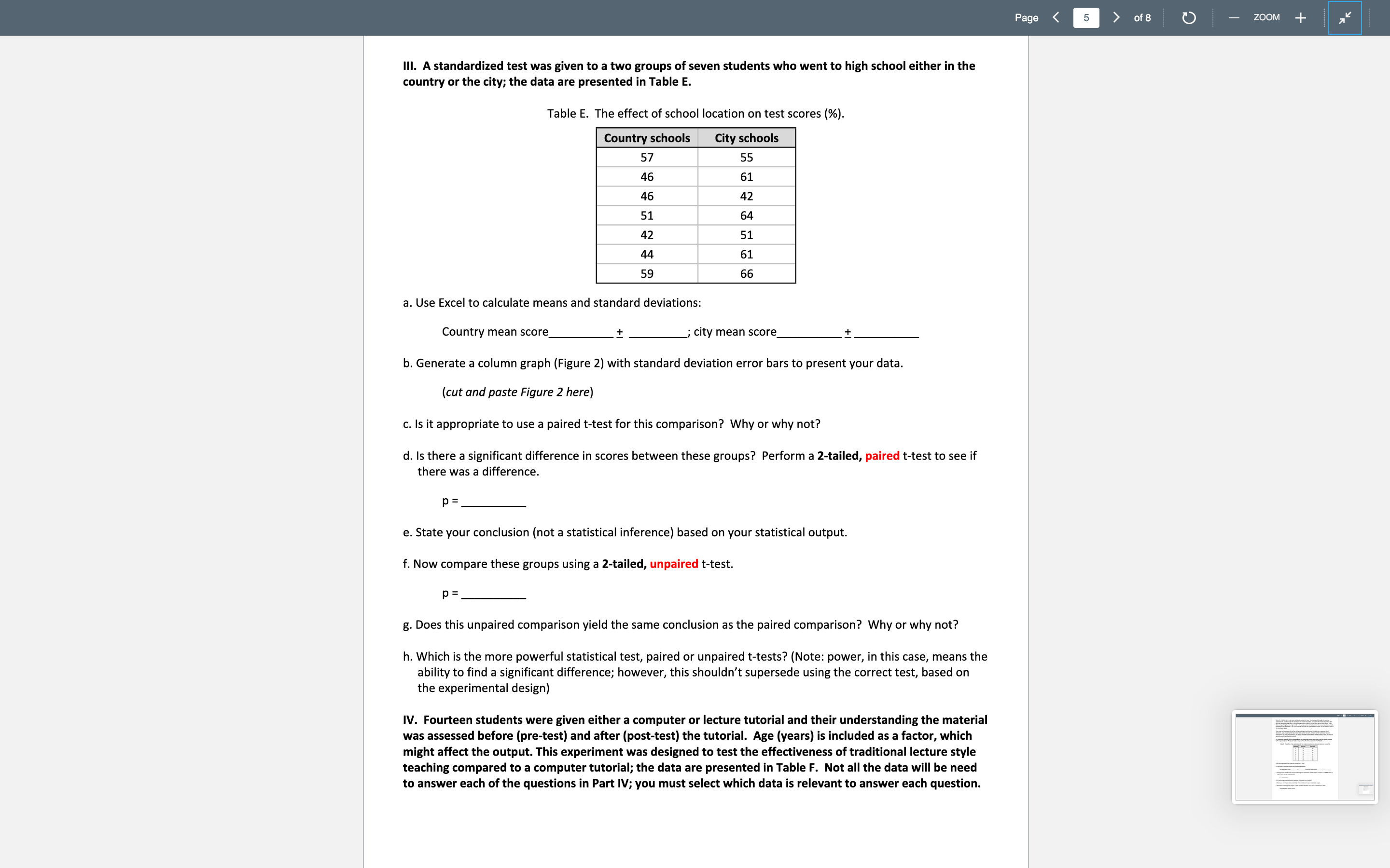

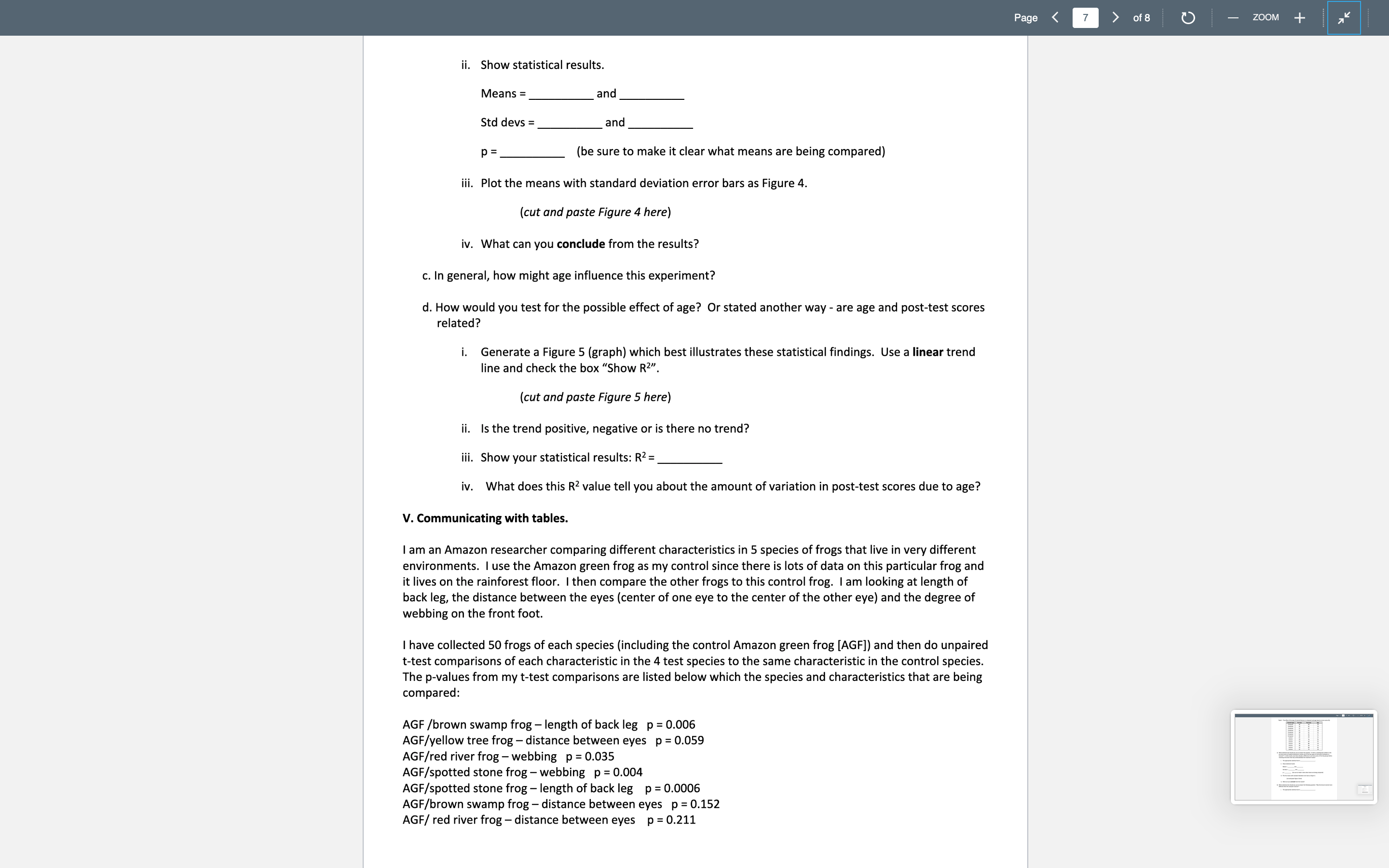

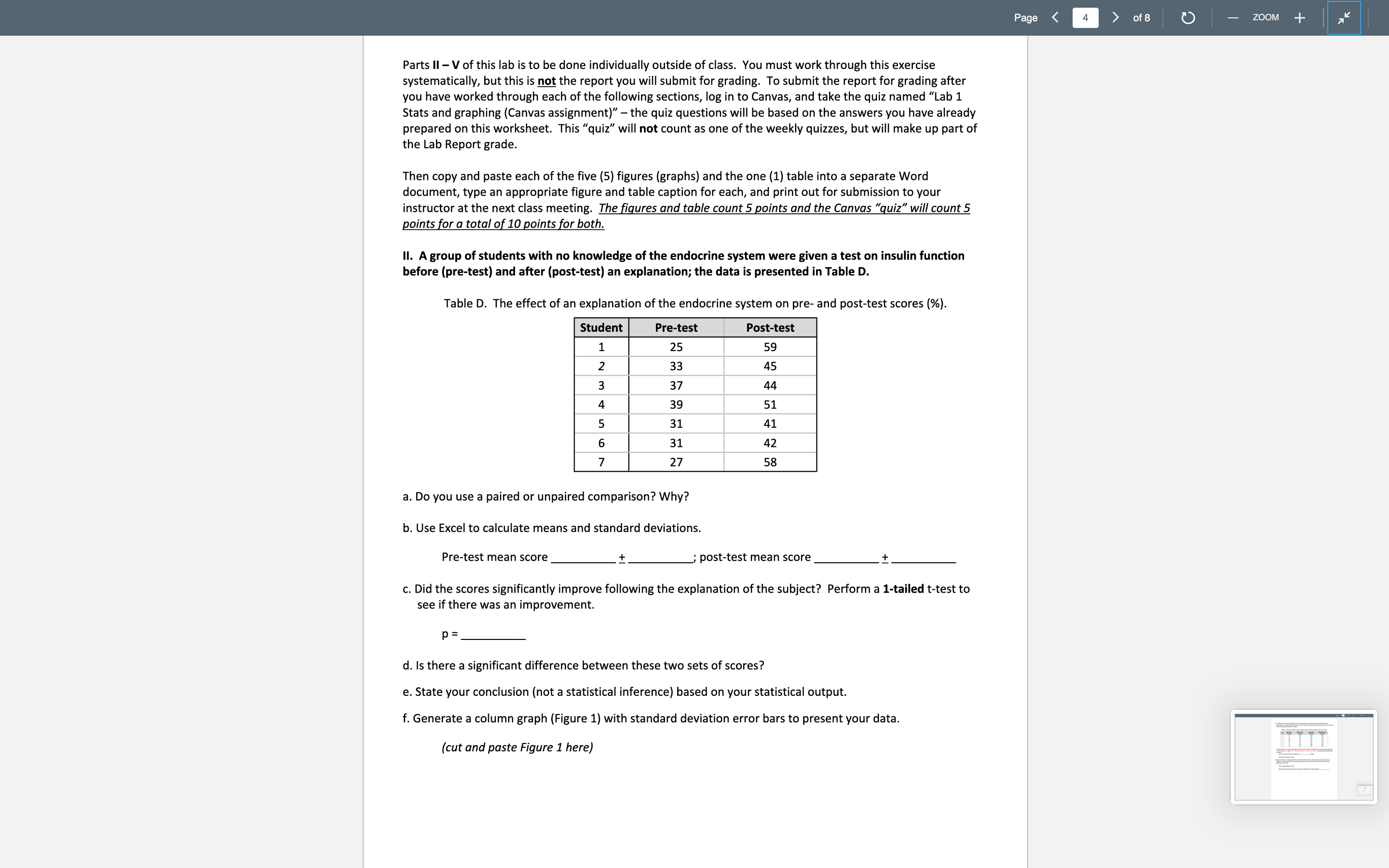
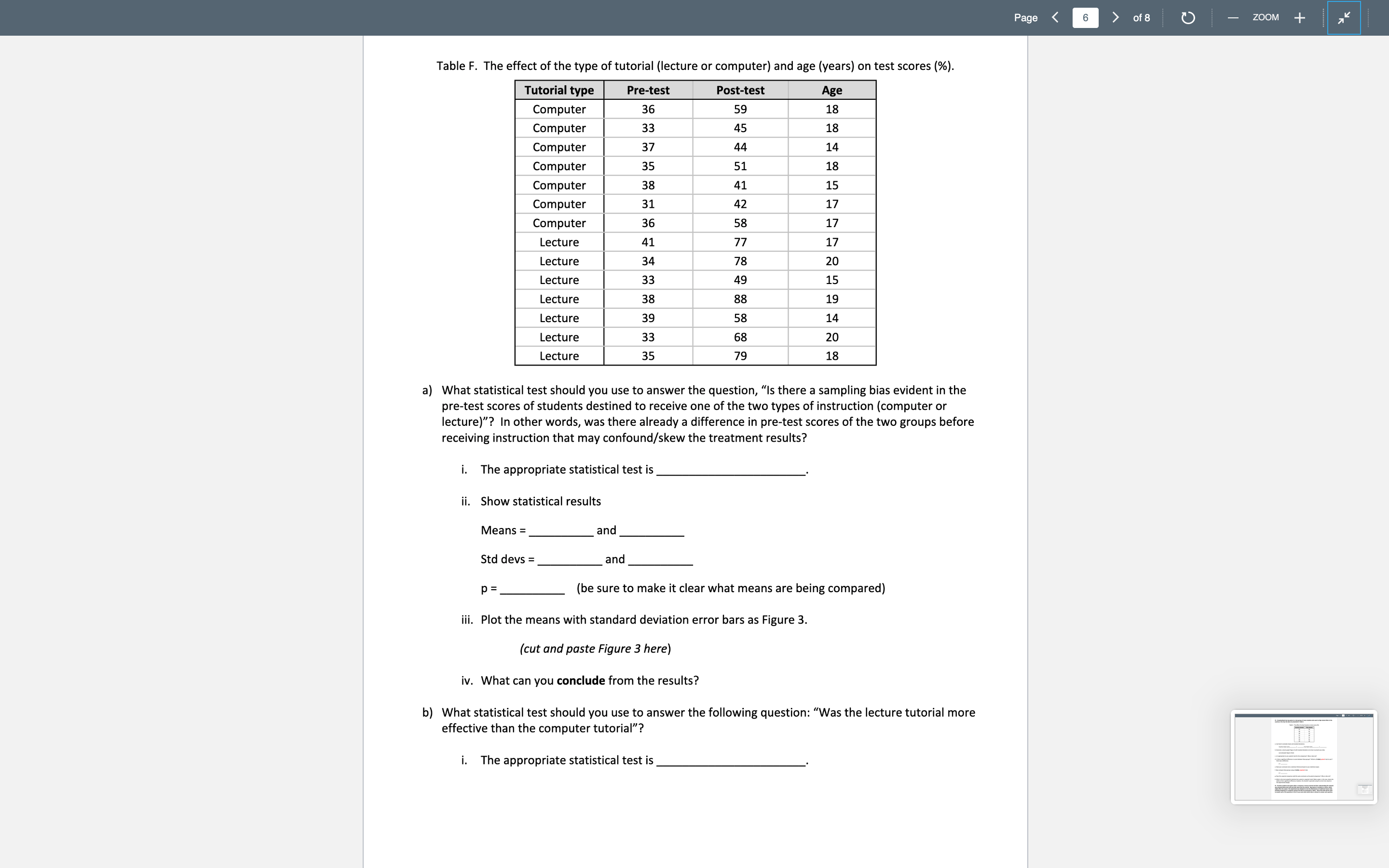
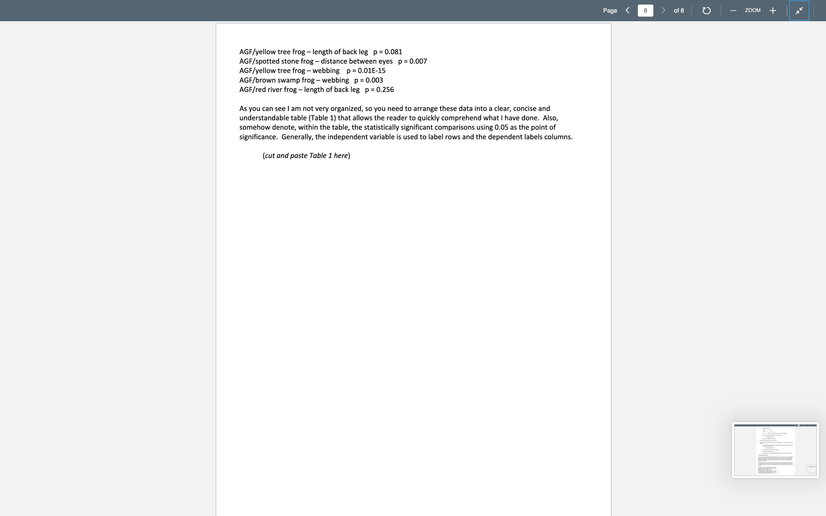
BIO 270 Lab 1: Statistics and graphing worksheet Instructions: In Excel input data as seen here Part I will be reviewed during the rst lab period and will NOT be turned in. However, make sure your lab instructor checks your answers before leaving the lab. Parts II, III, IV, and Vare to be done DNLINE and INDIVIDUALL Y for the lab report (see below for further instructions on Parts II-V)t Name: Section number: Table number: I. Seven Health Science students exercised and took measurements of their heart rate (HR) before and after the exercise; the data Is presented In Table A. Table A. Pre- and post-exercise heart rates (bpm) of seven students majoring in Health Science. exerclse H51 31 95 H52 55 _ 98 H53 63 101 H54 | 79 105 H55 69 _ 92 H56 71 mo H57 | 70 9o a. Using the above table, nd the mean (don't forget units!) and standard deviation for both columns (can be written as [mean] 1 [std dev]). Pre-exercise mean HR 1 Post-exercise mean HR 1 b. Construct Figure 1: a column graph of the mean values of these data (the word \"data\" is pleural; datum is singular) using a column plot and add standard deviation error bars' Make sure you use good graphing technique with proper axis labeling and a descriptive caption. (cut and paste Figure 1 here) What is the independent variable? On which axis is it plotted? What is the dependent variable? On which axis is it plotted? c. For the following statistical analyses, answer the following questions: 1. Did Health Science students' heart rates increase signicantly after exercise? Paired or unpaired (circle correct answer) Page Page of 8 - ZOOM + 1-tailed (is one mean expected to be larger than the other) or 2-tailed (are the means different) (circle correct answer) p : Statistical Inference: differences are significant or not significant (circle correct answer) Conclusion: 2. Further, seven Nursing students did the same experiment; that data is presented in Table B. Table B. Pre- and post-exercise heart rates (bpm) of seven students majoring in Nursing. Student Pre-exercise Post- exercise N1 50 111 N2 58 128 N3 60 118 N4 55 125 N5 67 132 N6 56 119 N7 53 118 Is there a significant difference between the pre-exercise heart rate of the Health Science students and the Nursing students? Paired or unpaired (circle correct answer) 1-tailed or 2-tailed (circle correct answer) p = Statistical Inference: differences are significant or not significant (circle correct answer) Conclusion: 3. Is the Nursing students'post-exercise heart rate significantly greater than their pre-exercise heart rate? Paired or unpaired (circle correct answer) 1-tailed or 2-tailed (circle correct answer) p = Statistical Inference: differences are significant or not significant (circle correct answer) Conclusion:Page - ZOOM + d. In addition to the above experiment, two of the Health Science students, James and Madison, also participated in an experiment that measured their heart rates before and after exercise over the course of a week; the data are presented in Table C. Table C. Heart rates (bpm) of two subjects before and after exercise over seven days. Day James pre- Madison pre- James post Madison post exercise exercise exercise exercise 1 71 61 124 121 74 68 134 119 69 63 125 118 68 71 120 111 73 64 134 123 75 62 139 108 67 66 132 124 Construct Figure 2: a scatter plot with a trend line and R2 using all 7 days of James' pre-exercise heart rate. In this course, do not ever use the line graph function in Excel. It has a flaw. Use good graphing technique as before. We can do this because time (days) is a . variable. (cut and paste Figure 2 here) e. Construct Figure 3: a scatter plot with a trend line and R2 of James' post exercise heart rate (x-axis) vs. Madison's pre-exercise heart rate (y-axis) (this figure makes no sense but shows one more way Excel graphing can be used). (cut and paste Figure 3 here) What type of statistical analysis is usually associated with this type of figure?Page of 8 - ZOOM + Parts II - V of this lab is to be done individually outside of class. You must work through this exercise systematically, but this is not the report you will submit for grading. To submit the report for grading after you have worked through each of the following sections, log in to Canvas, and take the quiz named "Lab 1 Stats and graphing (Canvas assignment)" - the quiz questions will be based on the answers you have already prepared on this worksheet. This "quiz" will not count as one of the weekly quizzes, but will make up part of the Lab Report grade Then copy and paste each of the five (5) figures (graphs) and the one (1) table into a separate Word document, type an appropriate figure and table caption for each, and print out for submission to your instructor at the next class meeting. The figures and table count 5 points and the Canvas "quiz" will count 5 points for a total of 10 points for both. Il. A group of students with no knowledge of the endocrine system were given a test on insulin function before (pre-test) and after (post-test) an explanation; the data is presented in Table D. Table D. The effect of an explanation of the endocrine system on pre- and post-test scores (%). Student Pre-test Post-test 1 25 59 N 33 45 37 44 39 51 31 41 31 42 27 58 a. Do you use a paired or unpaired comparison? Why? b. Use Excel to calculate means and standard deviations. Pre-test mean score post-test mean score c. Did the scores significantly improve following the explanation of the subject? Perform a 1-tailed t-test to see if there was an improvement. p = d. Is there a significant difference between these two sets of scores? e. State your conclusion (not a statistical inference) based on your statistical output. f. Generate a column graph (Figure 1) with standard deviation error bars to present your data. (cut and paste Figure 1 here)III. A standardized test was given to a two groups of seven students who went to high school either in the country or the city; the data are presented In 'lable E. Table E. The effect of school location on test scores (96). Countryschools Cityschools 57 55 46 61 46 42 571 7 7 e4 7 7 42 51 44 61 579 7 7 (756 7 7 a. Use Excel to calculate means and standard deviations: Country mean score 4 ' city mean score 1 b. Generate a column graph (Figure 2) with standard deviation error bars to present your data. (cut and paste Figure 2 here) c. Is it appropriate to use a paired t-test for this comparison? Why or why not? d. Is there a signicant difference in scores between these groups? Perform a 2-talled, paired t-test to see if there was a difference. p = e. State your conclusion (not a statistical inference) based on your statistical output. f. Now compare these groups using a Z-tailed, unpaired t-test. p = 5. Does this unpaired comparison yield the same conclusion as the paired comparison? Why or why not? h. Which is the more powerful statistical test, paired or unpaired t-tests? (Note: power, in this case, means the ability to nd a signicant difference; however, this shouldn't supersede using the correct test, based on the experimental design) IV. Fourteen students were given either a computer or lecture tutorial and their understanding the material was assessed before (pre-test) and after (post-test) the tutorial. Age (years) Is included as a factor, which might affect the output. This experiment was designed to test the effectiveness of traditional lecture style teaching compared to a computer tutorial; the data are presented in Table F. Not all the data will he need to answer each of the questions In Part IV; you must select which data is relevant to answer each question. Page of 8 - ZOOM + AGF/yellow tree frog - length of back leg p = 0.081 AGF/spotted stone frog - distance between eyes p = 0.007 AGF/yellow tree frog - webbing p = 0.01E-15 AGF/brown swamp frog - webbing p = 0.003 AGF/red river frog - length of back leg p = 0.256 As you can see I am not very organized, so you need to arrange these data into a clear, concise and understandable table (Table 1) that allows the reader to quickly comprehend what I have done. Also, somehow denote, within the table, the statistically significant comparisons using 0.05 as the point of significance. Generally, the independent variable is used to label rows and the dependent labels columns. (cut and paste Table 1 here)
Step by Step Solution
There are 3 Steps involved in it

Get step-by-step solutions from verified subject matter experts


