Answered step by step
Verified Expert Solution
Question
1 Approved Answer
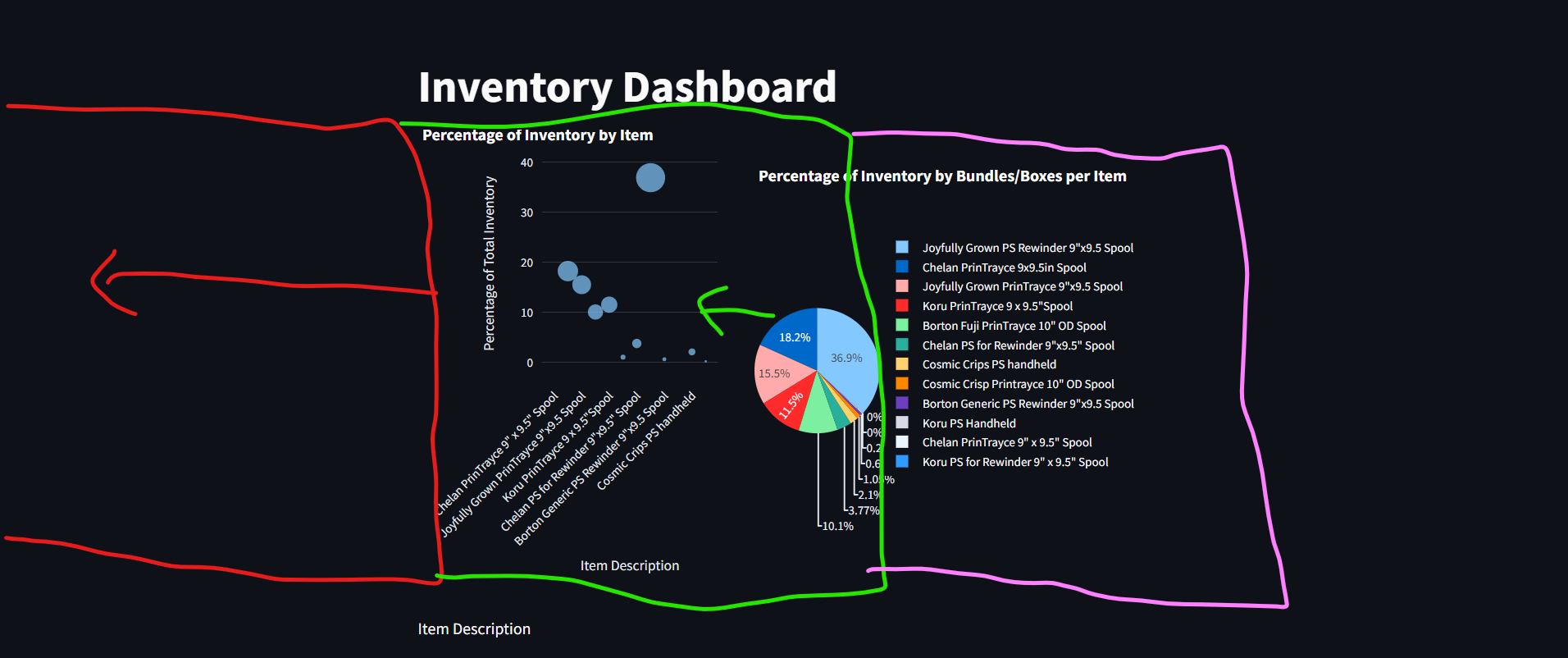
i have a python app, but i want the plots to be more orgranized. I want to move the plots to cover more of the
i have a python app, but i want the plots to be more orgranized. I want to move the plots to cover more of the window and have more space for other plot and reports, any help is really appreciated please:
import streamlit as st
from sqlalchemy import createengine
import pandas as pd
import plotly.express as px
# Function to create a database connection using SQLAlchemy
def createdbconnection:
dburl mysqlmysqlconnector:root:peter@localhostmainitems"
engine createenginedburl
return engine
# Fetch data from the database
def loaddata:
engine createdbconnection
query "SELECT FROM itemstable"
data pdreadsqlquery engine
return data
# plot the data in a scatter plot
def plotscatterchartdata:
# Convert 'BundlesBoxes' to numeric, setting errors to 'NaN'
dataBundlesBoxes' pdtonumericdataBundlesBoxes' errors'coerce'
# Replace NaN values with a default size, eg or the mean size
dataBundlesBoxes'fillna inplaceTrue
# Calculate total and percentage
totalbundles dataBundlesBoxes'sum
dataPercentagedataBundlesBoxes' totalbundles
# Create the scatter plot
fig pxscatter
dataframedata,
x'Description',
y'Percentage',
size'BundlesBoxes', # The size argument represents the size of each dot.
hoverdataBundlesBoxes' # Display bundlesboxes info on hover
labelsDescription: 'Item Description', 'Percentage': 'Percentage of Total Inventory'
title'Percentage of Inventory by Item'
# Update layout to adjust margins
fig.updatelayout
margindictl r t b # l adjusts the left margin
xaxistickangle
return fig
# plot data in a pie chart to display total inventory usage per BundlesBoxes
def plotpiechartdata:
# Calculate total bundles for percentage calculation
totalbundles dataBundlesBoxes'sum
# Add a percentage column to the dataframe
dataInventoryPercentage'dataBundlesBoxes' totalbundles
# Create a pie chart with Plotly
fig pxpie
dataframedata,
names'Description',
values'InventoryPercentage',
title'Percentage of Inventory by BundlesBoxes per Item'
return fig
# plot data into a bar chart
def plotbarchartdata:
fig pxbardataframedata, x'Description', y'UnitsPiecesEach', title'Item Description'
fig.updatelayoutxaxistickangle
return fig
# Define the Streamlit page
def main:
sttitleInventory Dashboard"
# Load the data
data loaddatacopy
# Define the layout for charts
col col stcolumns # Adjust the ratio based on your requirement
with col:
# Plotting the scatter chart
scatterchart plotscatterchartdata
stplotlychartscatterchart, usecontainerwidthTrue
with col:
# Plotting the pie chart
piechart plotpiechartdata
stplotlychartpiechart, usecontainerwidthTrue
# Plotting the bar chart below the scatter and pie charts
stwriteItem Description'
barchart plotbarchartdata
stplotlychartbarchart, usecontainerwidthTrue
# Run the main function when the script is executed
if namemain:
main

Step by Step Solution
There are 3 Steps involved in it
Step: 1

Get Instant Access to Expert-Tailored Solutions
See step-by-step solutions with expert insights and AI powered tools for academic success
Step: 2

Step: 3

Ace Your Homework with AI
Get the answers you need in no time with our AI-driven, step-by-step assistance
Get Started


