Question
I have a Scikit learn library of data, I need to write a program that completes a few analysis of the data. 1. A good
I have a Scikit learn library of data, I need to write a program that completes a few analysis of the data.
1. A good indicator of what prediction should be perfect is the variance. The more the variance is close to 1 the more the prediction is perfect ( I need a piece to pull the variance value. I need help on where in the code sequence this is done.)
. linreg.score(x_test, y_test) Out[ ]: 0.58507530226905713
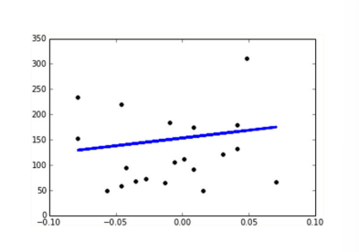
2. Draw the linear correlation between the ages of patients and the disease progression in the form of a scatterplot and the associated line. Something like:

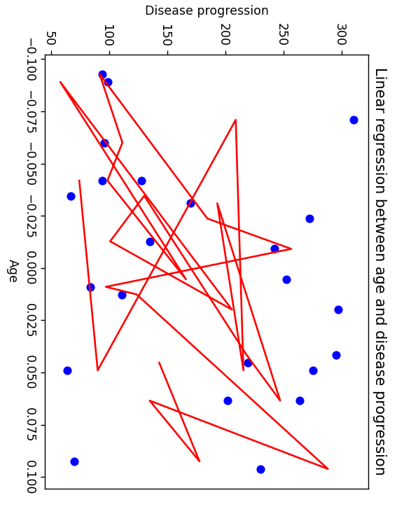
I have a scatter plot of age and disease progression in my program, but my scatterpots correlation line is not plotting as a linear line but rather a random. How can I fix? Or is it correct?
My scatter plot 
My code so far
from sklearn.datasets import load_diabetes from sklearn.model_selection import train_test_split from sklearn.linear_model import LinearRegression from sklearn.metrics import accuracy_score
diabetes = load_diabetes()
X_train, X_test, y_train, y_test = train_test_split(diabetes.data, diabetes.target, test_size=0.05, random_state=42)
lr = LinearRegression() lr.fit(X_train, y_train)
train_coefs = lr.coef_ print("Coefficients for training set: ", train_coefs)
y_pred = lr.predict(X_test)
test_coefs = lr.coef_ print("Coefficients for test set: ", test_coefs)
import matplotlib.pyplot as plt
x0_test = X_test[:, 0]
plt.scatter(x0_test, y_test, color='blue') plt.plot(x0_test, lr.predict(X_test), color='red') plt.xlabel('Age') plt.ylabel('Disease progression') plt.title('Linear regression between age and disease progression') plt.show()
fig, axes = plt.subplots(5, 2, figsize=(10, 20)) i = 0 for row in range(5): for col in range(2): x_train = X_train[:, i].reshape(-1, 1) x_test = X_test[:, i].reshape(-1, 1) lr = LinearRegression() lr.fit(x_train, y_train) y_pred = lr.predict(x_test) axes[row, col].scatter(x_test, y_test, color='blue') axes[row, col].plot(x_test, y_pred, color='red') axes[row, col].set_xlabel('Physiological factor {}'.format(i+1)) axes[row, col].set_ylabel('Disease progression') i += 1 plt.show()
Step by Step Solution
There are 3 Steps involved in it
Step: 1

Get Instant Access to Expert-Tailored Solutions
See step-by-step solutions with expert insights and AI powered tools for academic success
Step: 2

Step: 3

Ace Your Homework with AI
Get the answers you need in no time with our AI-driven, step-by-step assistance
Get Started


