

Question
In Chapter 2, we learned about misleading and deceiving graphs. Let's apply our knowledge to analyze a real-world example of a less-than-stellar graph! Below is
In Chapter 2, we learned about misleading and deceiving graphs. Let's apply our knowledge to analyze a real-world example of a less-than-stellar graph!
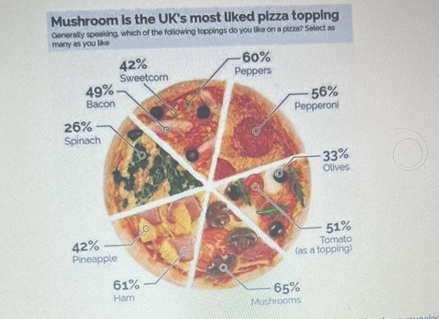
Below is a graph that presents information about a particular type of food, but is it a well-crafted graph? Does it present the underlying data clearly, concisely, and without bias? Or, is it misleading and/or deceitful?
McGuiness, R (March 6, 2017).The UK's most popular pizza topping has been revealed- and it's mushroom. Yahoo! News.
1. Open the spreadsheet with the raw data.Misleading Graphs - Background Data.xlsx
- Comparing the data in the spreadsheet to the graph, above, analyze what is wrong with the graph. Be specific. Why is it misleading and/or deceiving?
- How would you correct the graph?
2.Using the raw dataset in the linked spreadsheet, calculate the Mean, Median, Mode, and Standard Deviation for the attached dataset. Include the results you calculated in your post, clearly labeling which measure is which.
3. Post a comment/question on at least 2 other classmates' posts.
Step by Step Solution
There are 3 Steps involved in it
Step: 1

Get Instant Access to Expert-Tailored Solutions
See step-by-step solutions with expert insights and AI powered tools for academic success
Step: 2

Step: 3
Ace Your Homework with AI
Get the answers you need in no time with our AI-driven, step-by-step assistance
Get Started
Finite Mathematics and Its Applications
Authors: Larry J. Goldstein, David I. Schneider, Martha J. Siegel, Steven Hair
12th edition
978-0134768588, 9780134437767, 134768582, 134437764, 978-0134768632