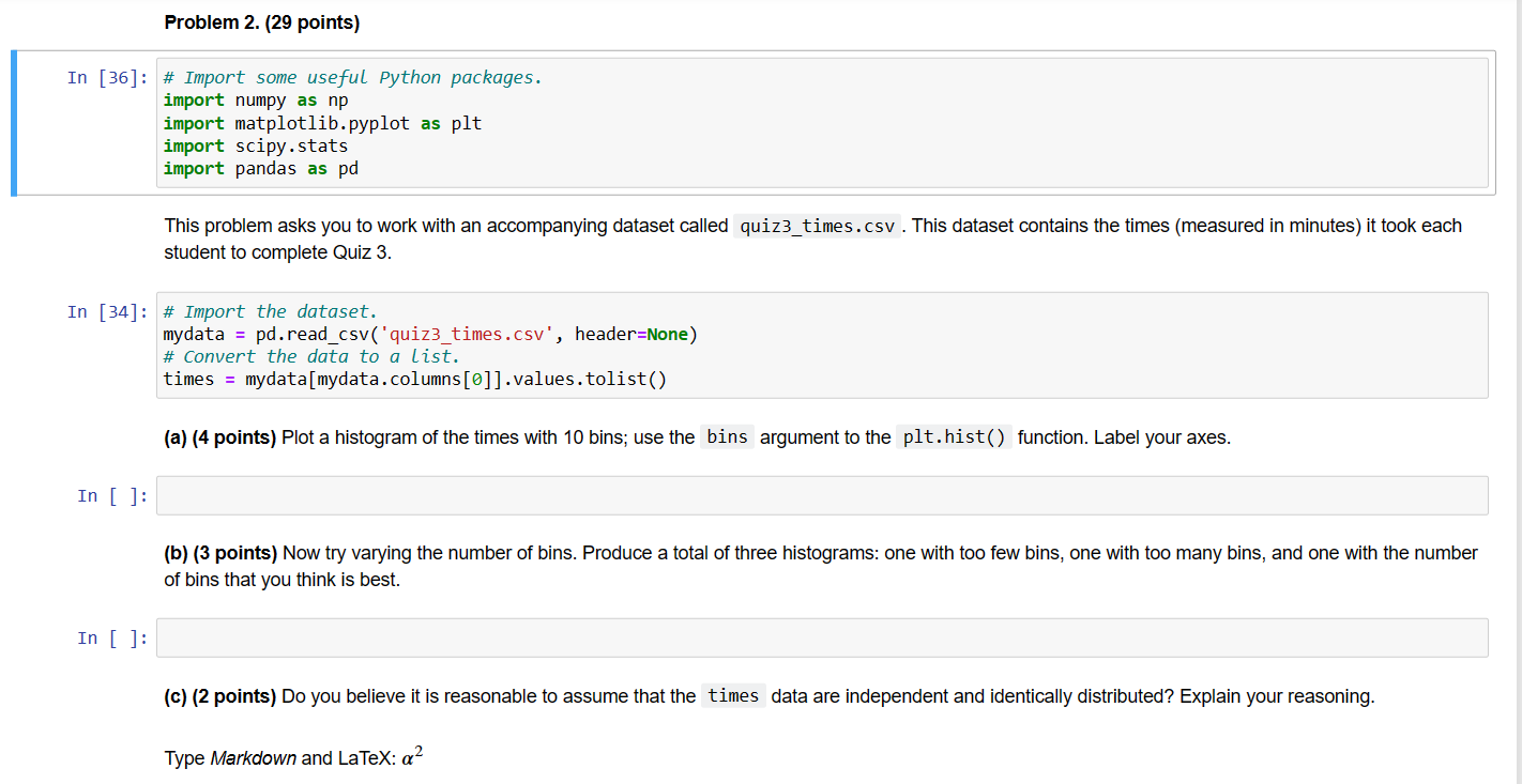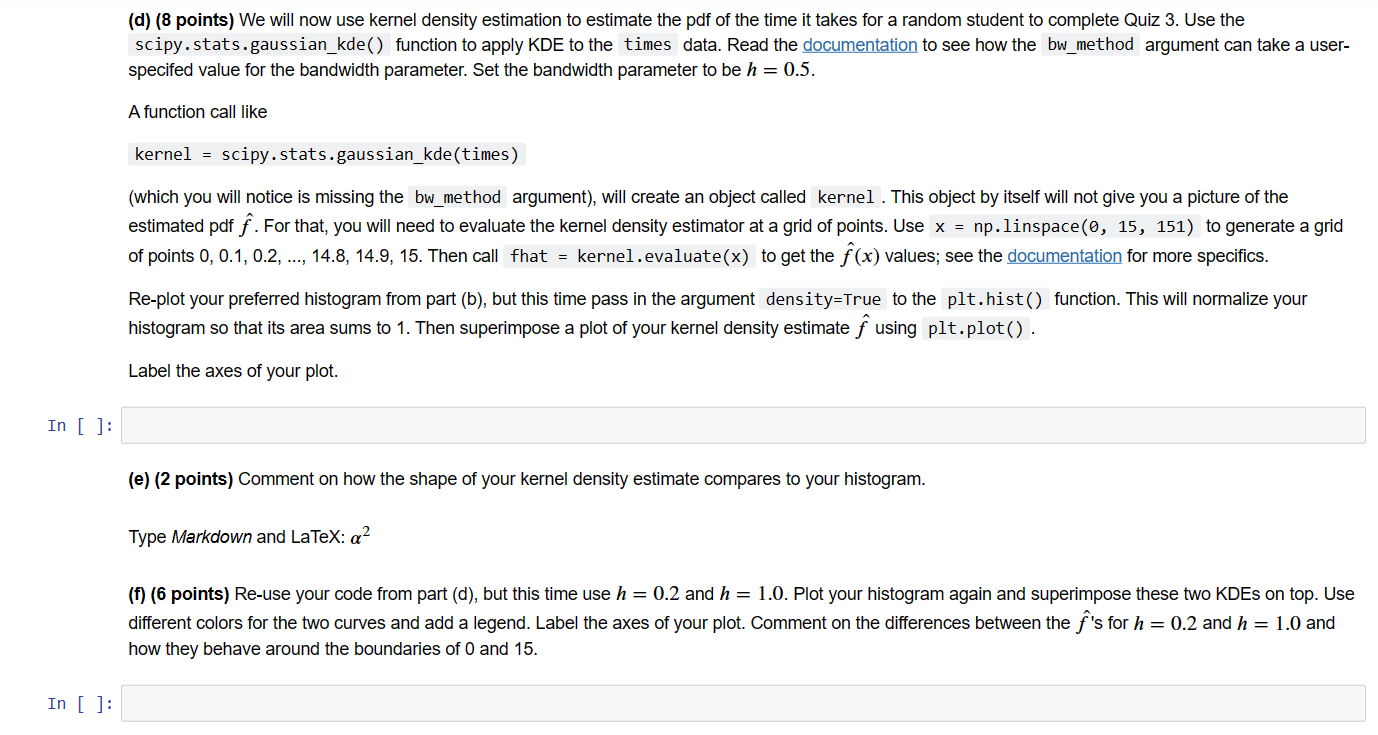


In[36]:#ImportsomeusefulPythonpackages.importnumpyasnpimportmatplotlib.pyplotaspltimportscipy.statsimportpandasaspd This problem asks you to work with an accompanying dataset called quiz3_times.csv. This dataset contains the times (measured in minutes) it took each student to complete Quiz 3. In [34]: \# Import the dataset. mydata = pd.read_csv('quiz3_times.csv', header=None) \# Convert the data to a list. times = mydata [ mydata. columns[]] values.tolist () (a) (4 points) Plot a histogram of the times with 10 bins; use the bins argument to the plt. hist() function. Label your axes. In [ ] (b) (3 points) Now try varying the number of bins. Produce a total of three histograms: one with too few bins, one with too many bins, and one with the number of bins that you think is best. In [ ]: (c) (2 points) Do you believe it is reasonable to assume that the data are independent and identically distributed? Explain your reasoning. Type Markdown and LaTeX: 2 (d) (8 points) We will now use kernel density estimation to estimate the pdf of the time it takes for a random student to complete Quiz 3 . Use the scipy.stats.gaussian_kde() function to apply KDE to the times data. Read the documentation to see how the bw_method argument can take a userspecifed value for the bandwidth parameter. Set the bandwidth parameter to be h=0.5. A function call like kernel = scipy. stats.gaussian_kde(times) (which you will notice is missing the bw_method argument), will create an object called kernel . This object by itself will not give you a picture of the estimated pdf f^. For that, you will need to evaluate the kernel density estimator at a grid of points. Use x=np.1inspace(0, 15 , 151) to generate a grid of points 0,0.1,0.2,,14.8,14.9,15. Then call fhat = kernel .evaluate (x) to get the f^(x) values; see the documentation for more specifics. Re-plot your preferred histogram from part (b), but this time pass in the argument density=True to the plt. hist() function. This will normalize your histogram so that its area sums to 1 . Then superimpose a plot of your kernel density estimate f^ using plt.plot(). Label the axes of your plot. (e) (2 points) Comment on how the shape of your kernel density estimate compares to your histogram. Type Markdown and LaTeX: 2 (f) (6 points) Re-use your code from part (d), but this time use h=0.2 and h=1.0. Plot your histogram again and superimpose these two KDEs on top. Use different colors for the two curves and add a legend. Label the axes of your plot. Comment on the differences between the f^ 's for h=0.2 and h=1.0 and how they beehave around the boundaries of 0 and 15. (g) (4 points) Compute the value of the bandwidth parameter recommended by Silverman's Rule of Thumb, using the formula given in the lecture slides. (Note that the scipy.stats.gaussian_kde() function has a Silverman option, but it uses a different formula. Do you use that for this question.) Use the np.std( ) function to calculate the sample standard deviation, paying special attention to the choice of the ddof argument. For the interquartile range (IQR), use the np.percentile function to calculate the 75 th and 25 th percentiles and take the difference. Recall that n is the number of observations in the dataset


