Answered step by step
Verified Expert Solution
Question
1 Approved Answer
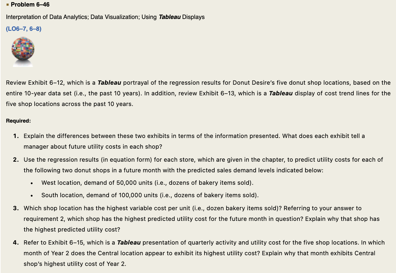
Interpretation of Data Analytics; Data Visualization; Using Tableau Displays (LOC7,68) Review Exhibit 6-12, which is a Tableau portrayal of the regression results for Donut Desire's

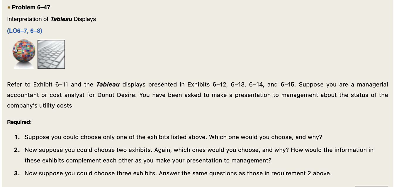
 Interpretation of Data Analytics; Data Visualization; Using Tableau Displays (LOC7,68) Review Exhibit 6-12, which is a Tableau portrayal of the regression results for Donut Desire's five donut shop locations, based on the entire 10-year data set (i.e., the past 10 years). In addition, review Exhibit 6-13, which is a Tableau display of cost trend lines for the five shop locations across the past 10 years. Required: 1. Explain the differences between these two exhibits in terms of the information presented. What does each exhibit tell a manager about future utility costs in each shop? 2. Use the regression results (in equation form) for each store, which are given in the chapter, to predict utility costs for each of the following two donut shops in a future month with the predicted sales demand levels indicated below: - West location, demand of 50,000 units (i.e., dozens of bakery items sold). - South location, demand of 100,000 units (i.e., dozens of bakery items sold). 3. Which shop location has the highest variable cost per unit (i.e., dozen bakery items sold)? Referring to your answer to requirement 2, which shop has the highest predicted utility cost for the future month in question? Explain why that shop has the highest predicted utility cost? 4. Refer to Exhibit 6-15, which is a Tableau presentation of quarterly activity and utility cost for the five shop locations. In which month of Year 2 does the Central location appear to exhibit its highest utility cost? Explain why that month exhibits Central shop's highest utility cost of Year 2. Interpretation of Tableau Displays (LOC7,68) Refer to Exhibit 6-11 and the Tableau displays presented in Exhibits 6-12,6-13, 6-14, and 6-15. Suppose you are a managerial accountant or cost analyst for Donut Desire. You have been asked to make a presentation to management about the status of the company's utility costs. Required: 1. Suppose you could choose only one of the exhibits listed above. Which one would you choose, and why? 2. Now suppose you could choose two exhibits. Again, which ones would you choose, and why? How would the information in these exhibits complement each other as you make your presentation to management? 3. Now suppose you could choose three exhibits. Answer the same questions as those in requirement 2 above. Interpretation of Data Analytics; Data Visualization; Using Tableau Displays (LOC7,68) Review Exhibit 6-12, which is a Tableau portrayal of the regression results for Donut Desire's five donut shop locations, based on the entire 10-year data set (i.e., the past 10 years). In addition, review Exhibit 6-13, which is a Tableau display of cost trend lines for the five shop locations across the past 10 years. Required: 1. Explain the differences between these two exhibits in terms of the information presented. What does each exhibit tell a manager about future utility costs in each shop? 2. Use the regression results (in equation form) for each store, which are given in the chapter, to predict utility costs for each of the following two donut shops in a future month with the predicted sales demand levels indicated below: - West location, demand of 50,000 units (i.e., dozens of bakery items sold). - South location, demand of 100,000 units (i.e., dozens of bakery items sold). 3. Which shop location has the highest variable cost per unit (i.e., dozen bakery items sold)? Referring to your answer to requirement 2, which shop has the highest predicted utility cost for the future month in question? Explain why that shop has the highest predicted utility cost? 4. Refer to Exhibit 6-15, which is a Tableau presentation of quarterly activity and utility cost for the five shop locations. In which month of Year 2 does the Central location appear to exhibit its highest utility cost? Explain why that month exhibits Central shop's highest utility cost of Year 2. Interpretation of Tableau Displays (LOC7,68) Refer to Exhibit 6-11 and the Tableau displays presented in Exhibits 6-12,6-13, 6-14, and 6-15. Suppose you are a managerial accountant or cost analyst for Donut Desire. You have been asked to make a presentation to management about the status of the company's utility costs. Required: 1. Suppose you could choose only one of the exhibits listed above. Which one would you choose, and why? 2. Now suppose you could choose two exhibits. Again, which ones would you choose, and why? How would the information in these exhibits complement each other as you make your presentation to management? 3. Now suppose you could choose three exhibits. Answer the same questions as those in requirement 2 above
 Step by Step Solution
There are 3 Steps involved in it
Step: 1

Get Instant Access to Expert-Tailored Solutions
See step-by-step solutions with expert insights and AI powered tools for academic success
Step: 2

Step: 3

Ace Your Homework with AI
Get the answers you need in no time with our AI-driven, step-by-step assistance
Get Started


