Answered step by step
Verified Expert Solution
Question
1 Approved Answer
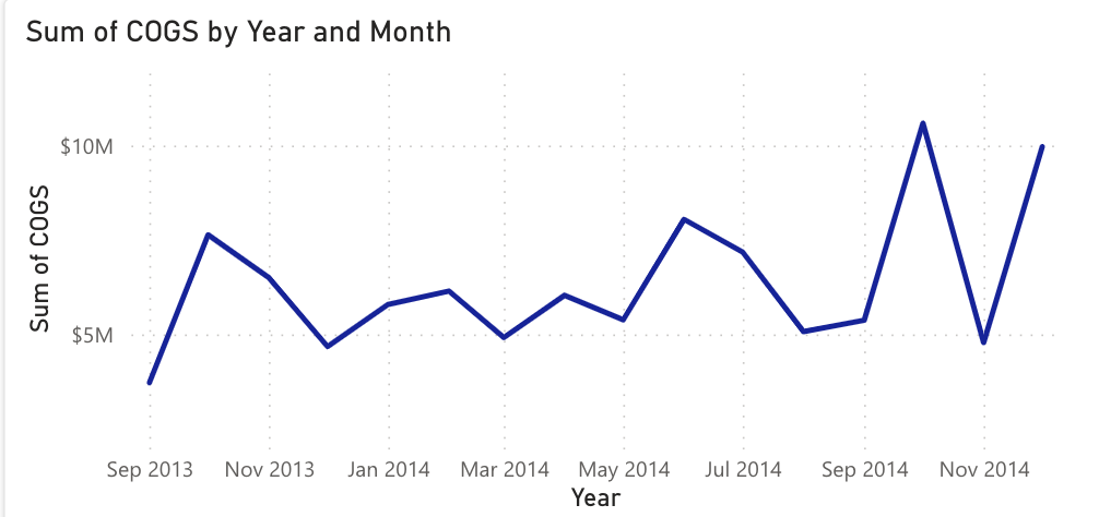
Introduction Briefly describe each of your charts (3 to 4 charts) Ex: Chart A shows the number of patients by 4 age groups on the

- Introduction Briefly describe each of your charts (3 to 4 charts)
- Ex: Chart A shows the number of patients by 4 age groups on the X axis
- Content Describe (in detail) what each chart represents (the facts).
- Example: The ages groups where 16-30; 31-45; 46-60; 61-75. The largest population of patients were shown in purple. They range from 46-60. The next largest age group of patients was 61-75 and the number of patients degreased starting with the group 31-45.
- Summary why do you think the data analytics turned out this way?
- Think about what the data is telling and describe your thoughts referring to the data presented.
- introduction ( half a page )
- Content ( 1 pages )
- Summary (half a page )
Step by Step Solution
There are 3 Steps involved in it
Step: 1

Get Instant Access to Expert-Tailored Solutions
See step-by-step solutions with expert insights and AI powered tools for academic success
Step: 2

Step: 3

Ace Your Homework with AI
Get the answers you need in no time with our AI-driven, step-by-step assistance
Get Started


