Answered step by step
Verified Expert Solution
Question
1 Approved Answer
INTRODUCTION TO EXCEL Microsoft Excel is the spreadsheet program we will use for much of our data analysis and graphing. It is a powerful and
INTRODUCTION TO EXCEL
Microsoft Excel is the spreadsheet program we will use for much of our data analysis and graphing. It is a powerful and easytouse application for graphing, fitting, and manipulating data. In this appendix, we will briefly describe how to use Excel to do some useful tasks.
DATA AND FORMULAE
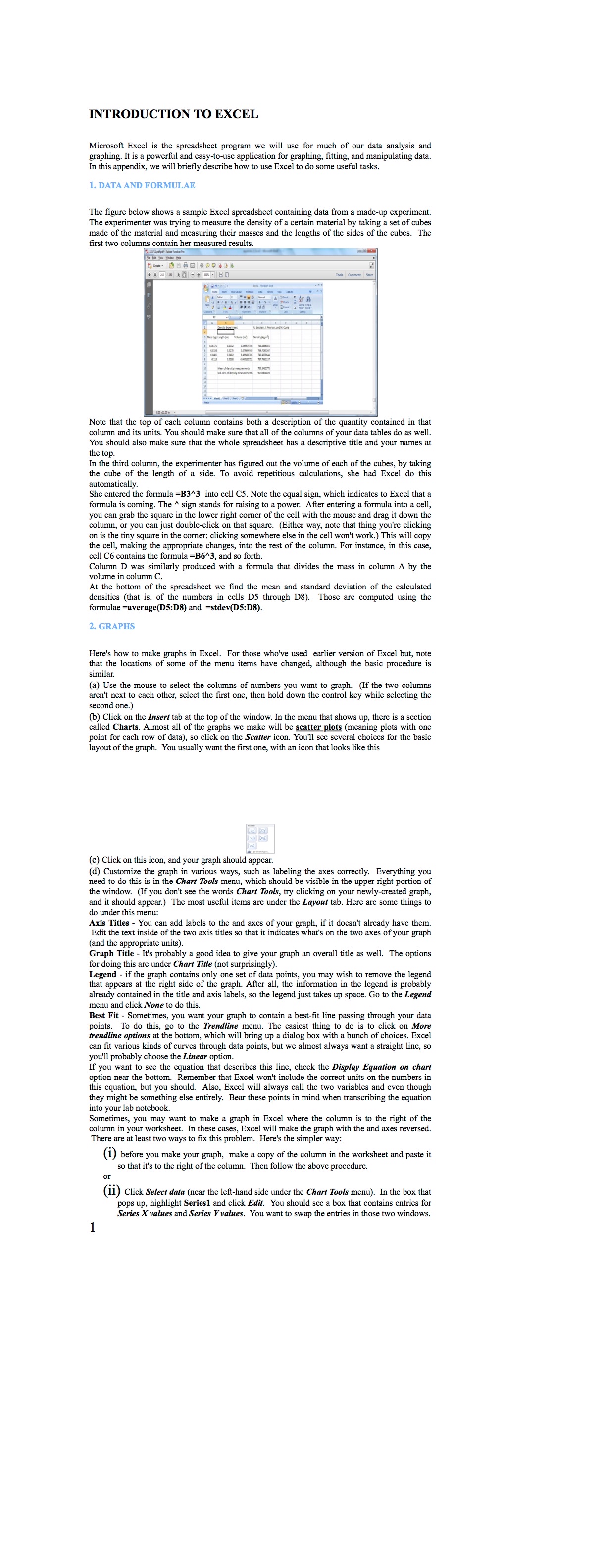
The figure below shows a sample Excel spreadsheet containing data from a madeup experiment. The experimenter was trying to measure the density of a certain material by taking a set of cubes made of the material and measuring their masses and the lengths of the sides of the cubes. The made of the material and measuring their mass first two columns contain her measured results.
Note that the top of each column contains both a description of the quantity contained in that column and its units. You should make sure that all of the columns of your data tables do as well. You should also make sure that the whole spreadsheet has a descriptive title and your names the top.
In the third column, the experimenter has figured out the volume of each of the cubes, by taking the cube of the length of a side. To avoid repetitious calculations, she had Excel do this automatically.
She entered the formula into cell Note the equal sign, which indicates to Excel that a you can grab the column, or you can just doubleclick on that square. Either way, note that thing you'se clickin on is the tiny square in the corner; clicking somewhere else in the cell won't work. This will copy the cell, making the appropriate changes, into the rest of the column. For instance, in this case, cell contains the formula and so forth.
Column was similarly produced with a formula that divides the mass in column A by the At the bottom of the
At the bottom of the spreadsheet we find the mean and standard deviation of the calculated densities that is of the numbers in cells D through D Those are computed using the formulae averageD:D and stevD:D GRAPHS
Here's how to make graphs in Excel. For those who've used earlier version of Excel but, note that the locations of some of the menu items have changed, although the basic procedure is a Use
a Use the mouse to select the columns of numbers you want to graph. If the two column aren't next to each other, select the first one, then hold down the control key while selecting the second one.b Click on the Insert tab at the top of the window. In the menu that shows up there is a section called Charts. Almost all of the graphs we make will be scatter plots meaning plots with one layout of the graph. You usually want the first one, with an icon that looks like this
c Click on this icon, and your graph should appear.
d Customize the graph in various ways, such as labeling the axes correctly. Everything you need to do this is in the Chart Tools menu, which should be visible in the upper right portion of the window. If you don't see the words Chart Tools, try clicking on your newlycreated graph, and it should If you don't see the words Chart Tools, try clicking on your newlycreated graph, do under this menu:
Axis Titles You can add labels to the and axes of your graph, if it doesn't already have them. Edit the text inside of the two axis titles so that it indicates what's on the two axes of your graph and the appropriate units
Graph Title It's probably a good idea to give your graph an overall title as well. The options Legend if the under Chart Title not surprisingly
that appears at the right contains only one set of data points, you may wish to remove the legend already contained in the side of the graph. After all, the information in the legend is probably menu and click None to do this.
Best Fit Sometimes, you want your graph to cor points. To do this, go to the Trendline menu. The at trendline options at the bottom, which will bring up a dialog box with a bunch of choices. Excel can fit various kinds of curves through data points, but we almost always want a straight line, so you'll probably choose the Linear option.
If you want to see the equation that describes this line, check the Display Equation on char option near the bottom. Remember that Excel won't include the correct units on the numbers in this equation, but you should. Also, Excel will always call the two variables and even though they might be something else entirely. Bear these points in mind when transcribing the equatio into your lab notebook
Sometimes, you may want to make a graph in Excel where the column is to the right of the column in your worksheet. In these cases, Excel will make the graph with the and axes reversed. There are at least two ways to fix this problem. Here's the simpler way:
i before you make your graph, make a copy of the column in the worksheet and paste it so that it's to the right o

Step by Step Solution
There are 3 Steps involved in it
Step: 1

Get Instant Access to Expert-Tailored Solutions
See step-by-step solutions with expert insights and AI powered tools for academic success
Step: 2

Step: 3

Ace Your Homework with AI
Get the answers you need in no time with our AI-driven, step-by-step assistance
Get Started


