

Answered step by step
Verified Expert Solution
Question
1 Approved Answer
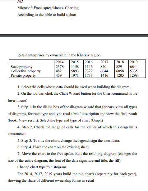
Microsoft Excel spreadsheets. Charting According to the table to build a chart Retail enterprises by ownership in the Kharkiv region | 2014 2015 2016 2017
Step by Step Solution
There are 3 Steps involved in it
Step: 1

Get Instant Access to Expert-Tailored Solutions
See step-by-step solutions with expert insights and AI powered tools for academic success
Step: 2

Step: 3
Ace Your Homework with AI
Get the answers you need in no time with our AI-driven, step-by-step assistance
Get Started
AWS Database Services A Complete Guide To Understanding Database Services Companion Guide
Authors: IP Specialist
1st Edition
B0C881Q36H, 979-8398897883