Need a python code for the following questions please!!
All i have is...
import numpy as np
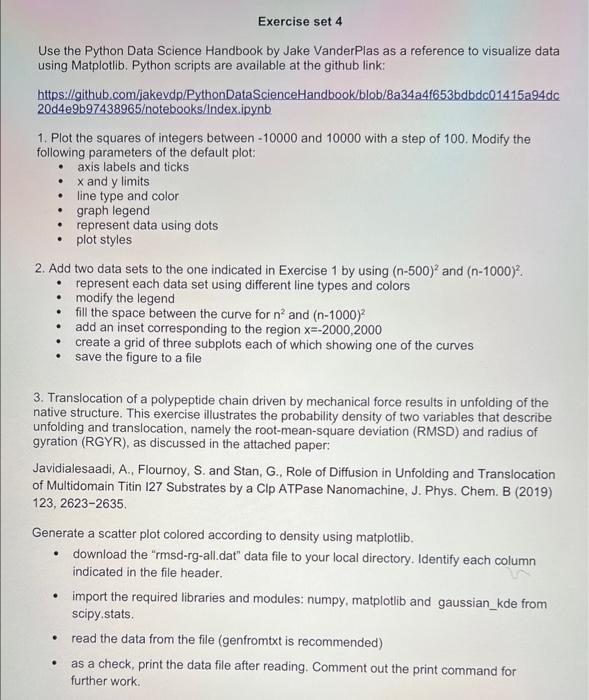
Use the Python Data Science Handbook by Jake VanderPlas as a reference to visualize data using Matplotlib. Python scripts are available at the github link: https://github,com/iakevdp/PythonDataScienceHandbook/blob/8a34a4f653bdbdc 01415a94dc 20d4e9b97438965/ notebooks/index.ipynb 1. Plot the squares of integers between 10000 and 10000 with a step of 100 . Modify the following parameters of the default plot: - axis labels and ticks - x and y limits - line type and color - graph legend - represent data using dots - plot styles 2. Add two data sets to the one indicated in Exercise 1 by using (n500)2 and (n1000)2. - represent each data set using different line types and colors - modify the legend - fill the space between the curve for n2 and (n1000)2 - add an inset corresponding to the region x=2000,2000 - create a grid of three subplots each of which showing one of the curves - save the figure to a file 3. Translocation of a polypeptide chain driven by mechanical force results in unfolding of the native structure. This exercise illustrates the probability density of two variables that describe unfolding and translocation, namely the root-mean-square deviation (RMSD) and radius of gyration (RGYR), as discussed in the attached paper: Javidialesaadi, A., Flournoy, S. and Stan, G., Role of Diffusion in Unfolding and Translocation of Multidomain Titin 127 Substrates by a Clp ATPase Nanomachine. J. Phys. Chem. B (2019) 123,26232635. Generate a scatter plot colored according to density using matplotlib. - download the "rmsd-rg-all.dat" data file to your local directory. Identify each column indicated in the file header. - import the required libraries and modules: numpy, matplotlib and gaussian_kde from scipy. stats. - read the data from the file (genfromtxt is recommended) - as a check, print the data file after reading. Comment out the print command for further work