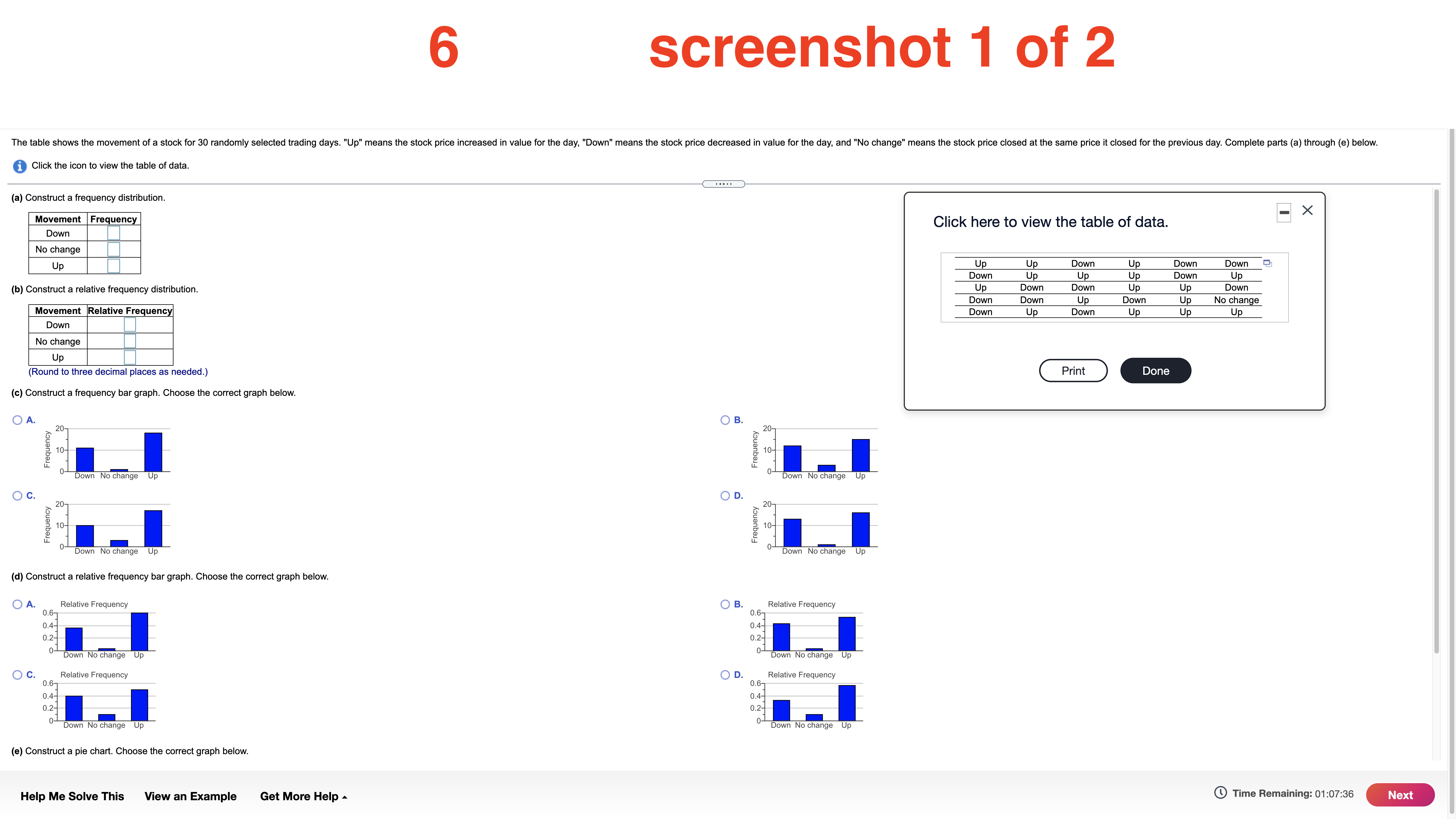
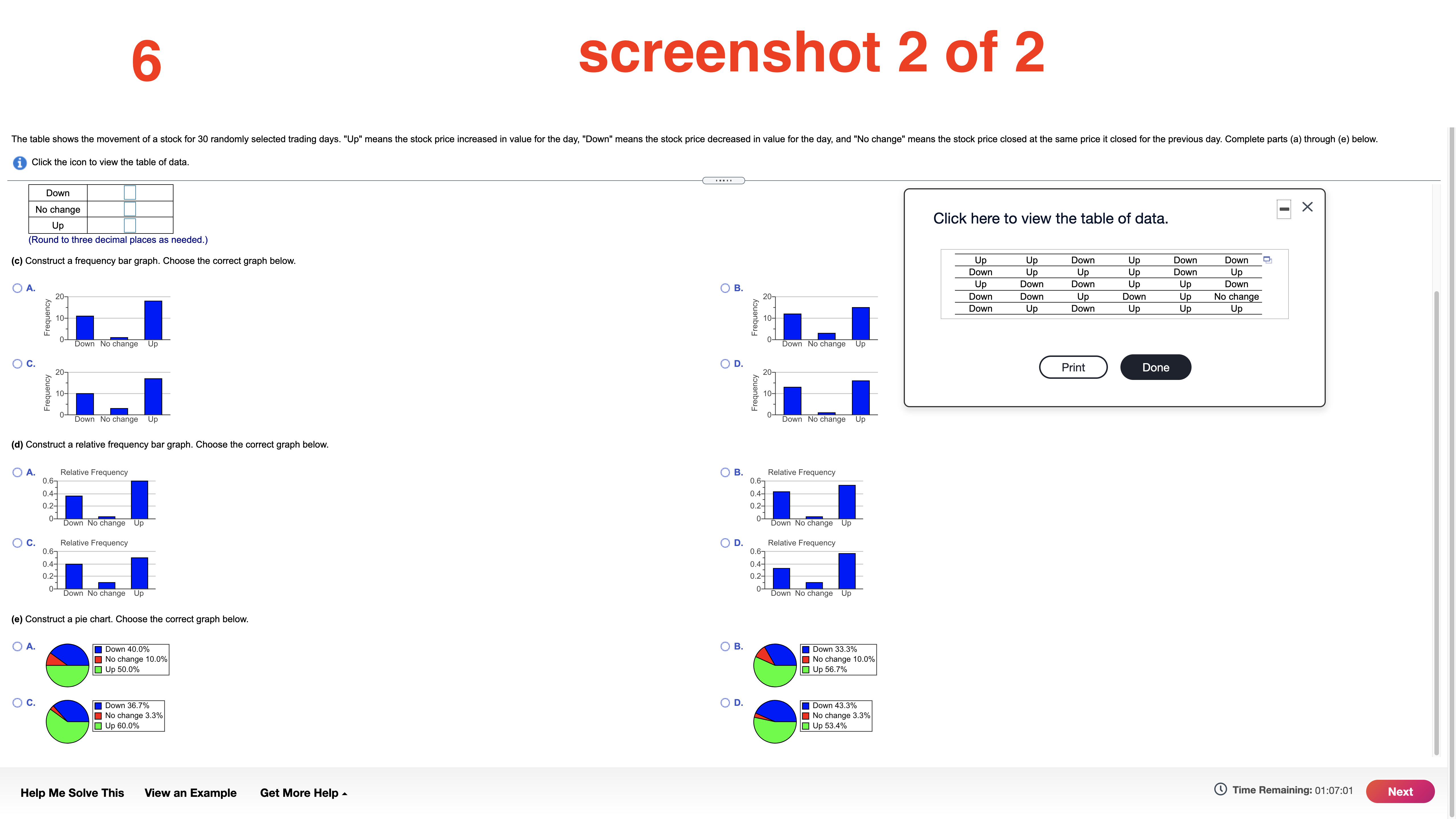
Need help with screenshots 4, 5, and 6. All info needed is here. Please number them as I have, THANK YOU!!
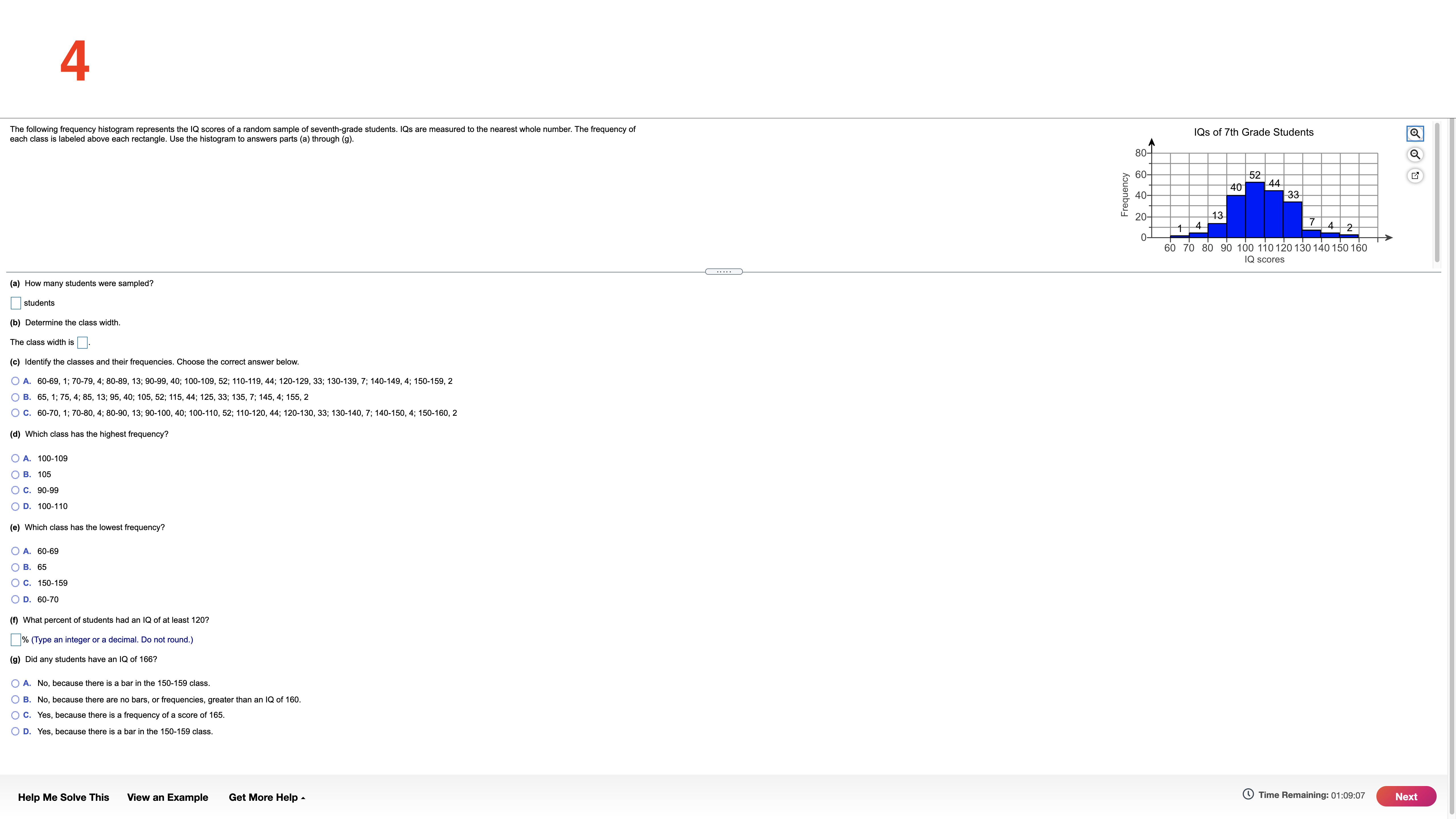
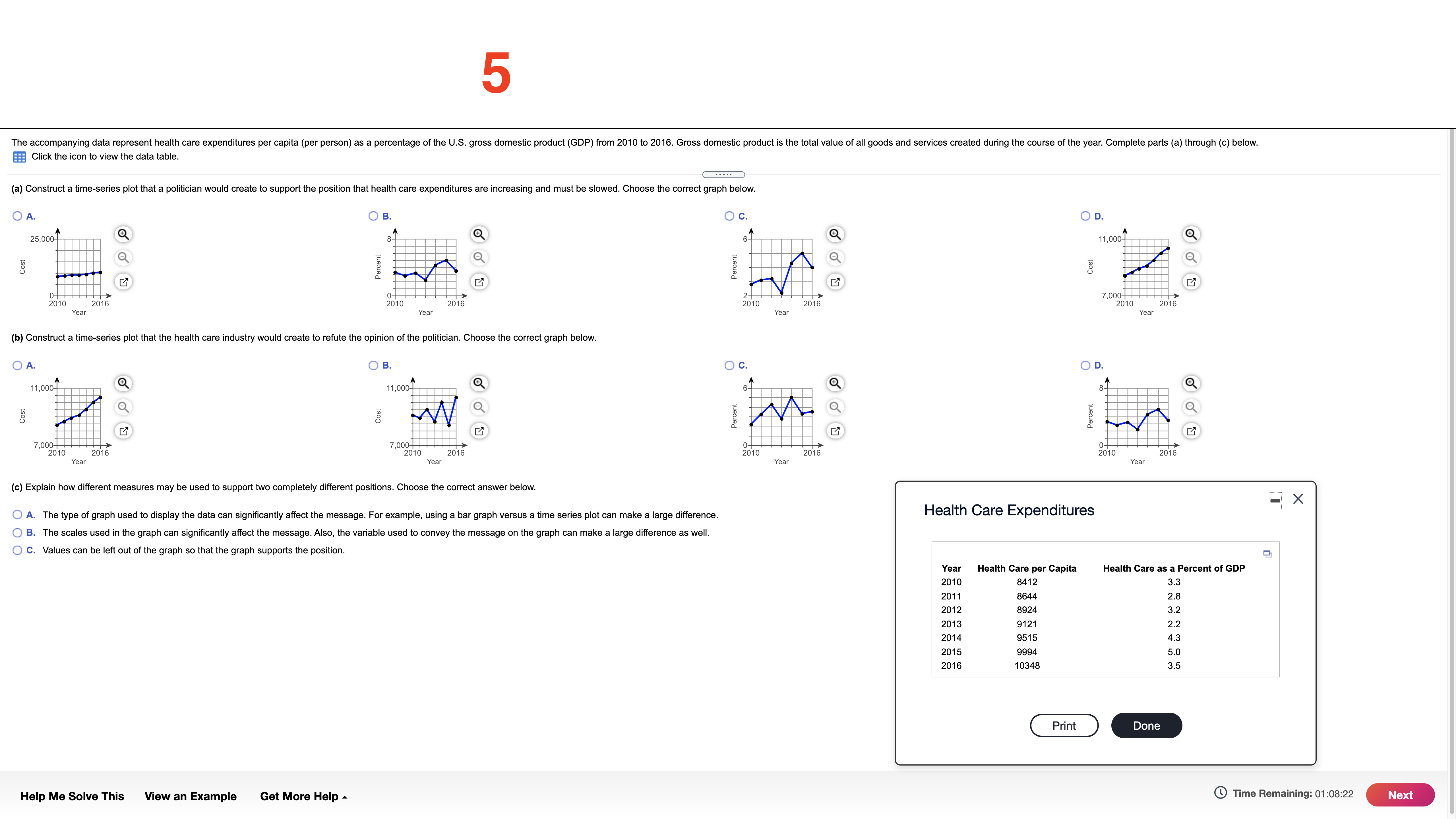
4 The following frequency histogram represents the IQ scores of a random sample of seventh-grade students. IQs are measured to the nearest whole number. The frequency of each class is labeled above each rectangle. Use the histogram to answers parts (a) through (9). IQs of 7th Grade Students 80- 60- 52 40 Frequency 40- 33 20- 13 7 4 2 TO 1 4 60 70 80 90 100 110 120 130 140 150 160 IQ scores (a) How many students were sampled? students (b) Determine the class width. The class width is (c) Identify the classes and their frequencies. Choose the correct answer below. O A. 60-69, 1; 70-79, 4; 80-89, 13; 90-99, 40; 100-109, 52; 110-119, 44; 120-129, 33; 130-139, 7; 140-149, 4; 150-159, 2 O B. 65, 1; 75, 4; 85, 13; 95, 40; 105, 52; 115, 44; 125, 33; 135, 7; 145, 4; 155, 2 O C. 60-70, 1; 70-80, 4; 80-90, 13; 90-100, 40; 100-110, 52; 110-120, 44; 120-130, 33; 130-140, 7; 140-150, 4; 150-160, 2 (d) Which class has the highest frequency? O A. 100-109 O B. 105 O C. 90-99 O D. 100-110 (e) Which class has the lowest frequency? O A. 60-69 O B. 65 O C. 150-159 O D. 60-70 (f) What percent of students had an IQ of at least 120? % (Type an integer or a decimal. Do not round.) (9) Did any students have an IQ of 166? O A. No, because there is a bar in the 150-159 class. O B. No, because there are no bars, or frequencies, greater than an IQ of 160. O C. Yes, because there is a frequency of a score of 165. O D. Yes, because there is a bar in the 150-159 class. Help Me Solve This View an Example Get More Help - Time Remaining: 01:09:07 Next5 The accompanying data represent health care expenditures per capita (per person) as a percentage of the U.S. gross domestic product (GDP) from 2010 to 2016. Gross domestic product is the total value of all goods and services created during the course of the year. Complete parts (a) through (c) below. Click the icon to view the data table (a) Construct a time-series plot that a politician would create to support the position that health care expenditures are increasing and must be slowed. Choose the correct graph below. O A. B O C. OD. 25,000- 11,000- O Percent Percent COS 2010 2016 2010 2- 2016 7,000 Year 2010 Year 2016 2010 2016 Year Year (b) Construct a time-series plot that the health care industry would create to refute the opinion of the politician. Choose the correct graph below. O A. OB. O C. OD. 11,000- 11,009- Q 6- Cost Cost Percent Percent ,000 2010 2016 ,ooo 2016 o- Year Year 2010 2016 2010 2016 Year Year (c) Explain how different measures may be used to support two completely different positions. Choose the correct answer below. -X O A. The type of graph used to display the data can significantly affect the message. For example, using a bar graph versus a time series plot can make a large difference. Health Care Expenditures O B. The scales used in the graph can significantly affect the message. Also, the variable used to convey the message on the graph can make a large difference as well. O C. Values can be left out of the graph so that the graph supports the position. Year Health Care per Capita Health Care as a Percent of GDP 2010 8412 3.3 2011 8644 2.8 2012 8924 3.2 2013 9121 22 2014 9515 4.3 2015 9994 5.0 2016 10348 3.5 Print Done Help Me Solve This View an Example Get More Help - Time Remaining: 01:08:22 Nextscreenshot 1 of 2 The table shows the movement of a stock for 30 randomly selected trading days. "Up" means the stock price increased in value for the day, "Down" means the stock price decreased in value for the day, and "No change" means the stock price closed at the same price it closed for the previous day. Complete parts (a) through (e) below. i Click the icon to view the table of data. (a) Construct a frequency distribution. -X Click here to view the table of data. Movement Frequency Down No change Up Up Down Up Down Down Down Up Up Up Down Up Up Up Down Down Up Up Down (b) Construct a relative frequency distribution. Down Down Up Down Up No change Down Up Down Up Up Up Movement Relative Frequency Down No change Up Print Done (Round to three decimal places as needed.) (c) Construct a frequency bar graph. Choose the correct graph below. B. A. Frequency Frequency Down No change up Down No change Up D. O C. Frequency Frequency Down No change Up Down No change Up (d) Construct a relative frequency bar graph. Choose the correct graph below. OB. Relative Frequency O A. Relative Frequency 0.67 0.67 0.4- 0.4- .2- 0.2- Down No change Up Down No change Up D. Relative Frequency O C. Relative Frequency 0.67 0.67 0.4- 0.4- 0.2- 0.2- 0- Down No change Up 0- Down No change Up (e) Construct a pie chart. Choose the correct graph below. Time Remaining: 01:07:36 Next Help Me Solve This View an Example Get More Help -6 screenshot 2 of 2 The table shows the movement of a stock for 30 randomly selected trading days. "Up" means the stock price increased in value for the day, "Down" means the stock price decreased in value for the day, and "No change" means the stock price closed at the same price it closed for the previous day. Complete parts (a) through (e) below. i Click the icon to view the table of data. Down No change -X Up Click here to view the table of data. (Round to three decimal places as needed.) (c) Construct a frequency bar graph. Choose the correct graph below. Up Up Down Up Down Down Down Up Up Up Down Up Up Up O A. B. Up Down Down Down 20- 207 Down Down Up Down Up No change Down Up Down Up Up Up Frequency Frequency Down No change Up Down No change Up O C. OD Print Done 20- 207 Frequency Frequency 10- Down No change Up Down No change Up (d) Construct a relative frequency bar graph. Choose the correct graph below. O A. Relative Frequency O B. Relative Frequency 0.67 0.67 0.4- 0.4- 0.2- 0.2- 1 Down No change Up Down No change Up O C. Relative Frequency O D. Relative Frequency 0.67 0.67 0.4- 0.4- 0.2- 0- Down No change Up Down No change Up (e) Construct a pie chart. Choose the correct graph below. O A. Down 40.0% O B. Down 33.3% No change 10.0% No change 10.0% Up 50.0% Up 56.7% O c. Down 36.7% O D. Down 43.3% No change 3.3% No change 3.3% Up 60.0% Up 53.4% Help Me Solve This View an Example Get More Help - Time Remaining: 01:07:01 Next