Please fill out the form for me using the product "Amazon.com"


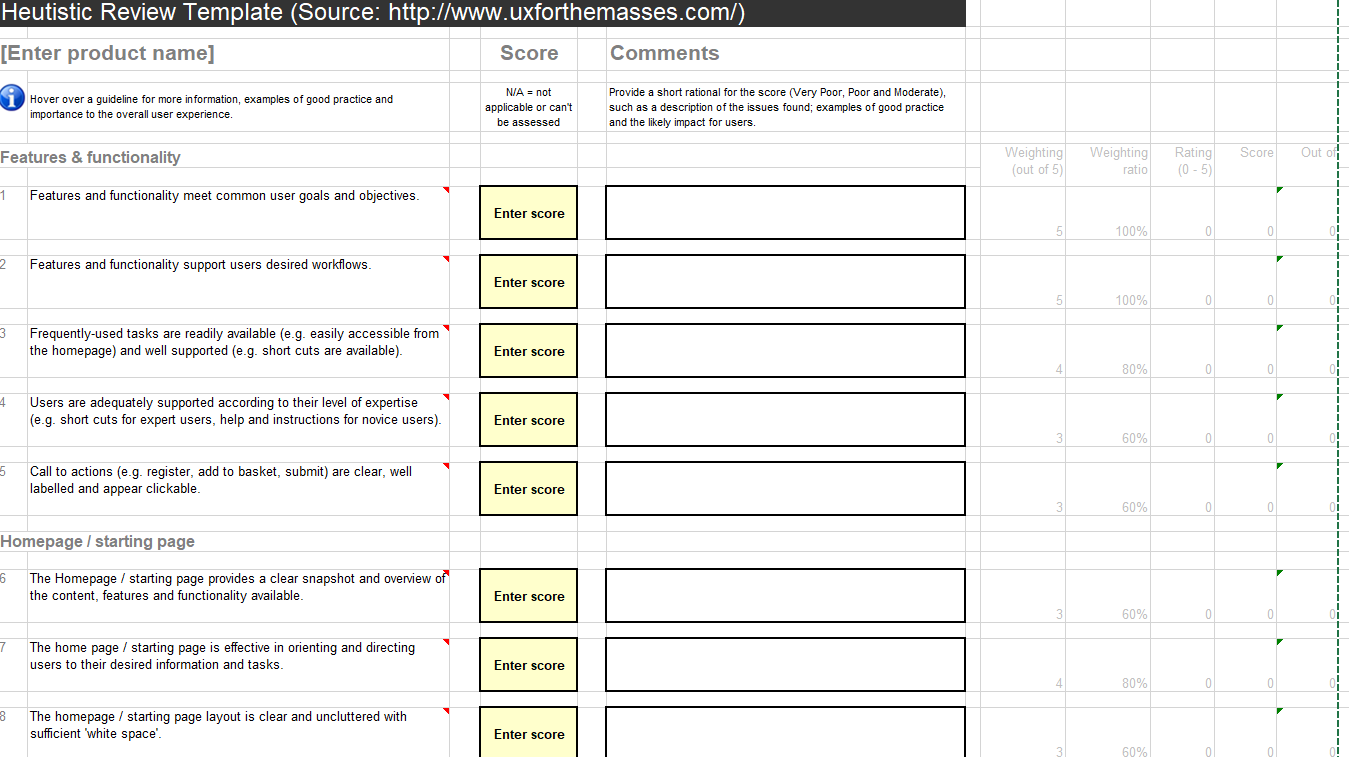
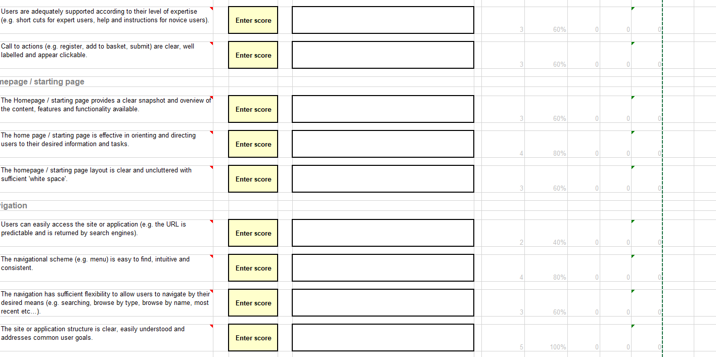
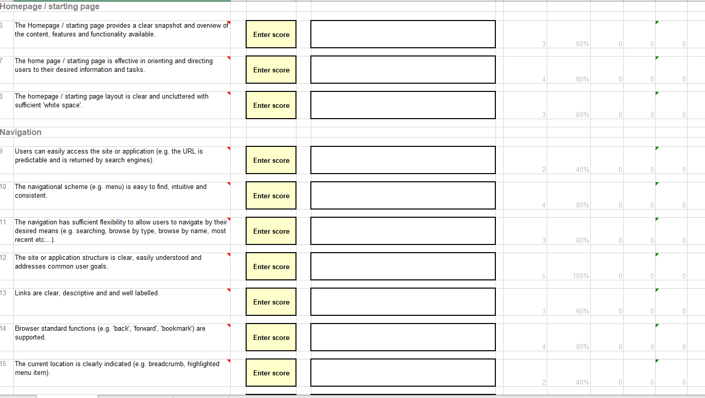
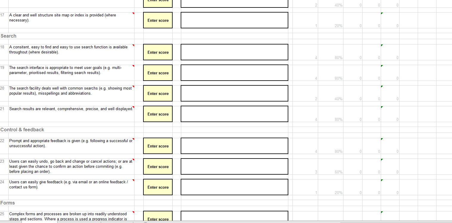
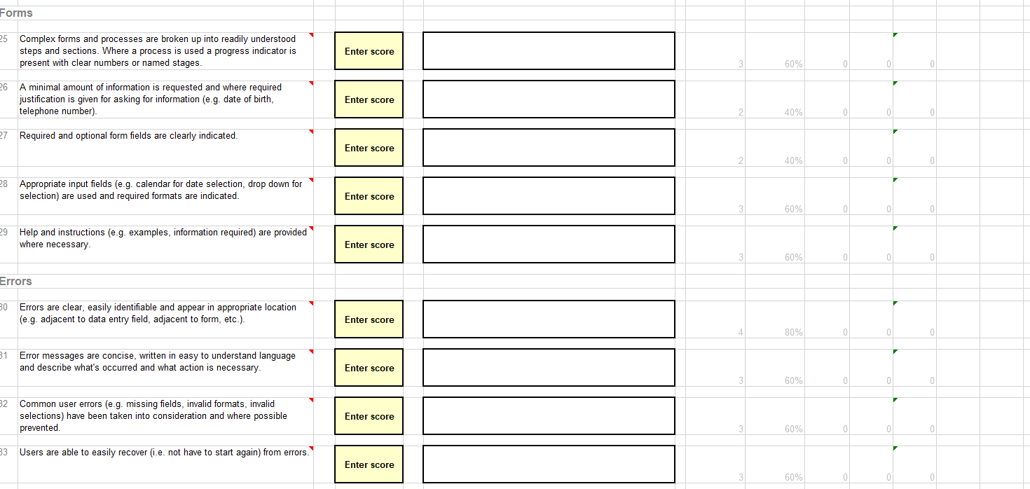
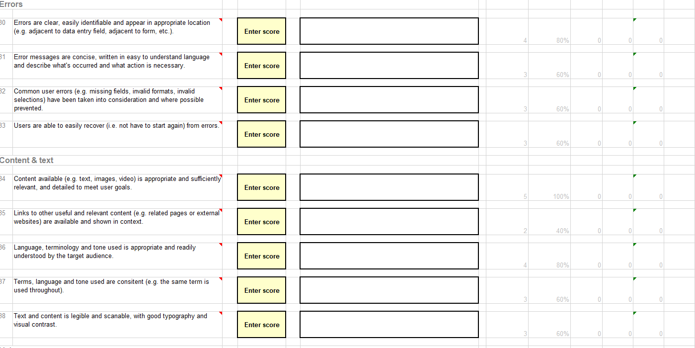
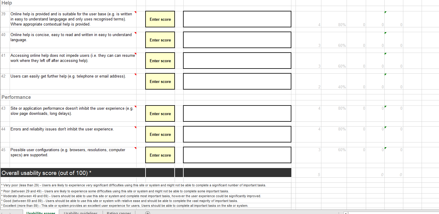
Heutistic Review Template (Source: http://www.uxforthemasses.com/) [Enter product name] Score Comments Hover over a guideline for more information, examples of good practice and importance to the overall user experience. N/A = not applicable or can't be assessed Provide a short rational for the score (Very Poor, Poor and Moderate), such as a description of the issues found; examples of good practice and the likely impact for users. Features & functionality Out Weighting (out of 5 Weighting ratio Score Rating (0-5) 1 Features and functionality meet common user goals and objectives. Enter score 5 100% 0 0 Features and functionality support users desired workflows. Enter score 100% 0 0 3 Frequently-used tasks are readily available (eg. easily accessible from the homepage) and well supported (e.g. short cuts are available). Enter score 80% 0 4 Users are adequately supported according to their level of expertise (e.g. short cuts for expert users, help and instructions for novice users). Enter score 60% 0 US Call to actions (e.g. register, add to basket, submit) are clear, well labelled and appear clickable. Enter score 60% 0 0 Homepage / starting page The Homepage / starting page provides a clear snapshot and overview of the content, features and functionality available. Enter score 60% 0 The home page / starting page is effective in orienting and directing users to their desired information and tasks. Enter score 80% 0 The homepage / starting page layout is clear and uncluttered with sufficient white space'. Enter score 60% Users are adequately supported according to their level of expertise (e.g. short cuts for expert users, help and instructions for novice users). Enter score 60% 0 Call to actions (e.g. register, add to basket, submit) are clear, well labelled and appear clickable. Enter score 60% 0 0 nepage / starting page The Homepage / starting page provides a clear snapshot and overview of the content, features and functionality available. Enter score 60% 0 The home page / starting page is effective in orienting and directing users to their desired information and tasks. Enter score 80% 0 0 The homepage / starting page layout is clear and uncluttered with sufficient 'white space Enter score 60% 0 0 rigation Users can easily access the site or application (e.g. the URL is predictable and is returned by search gines) Enter score 40% 0 The navigational scheme (e.g. menu) is easy to find intuitive and consistent Enter score 80% 0 The navigation has sufficient flexibility to allow users to navigate by their desired means (e.g. searching, browse by type, browse by name, most recent etc...). Enter score 60% 0 0 The site or application structure is clear, easily understood and addresses common user goals. Enter score 100% 0 0 Homepage / starting page 03 The Homepage / starting page provides a clear snapshot and overview of the content, features and functionality available. Enter score 3 60% 0 0 The home page / starting page is effective in orienting and directing users to their desired information and tasks. Enter score 4 80% 0 0 0 3 The homepage / starting page layout is clear and uncluttered with sufficient white space Enter score 3 60% 0 0 0 Navigation Users can easily access the site or application (e.g. the URL is predictable and is returned by search engines). Enter score 40% 0 0 0 10 The navigational scheme (e.g. menu) is easy to find intuitive and consistent Enter score 4 80% 0 0 0 Enter score 60% 0 0 11 The navigation has sufficient flexibility to allow users to navigate by their desired means (e.g. searching, browse by type, browse by name, most recent etc...). 12 The site or application structure is clear, easily understood and addresses common user goals Enter score 100% 0 0 13 Links are clear, descriptive and and well labelled. Enter score 3 60% 0 0 0 14 Browser standard functions (e.g. "back', 'forward", "bookmark") are supported. Enter score 4 80% 0 0 0 15 The current location is clearly indicated (eg. breadcrumb, highlighted menu item). Enter score 2 40% 0 0 40% 17 A clear and well structure site map or index is provided (where necessary) Enter score 20% 0 0 0 Search 18 A consitent, easy to find and easy to use search function is available throughout (where desirable) Enter score 80% 0 0 19 The search interface is appropriate to meet user goals (e.g. multi- parameter, prioritised results, filtering search results). Enter score 80% 0 0 0 20 The search facility deals well with common searchs (e.g. showing most popular results), misspellings and abbreviations. Enter score 40% 0 21 Search results are relevant, comprehensive, precise, and well displayed. Enter score 80% 0 Control & feedback 22 Prompt and appropriate feedback is given (e.g. following a successful or unsuccessful action). Enter score 80% 0 0 23 Users can easily undo, go back and change or cancel actions; or are at least given the chance to confirm an action before commiting (e.g. before placing an order). Enter score 3 60% 0 0 0 24 Users can easily give feedback (e.g. via email or an online feedback / contact us form). Enter score 20% 0 0 Forms 25 Complex forms and processes are broken up into readily understood steps and sections. Where a process is used a progress indicator is Enter score Forms 25 Complex forms and processes are broken up into readily understood steps and sections. Where a process is used a progress indicator is present with clear numbers or named stages. Enter score 60% o 26 A minimal amount of information is requested and where required justification is given for asking for information (e.g. date of birth, telephone number). Enter score 40% 0 0 27 Required and optional form fields are clearly indicated. Enter score 40% 0 0 0 28 Appropriate input fields (eg. calendar for date selection, drop down for selection) are used and required formats are indicated. Enter score 60% 0 0 29 Help and instructions (e.g. examples, information required) are provided where necessary Enter score 60% 0 0 0 Errors 30 Errors are clear, easily identifiable and appear in appropriate location (e.g. adjacent to data entry field, adjacent to form, etc.). Enter score 80% 0 31 Error messages are concise, written in easy to understand language and describe what's occurred and what action is necessary. Enter score 60% 0 0 0 32 Common user errors (e.g. missing fields, invalid formats, invalid selections) have been taken into consideration and where possible prevented. Enter score 60% 0 0 33 Users are able to easily recover (i.e. not have to start again) from errors. Enter score 60% Errors 30 Errors are clear, easily identifiable and appear in appropriate location (e.g. adjacent to data entry field, adjacent to form, etc.). Enter score 80% 0 0 31 Error messages are concise, written in easy to understand language and describe what's occurred and what action is necessary. Enter score 60% 0 0 32 Common user errors (e.g. missing fields, invalid formats, invalid selections) have been taken into consideration and where possible prevented. Enter score 60% 0 0 0 33 Users are able to easily recover (i.e. not have to start again) from errors. Enter score 60% 0 0 Content & text 34 Content available (e.g. text, images, video) is appropriate and sufficiently relevant, and detailed to meet user goals. Enter score 100% 0 o 35 Links to other useful and relevant content (e.g. related pages or external websites) are available and shown in context. Enter score 40% 0 0 0 36 Language, terminology and tone used is appropriate and readily understood by the target audience. Enter score 80% 0 37 Terms, language and tone used are consitent (e.g. the same term is used throughout). Enter score 60% 0 0 38 Text and content is legible and scanable, with good typography and visual contrast Enter score 60% 0 0 Help 39 Online help is provided and is suitable for the user base (e.g. is written in easy to understand langugage and only uses recognised terms). Where appropriate contextual help is provided. Enter score 80% 0 40 Online help is concise, easy to read and written in easy to understand language. Enter score 60% 0 0 0 41 Accessing online help does not impede users (i.e. they can can resume work where they left off after accessing help) Enter score 60% 0 0 0 42 Users can easily get further help (e.g. telephone or email address). Enter score 40% 0 0 0 Performance 43 80% 0 0 0 Site or application performance doesn't inhibit the user experience (e-g. slow page downloads, long delays). Enter score 44 Errors and reliabilty issues don't inhibit the user experience. 80% 0 01 Enter score 60% 0 01 0 45 Possible user configurations (e.g. browsers, resolutions, computer specs) are supported. Enter score Overall usability score (out of 100)* 0 0 * Very poor (less than 29) - Users are likely to experience very significant difficulties using this site or system and might not be able to complete a significant number of important tasks. * Poor (between 29 and 49) - Users are likely to experience some difficulties using this site or system and might not be able to complete some important tasks. * Moderate (between 49 and 69) - Users should be able to use this site or system and complete most important tasks, however the user experience could be significantly improved. * Good (between 69 and 89) - Users should be able to use this site or system with relative ease and should be able to complete the vast majority of important tasks. * Excellent (more than 89) - This site or system provides an excellent user experience for users. Users should be able to complete all important tasks on the site system. Ilsability scores Isability cuidelines Rating ranges Heutistic Review Template (Source: http://www.uxforthemasses.com/) [Enter product name] Score Comments Hover over a guideline for more information, examples of good practice and importance to the overall user experience. N/A = not applicable or can't be assessed Provide a short rational for the score (Very Poor, Poor and Moderate), such as a description of the issues found; examples of good practice and the likely impact for users. Features & functionality Out Weighting (out of 5 Weighting ratio Score Rating (0-5) 1 Features and functionality meet common user goals and objectives. Enter score 5 100% 0 0 Features and functionality support users desired workflows. Enter score 100% 0 0 3 Frequently-used tasks are readily available (eg. easily accessible from the homepage) and well supported (e.g. short cuts are available). Enter score 80% 0 4 Users are adequately supported according to their level of expertise (e.g. short cuts for expert users, help and instructions for novice users). Enter score 60% 0 US Call to actions (e.g. register, add to basket, submit) are clear, well labelled and appear clickable. Enter score 60% 0 0 Homepage / starting page The Homepage / starting page provides a clear snapshot and overview of the content, features and functionality available. Enter score 60% 0 The home page / starting page is effective in orienting and directing users to their desired information and tasks. Enter score 80% 0 The homepage / starting page layout is clear and uncluttered with sufficient white space'. Enter score 60% Users are adequately supported according to their level of expertise (e.g. short cuts for expert users, help and instructions for novice users). Enter score 60% 0 Call to actions (e.g. register, add to basket, submit) are clear, well labelled and appear clickable. Enter score 60% 0 0 nepage / starting page The Homepage / starting page provides a clear snapshot and overview of the content, features and functionality available. Enter score 60% 0 The home page / starting page is effective in orienting and directing users to their desired information and tasks. Enter score 80% 0 0 The homepage / starting page layout is clear and uncluttered with sufficient 'white space Enter score 60% 0 0 rigation Users can easily access the site or application (e.g. the URL is predictable and is returned by search gines) Enter score 40% 0 The navigational scheme (e.g. menu) is easy to find intuitive and consistent Enter score 80% 0 The navigation has sufficient flexibility to allow users to navigate by their desired means (e.g. searching, browse by type, browse by name, most recent etc...). Enter score 60% 0 0 The site or application structure is clear, easily understood and addresses common user goals. Enter score 100% 0 0 Homepage / starting page 03 The Homepage / starting page provides a clear snapshot and overview of the content, features and functionality available. Enter score 3 60% 0 0 The home page / starting page is effective in orienting and directing users to their desired information and tasks. Enter score 4 80% 0 0 0 3 The homepage / starting page layout is clear and uncluttered with sufficient white space Enter score 3 60% 0 0 0 Navigation Users can easily access the site or application (e.g. the URL is predictable and is returned by search engines). Enter score 40% 0 0 0 10 The navigational scheme (e.g. menu) is easy to find intuitive and consistent Enter score 4 80% 0 0 0 Enter score 60% 0 0 11 The navigation has sufficient flexibility to allow users to navigate by their desired means (e.g. searching, browse by type, browse by name, most recent etc...). 12 The site or application structure is clear, easily understood and addresses common user goals Enter score 100% 0 0 13 Links are clear, descriptive and and well labelled. Enter score 3 60% 0 0 0 14 Browser standard functions (e.g. "back', 'forward", "bookmark") are supported. Enter score 4 80% 0 0 0 15 The current location is clearly indicated (eg. breadcrumb, highlighted menu item). Enter score 2 40% 0 0 40% 17 A clear and well structure site map or index is provided (where necessary) Enter score 20% 0 0 0 Search 18 A consitent, easy to find and easy to use search function is available throughout (where desirable) Enter score 80% 0 0 19 The search interface is appropriate to meet user goals (e.g. multi- parameter, prioritised results, filtering search results). Enter score 80% 0 0 0 20 The search facility deals well with common searchs (e.g. showing most popular results), misspellings and abbreviations. Enter score 40% 0 21 Search results are relevant, comprehensive, precise, and well displayed. Enter score 80% 0 Control & feedback 22 Prompt and appropriate feedback is given (e.g. following a successful or unsuccessful action). Enter score 80% 0 0 23 Users can easily undo, go back and change or cancel actions; or are at least given the chance to confirm an action before commiting (e.g. before placing an order). Enter score 3 60% 0 0 0 24 Users can easily give feedback (e.g. via email or an online feedback / contact us form). Enter score 20% 0 0 Forms 25 Complex forms and processes are broken up into readily understood steps and sections. Where a process is used a progress indicator is Enter score Forms 25 Complex forms and processes are broken up into readily understood steps and sections. Where a process is used a progress indicator is present with clear numbers or named stages. Enter score 60% o 26 A minimal amount of information is requested and where required justification is given for asking for information (e.g. date of birth, telephone number). Enter score 40% 0 0 27 Required and optional form fields are clearly indicated. Enter score 40% 0 0 0 28 Appropriate input fields (eg. calendar for date selection, drop down for selection) are used and required formats are indicated. Enter score 60% 0 0 29 Help and instructions (e.g. examples, information required) are provided where necessary Enter score 60% 0 0 0 Errors 30 Errors are clear, easily identifiable and appear in appropriate location (e.g. adjacent to data entry field, adjacent to form, etc.). Enter score 80% 0 31 Error messages are concise, written in easy to understand language and describe what's occurred and what action is necessary. Enter score 60% 0 0 0 32 Common user errors (e.g. missing fields, invalid formats, invalid selections) have been taken into consideration and where possible prevented. Enter score 60% 0 0 33 Users are able to easily recover (i.e. not have to start again) from errors. Enter score 60% Errors 30 Errors are clear, easily identifiable and appear in appropriate location (e.g. adjacent to data entry field, adjacent to form, etc.). Enter score 80% 0 0 31 Error messages are concise, written in easy to understand language and describe what's occurred and what action is necessary. Enter score 60% 0 0 32 Common user errors (e.g. missing fields, invalid formats, invalid selections) have been taken into consideration and where possible prevented. Enter score 60% 0 0 0 33 Users are able to easily recover (i.e. not have to start again) from errors. Enter score 60% 0 0 Content & text 34 Content available (e.g. text, images, video) is appropriate and sufficiently relevant, and detailed to meet user goals. Enter score 100% 0 o 35 Links to other useful and relevant content (e.g. related pages or external websites) are available and shown in context. Enter score 40% 0 0 0 36 Language, terminology and tone used is appropriate and readily understood by the target audience. Enter score 80% 0 37 Terms, language and tone used are consitent (e.g. the same term is used throughout). Enter score 60% 0 0 38 Text and content is legible and scanable, with good typography and visual contrast Enter score 60% 0 0 Help 39 Online help is provided and is suitable for the user base (e.g. is written in easy to understand langugage and only uses recognised terms). Where appropriate contextual help is provided. Enter score 80% 0 40 Online help is concise, easy to read and written in easy to understand language. Enter score 60% 0 0 0 41 Accessing online help does not impede users (i.e. they can can resume work where they left off after accessing help) Enter score 60% 0 0 0 42 Users can easily get further help (e.g. telephone or email address). Enter score 40% 0 0 0 Performance 43 80% 0 0 0 Site or application performance doesn't inhibit the user experience (e-g. slow page downloads, long delays). Enter score 44 Errors and reliabilty issues don't inhibit the user experience. 80% 0 01 Enter score 60% 0 01 0 45 Possible user configurations (e.g. browsers, resolutions, computer specs) are supported. Enter score Overall usability score (out of 100)* 0 0 * Very poor (less than 29) - Users are likely to experience very significant difficulties using this site or system and might not be able to complete a significant number of important tasks. * Poor (between 29 and 49) - Users are likely to experience some difficulties using this site or system and might not be able to complete some important tasks. * Moderate (between 49 and 69) - Users should be able to use this site or system and complete most important tasks, however the user experience could be significantly improved. * Good (between 69 and 89) - Users should be able to use this site or system with relative ease and should be able to complete the vast majority of important tasks. * Excellent (more than 89) - This site or system provides an excellent user experience for users. Users should be able to complete all important tasks on the site system. Ilsability scores Isability cuidelines Rating ranges
