please solve all of these questions:-
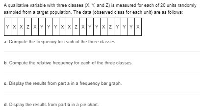
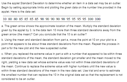
A qualitative variable with three classes (X, Y, and Z) is measured for each of 20 units randomly sampled from a target population. The data (observed class for each unit) are as follows: X XZXY Y Y X X Z X Y Y X Y YX a. Compute the frequency for each of the three classes. b. Compute the relative frequency for each of the three classes. c. Display the results from part a in a frequency bar graph. d. Display the results from part b in a pie chart.Use the applet Standard Deviation to study the effect that an extreme value has on the standard deviation. Begin by setting appropriate limits and plotting the following data on the number line provided in the applet: 06778880910 a. Record the standard deviation. Replace the extreme value of 0 with 2, then 4, and then 6. Record the standard deviation each time. Describe what happens to the standard deviation as 0 is replaced by ever higher numbers. b. How would the standard deviation of the data set compare with the original standard deviation if the 0 were replaced by 16? Explain.Use the applet Standard Deviation to determine whether an item in a data set may be an outlier. Begin by setting appropriate limits and plotting the given data on the number line provided in the applet. Here is the data set: 10 80 80 85 85 85 85 90 90 90 90 90 95 95 95 95 100 100 3. The green arrow shows the approximate location of the mean. Multiply the standard deviation given by the applet by 3. Is the data item 10 more than three standard deviations away from the green arrow (the mean)? Can you conclude that the 10 is an outlier? b. Using the mean and standard deviation from part a, move the point at 10 on your plot to a point that appears to be about three standard deviations from the mean. Repeat the process in part a for the new plot and the new suspected outlier. c. When you replaced the extreme value in part a with a number that appeared to be within three standard deviations of the mean, the standard deviation got smaller and the mean moved to the right, yielding a new data set whose extreme value was not within three standard deviations of the mean. Continue to replace the extreme value with higher numbers until the new value is within three standard deviations of the mean in the new data set. Use trial and error to estimate the smallest number that can replace the 10 in the original data set so that the replacement is not considered to be an outlier.Do social robots walk or roll? According to the United Nations, social robots now outnumber industrial robots worldwide. A social (or service) robot is designed to entertain, educate, and care for human users. In a paper published by the International Conference on Social Robotics (Vol. 8414, 2010). design engineers investigated the trend in the design of social robots. Using a random sample of 106 social robots obtained through a Web search, the engineers found that 63 were built with legs only. 20 with wheels only, 8 with both legs and wheels, and 15 with neither legs nor wheels. This information is portrayed in the accompanying graphic. 3. What type of graph is used to describe the data? b. Identify the variable measured for each of the 108 robot designs. c. Use the graph to identify the social robot design that is currently used the most. d. Compute class relative frequencies for the different categories shown in the graph. e. Use the results from part d to construct a Pareto diagram for the data. 70 40 Both Love Only Wheel Only Type of Helvetic LinksPaying for music downloads. If you use the Internet, have you ever paid to access or download music? This was one of the questions of interest in a recent Pew Internet & American Life Project Survey (October 2010). Telephone interviews were conducted on a representative sample of 1,003 adults living in the United States. For this sample, 248 adults stated that they do not use the Internet, 249 revealed that they use the Internet but have never paid to download music, and the remainder (506 adults) stated that they use the Internet and have paid to download music. The results are summarized in the MINITAB pie chart shown. a. According to the pie chart, what proportion of the sample use the Internet and pay to download music? Verify the accuracy of this proportion using the survey results. b. Now consider only the 755 adults in the sample that use the Internet. Create a graph that compares the proportion of these adults that pay to download music with the proportion that do not pay- Ple Chart of Download-Music Na Internet In barrel . No Pay internet - PaidEstimating the rhino population. The International Rhino Foundation estimates that there are 28,933 rhinoceroses living in the wild in Africa and Asia. A breakdown of the number of rhinos of each species is reported in the accompanying table: Rhino Species Population Estimate African Black African White 20.405 (Asian) Sumatran 100 [ Asian) Javan 40 (Asian) Greater One-Horned 3.313 Total 28,933 Source International Rhine Foundation, 7014. a. Construct a relative frequency table for the data. b. Display the relative frequencies in a bar graph. c. What proportion of the 28,933 rhinos are African rhinos? Asian?STEM experiences for girls. The National Science Foundation (NSF) sponsored a study on girls" participation in informal science, technology. engineering, and mathematics (STEM) programs (see Exercise 1.13). The results of the study were published in Cascading Influences: Long- Term Impacts of Informal STEM Experiences for Girls (Mar. 2013). The researchers questioned 174 young women who recently participated in a STEM program. They used a pie chart to describe the geographic location (urban, suburban, or rural) of the STEM programs attended. Of the 174 STEM participants, 107 were in urban areas, 57 in suburban areas, and 10 in rural areas. Use this information to construct the pie chart. Interpret the results. (Reference Exercise 1.13) STEM experiences for girls. The National Science Foundation (NSF) promotes girls' participation in informal science, technology. engineering. and mathematics (STEM) programs. What has been the impact of these informal STEM experiences? This was the question of interest in the published study Cascading Influences: Long-Term Impacts of Informal STEM Experiences for Girls (Mar. 2013). A sample of 159 young women who recently participated in a STEM program were recruited to complete an online survey. Of these, only 27% felt that participation in the STEM program increased their interest in science. a. Identify the population of interest to the researchers. b. Identify the sample. c. Use the information in the study to make an inference about the relevant population.Genealogy research. The Journal of Family History (Jan. 2010) investigated the genealogy of a certain Korean clan. Of interest was whether or not a family name continued into the next generation in the clan genealogy (called a continued line) or dropped out (called a dropout line). Side by- side pie charts were used to describe the rate at which certain occupational titles of clan individuals occurred within each line type. Similarly constructed MINITAB bar charts are shown on p. 39. a. Identify the two qualitative variables graphed in the side-by-side pie charts. b. Give a full interpretation of the charts. Identify the major differences (if any) between the two line groups. MINITAB Output for Exercise 2.14 CLAN TITLE\fCurbing street gang gun violence. Operation Ceasefire is a program implemented to reduce street gang gun violence in the city of Boston. The effectiveness of the program was examined in the Journal of Quantitative Criminology (Mar. 2014). Over a 5-year period (2008-2010), there were 80 shootings involving a particular Boston street gang (called the Lucerne Street Doggz). The information in the table breaks down these shootings by year and by who was shot (gang members or non-gang members). Note: The Ceasefire program was implemented at the end of 2007. Shootings of Shootings of Total Gang Non-Gang Year Shootings Members Members 2005 37 30 2007 30 22 2008 3 2009 4 2010 Totals 62 18 Source Briga, A A. Hercau, I M., and Papachraios, A. V. "Deterring gang- involved gun violence: Memuring the impact of Boston's Operation Ceasefire on sirect pang behavior." Journal of Vawantsnive Criminology, Val 31 Na 1, Mar. 2014 (adapted from Figure ]). a. Construct a Pareto diagram for the total annual shootings involving the Boston street gang. b. Construct a Pareto diagram for the annual shootings of the Boston street gang members. c. Based on the Pareto diagrams, comment on the effectiveness of Operation Ceasefire.Interactions in a children's museum. The nature of child-led and adult-led interactions in a children's museum was investigated in Early Childhood Education Journal (Mar. 2014). Interactions by visitors to the museum were classified as (1) show-and-tell, (2) learning. (3) teaching. (4) refocusing. (5) participatory play. (8) advocating. or (7) disciplining. Over a 3-month period, the researchers observed 170 meaningful interactions, of which 81 were led by children and 80 were led by adult caregivers. The number of interactions observed in each category is provided in the accompanying table. Use side-by-side bar graphs to compare the interactions led by children and adults. Do you observe any trends? Type of Interaction Child-Led Adult-Led Show-and-tell 26 Learning 21 Teaching 10 Refocusing 21 Participatory Play 12 Advocating Disciplining Tolals 81 Source: McMunn-Dooky C, and Welch, M. M. "Nature of interactions among young children and adult caregivers in a children's muscum." from Figure 21Motivation and right-oriented bias. Evolutionary theory suggests that motivated decision makers tend to exhibit a right-oriented bias. (For example, if presented with two equally valued brands of detergent on a supermarket shelf, consumers are more likely to choose the brand on the right.) In Psychological Science (November 2011), researchers tested this theory using data on all penalty shots attempted in World Cup soccer matches (a total of 204 penalty shots). The researchers believe that goalkeepers, motivated to make a penalty shot save but with little time to make a decision, will tend to dive to the right. The results of the study (percentages of dives to the left, middle, or right) are provided in the table. Note that the percentages in each row. corresponding to a certain match situation, add to 100%. Construct side-by-side bar graphs showing the distribution of dives for the three match situations. What inferences can you draw from the graphs? Match Situation Dive Left Stay Middle Dive Right Team behind 29% 71% Tied 49% Team ahead 51% 48% Sauce: Rockes, M. cial. "The right side? Under time pressure, approach molinvation leads to right-oriented his"Packedopal Saran, Val. ). No. II. Nov 2011 ( adapted from Figure 1)


