Answered step by step
Verified Expert Solution
Question
1 Approved Answer
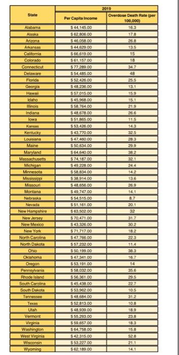
pleasse answer the following questions in relation to the scatterplot and data shared below, thank you! State Per Capita Income Alabama Alaska Arizona Arkansas California
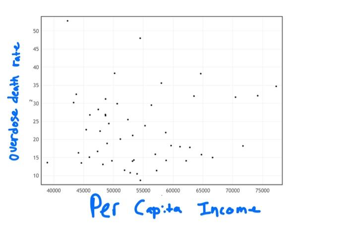
pleasse answer the following questions in relation to the scatterplot and data shared below, thank you! 


State Per Capita Income Alabama Alaska Arizona Arkansas California Colorado Connecticut Delaware Florida Georgia Hawaii Idaho inois Indiana Iowa 2019 Overdose Death Rate (per 100.000) 16.3 178 250 135 15 18 34.7 48 25.5 13.1 159 15.1 219 256 115 143 325 28.3 299 38.2 321 Kan 14.2 136 26.9 Kentucky Louisiana Maine Maryland Massachusetts Michigan Minnesota Mississipl Missouri Montana Nebraska Nevada New Hampshire New Jersey New Mexico New York North Carolina North Dakota Ohio Oklahoma Oregon Pennsylvania Rhode Island South Carolina South Dakota Tennessee Texas Utah Vermont Virginia Washington West Virginia Wisconsin Wyoming $ 44,145.00 $ 62 806.00 $ 46,058.00 $44,629.00 $ 66,619.00 5 61.157.00 $77.289.00 S54,485.00 5 52.426.00 $ 48,235.00 $ 57,015.00 $ 45,968.00 $58,764.00 $48.678.00 $51 865.00 $ 53.426.00 S 43.770.00 $ 47.450.00 S 50,634 00 $64540.00 S 74 16709 $ 49.228.00 $ 58.834.00 $38.914,00 $ 48,656.00 $ 49,747.00 554,515.00 $ 51.161.00 $63.502.00 $ 70,47100 $.43.326.00 $71,71700 $ 47.766.00 $57222.00 S 50,199.00 $ 47,341.00 553,191.00 S 58.032.00 $156 361 00 $ 45,438.00 $ 53.962.00 $48.684.00 S 52.813.00 $ 48,939.00 555 283.00 $ 59,657.00 564,758.00 $ 42315.00 $53 22700 $ 62,189.00 140 a.7 20.1 32 31.7 302 182 3223 11.4 38.3 16.7 14 35.6 295 227 10.5 312 10.8 18.9 133 15.3 21.1 141 50 45 40 35 Overdose death rate *30 25 20 15 10 40000 45000 50000 55000 60000 65000 70000 75000 Per Capita Income 1. Use StatKey to graph a scatterplot. Per Capita Income should be on the horizonal axis versus Overdose Death Rate on the vertical axis. Make sure the graph is fully labeled. Briefly summarize the visual association between the two variables (positive, negative, or no association). . 2. Test the alternative hypothesis that the average overdose death rate per 100,000 individuals (across the 50 states) is greater in 2019 than in 2015 (the average in 2015 was 17.8, which will be used as Ho). Take the level of significance to be 0.05. Exhibit the null and alternative, show all your work for the test statistic, report a p-value and explain how you got it (screenshot of StatKey), and explain your ultimate decision. Make sure to also explain the type of uncertainty that statistical significance addresses (explain the concept of a Type I error in a hypothesis test). 3. The overdose epidemic that has ravaged Chicago has not spared the nearby suburbs, some of which have death rates comparable to anything seen in the city, according to a report released this week by the Cook County Department of Public Health. ZIP codes in the towns of Worth, Broadview, Maywood and Forest Park, areas that "have substantially lower median household incomes and higher poverty rates," have been especially hard-hit, the report said. The data you have been analyzing wasn't focused on Chicago, obviously. But do your results support the general gist of the statistical argument being made in this Tribune excerpt? Please address: Do overdose death rates appear to be associated with per capita income (use scatterplot)? Do overdose death rates appear to be increasing over time (use hypothesis test)? State Per Capita Income Alabama Alaska Arizona Arkansas California Colorado Connecticut Delaware Florida Georgia Hawaii Idaho inois Indiana Iowa 2019 Overdose Death Rate (per 100.000) 16.3 178 250 135 15 18 34.7 48 25.5 13.1 159 15.1 219 256 115 143 325 28.3 299 38.2 321 Kan 14.2 136 26.9 Kentucky Louisiana Maine Maryland Massachusetts Michigan Minnesota Mississipl Missouri Montana Nebraska Nevada New Hampshire New Jersey New Mexico New York North Carolina North Dakota Ohio Oklahoma Oregon Pennsylvania Rhode Island South Carolina South Dakota Tennessee Texas Utah Vermont Virginia Washington West Virginia Wisconsin Wyoming $ 44,145.00 $ 62 806.00 $ 46,058.00 $44,629.00 $ 66,619.00 5 61.157.00 $77.289.00 S54,485.00 5 52.426.00 $ 48,235.00 $ 57,015.00 $ 45,968.00 $58,764.00 $48.678.00 $51 865.00 $ 53.426.00 S 43.770.00 $ 47.450.00 S 50,634 00 $64540.00 S 74 16709 $ 49.228.00 $ 58.834.00 $38.914,00 $ 48,656.00 $ 49,747.00 554,515.00 $ 51.161.00 $63.502.00 $ 70,47100 $.43.326.00 $71,71700 $ 47.766.00 $57222.00 S 50,199.00 $ 47,341.00 553,191.00 S 58.032.00 $156 361 00 $ 45,438.00 $ 53.962.00 $48.684.00 S 52.813.00 $ 48,939.00 555 283.00 $ 59,657.00 564,758.00 $ 42315.00 $53 22700 $ 62,189.00 140 a.7 20.1 32 31.7 302 182 3223 11.4 38.3 16.7 14 35.6 295 227 10.5 312 10.8 18.9 133 15.3 21.1 141 50 45 40 35 Overdose death rate *30 25 20 15 10 40000 45000 50000 55000 60000 65000 70000 75000 Per Capita Income 1. Use StatKey to graph a scatterplot. Per Capita Income should be on the horizonal axis versus Overdose Death Rate on the vertical axis. Make sure the graph is fully labeled. Briefly summarize the visual association between the two variables (positive, negative, or no association). . 2. Test the alternative hypothesis that the average overdose death rate per 100,000 individuals (across the 50 states) is greater in 2019 than in 2015 (the average in 2015 was 17.8, which will be used as Ho). Take the level of significance to be 0.05. Exhibit the null and alternative, show all your work for the test statistic, report a p-value and explain how you got it (screenshot of StatKey), and explain your ultimate decision. Make sure to also explain the type of uncertainty that statistical significance addresses (explain the concept of a Type I error in a hypothesis test). 3. The overdose epidemic that has ravaged Chicago has not spared the nearby suburbs, some of which have death rates comparable to anything seen in the city, according to a report released this week by the Cook County Department of Public Health. ZIP codes in the towns of Worth, Broadview, Maywood and Forest Park, areas that "have substantially lower median household incomes and higher poverty rates," have been especially hard-hit, the report said. The data you have been analyzing wasn't focused on Chicago, obviously. But do your results support the general gist of the statistical argument being made in this Tribune excerpt? Please address: Do overdose death rates appear to be associated with per capita income (use scatterplot)? Do overdose death rates appear to be increasing over time (use hypothesis test) 


Step by Step Solution
There are 3 Steps involved in it
Step: 1

Get Instant Access to Expert-Tailored Solutions
See step-by-step solutions with expert insights and AI powered tools for academic success
Step: 2

Step: 3

Ace Your Homework with AI
Get the answers you need in no time with our AI-driven, step-by-step assistance
Get Started


