

Answered step by step
Verified Expert Solution
Question
1 Approved Answer
pls help solve The figure above shows a plot of surface temperature values (in Fatirenheit) to be used to create an interpolated map. On Figure
pls help solve 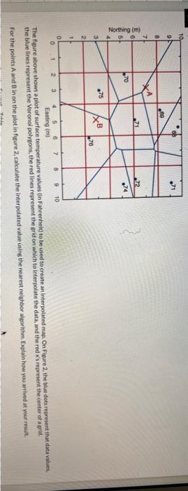
The figure above shows a plot of surface temperature values (in Fatirenheit) to be used to create an interpolated map. On Figure 2 , the blue dots represent that data values, the blue lines represent the Voronol polyesons, the red lines represent the erld on which to interpolate the data, and the red x's represent the center of a srie. For the points A and 8 in on the plot in figure 2, calculate the interpolated value uaing the nearest neighbor algorithm. Explaln how you arrived at your resuit Step by Step Solution
There are 3 Steps involved in it
Step: 1

Get Instant Access to Expert-Tailored Solutions
See step-by-step solutions with expert insights and AI powered tools for academic success
Step: 2

Step: 3
Ace Your Homework with AI
Get the answers you need in no time with our AI-driven, step-by-step assistance
Get Started
Master The Art Of Data Storytelling With Visualizations
Authors: Alexander N Donovan
1st Edition
B0CNMD9QRD, 979-8867864248