

Question
Purpose: To apply the use of graphs for categorical and numerical data. In Statistics, time charts are used to track many things, for example, organizations
Purpose: To apply the use of graphs for categorical and numerical data. In Statistics, time charts are used to track many things, for example, organizations track annual revenues by year for past performance, they then use past, present and future economic indicators (i.e., inflation, interests, commodity rates, political climate etc.) to forecast future revenue performance. Complete the below questions and worksheet.
Scenario
Let's assume that a small business created an app that is sold for use on mobile devices. Each year, the product has increased in functionality and price.
The original business case for the product estimated that product revenue would be $75,000 by the year 2022 based on their forecast of at least 3% per year increase. However, the actual results have not matched expectations.
Using the data set in the table below, enter the values in an Excel spreadsheet.
Figure 1 Revenue by Year
| Year | 2015 | 2016 | 2017 | 2018 | 2019 | 2020 | 2021 | 2022 |
|---|---|---|---|---|---|---|---|---|
| Revenue | $60,000 | $62,000 | $64,000 | $65,000 | $66,000 | $67,500 | $68,000 | $68,400 |
| Change | ||||||||
| Change % |
Question 1 - Analyze the Data
a) In your Excel spreadsheet calculate the missing two rows of numbers for "Change" and "Change %". Insert your spreadsheet (or a snippet of it) below.
b) Identify the two years with the steepest monetary increases.
c) Explain how you determined this: for example, did you use Actual Revenue Increase or the Percentage Increase? Why did you choose that method?
Question 2 - Graph the Data
Create a graph that shows the revenue per year.
a) What type of graph or chart did you use? Why?
b) What scale did you use for the vertical axis on your graph. Why?
c) Paste a copy (or a picture) of your graph here:
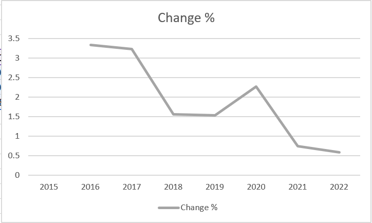
Figure 2 Percent Change in Price shows the rate of change from one year to the next. For example, in the first year there was a 3.3% increase in revenue. The chart in Figure 1 seems to show a dramatic change from year to year even though the changes in percentage were relatively small.
Figure 2 Percent Change in Price
Step by Step Solution
There are 3 Steps involved in it
Step: 1

Get Instant Access to Expert-Tailored Solutions
See step-by-step solutions with expert insights and AI powered tools for academic success
Step: 2

Step: 3
Ace Your Homework with AI
Get the answers you need in no time with our AI-driven, step-by-step assistance
Get Started
Precalculus
Authors: Michael Sullivan
9th edition
321716835, 321716833, 978-0321716835